Why James Talarico's typography signals a new kind of politics
Plus: Why Kristi Noem’s state-funded ad campaigns ended up dooming her

Texas state Rep. James Talarcio won Tuesday’s Democratic primary for U.S. Senate, but his campaign’s real mission is even more ambitious. “We are not just trying to win an election. We are trying to fundamentally change our politics,” Talarico said during his election night speech in South Austin, where he touted the more than 28,000 volunteers the campaign recruited and the impressive amount of funding it raised without taking money from corporate PACs.
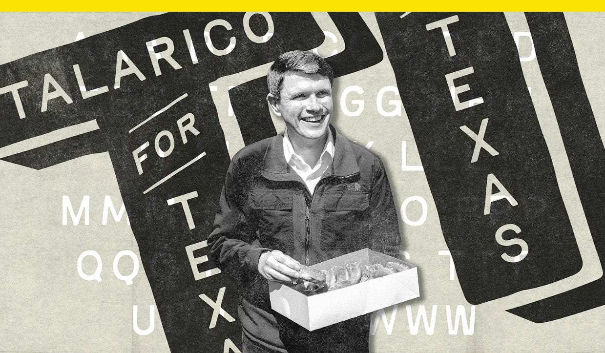
It’s a message his campaign isn’t just saying with words, but with the letterforms that shape them, too. Talarcio won the primary with typography that’s intentionally imperfect.
Contemporary political typography tends toward fonts that are loud and bold, especially when it comes to campaign logos. Those used for candidates like President Donald Trump and former Vice President Kamala Harris set their last names in all-caps, sans-serif typefaces that could be read clearly and at a distance, like an athlete’s surname on the back of a jersey. In contrast, the Talarico campaign’s visual identity looks a little rough around the edges.
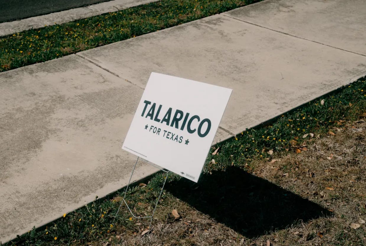
The politician’s primary campaign slogan, “Talarico for Texas,” is far from precision set. It’s subtle at first, but upon closer inspection, you’ll notice that the letters’ strokes aren’t straight (most evident in the letter C, which has an especially uneven weight). And where another designer might have used clean and crisp Texas Lone Stars, this wordmark features rounded, ornamental asterisks to set apart “For Texas.”
Talarico’s black-and-white palette recalls the one used for former Texas Congressman Beto O’Rourke’s 2018 campaign for a U.S. Senate seat, but their approaches to typography are different. O’Rourke’s type was tall and condensed. Talarico’s looks handmade.
A secondary “Talarico for Texas” logo arranges the words within the shape of a letter T. It uses slightly different but still notably imperfect typography that draws a contrast to previous political branding standard bearers. Whereas then-presidential candidate Barack Obama’s iconic, corporate-style “O” logo was geometric, balanced, and precisely designed, the “O” in “Talarico” is not at all perfectly round.
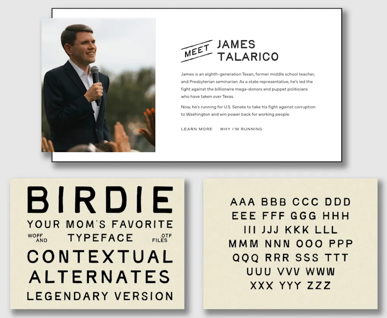
Talarico deploys that look at scale with Birdie, a handmade, vintage-print-inspired typeface by designer Taylor Penton, who says on his website that he designed the font to be “a little off.” Those slight imperfections have proven popular. Penton calls Birdie the “most-used, most-downloaded, and least-regretted font” he’s ever released. Neither Penton nor the Talarico campaign responded to a request for comment.
Overall, the effect of the typography gives Talarico’s campaign brand voice a sense of humanity. This type wasn’t whipped up by a computer, it suggests, but made with a human touch. It’s not unlike the hand-drawn logo New York City Mayor Zohran Mamdani’s campaign used last year, which was inspired by city street signs and Bollywood movie posters. In Talarico slogans like “It’s Time to Start Flipping Tables” — a Biblical reference about righteous moral outrage toward the sins of the Trump administration — the type style gives the letters life.
Talarico is running to change politics as we know it, and much like Mamdani and Alexandria Ocasio-Cortez before him, he’s doing it with typography that doesn’t look like typical political branding. As campaigns have grown more digital, fonts that feel analog can help candidates communicate authenticity through type.
This story was first published in Fast Company.
A new license plate was designed to be easier to read. Toll cams keep misreading it.
Pennsylvania’s “Let Freedom Ring” plate used a slashed zero to distinguish the number from the letter O.
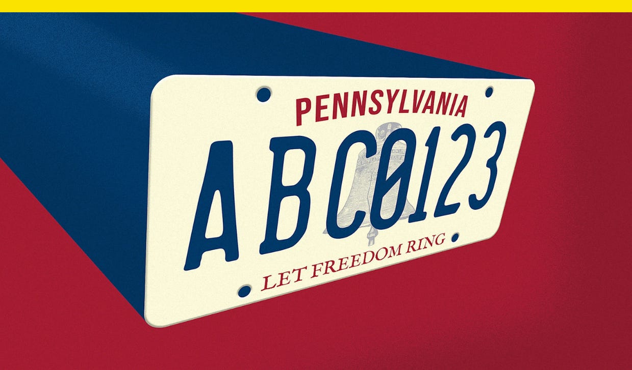
The numbers on a new patriotic Pennsylvania license plate were designed to be easy to read, but they’ve actually introduced a new point of confusion.
Pennsylvania Governor Josh Shapiro announced the “Let Freedom Ring” specialty license plate last summer to promote the commonwealth’s role in America’s founding 250 years ago. The cream-colored plate depicts a dark blue Liberty Bell in the background, along with the previously mentioned slogan and commonwealth’s name in red. None of that is at issue, though: The problem is the style of the zero.
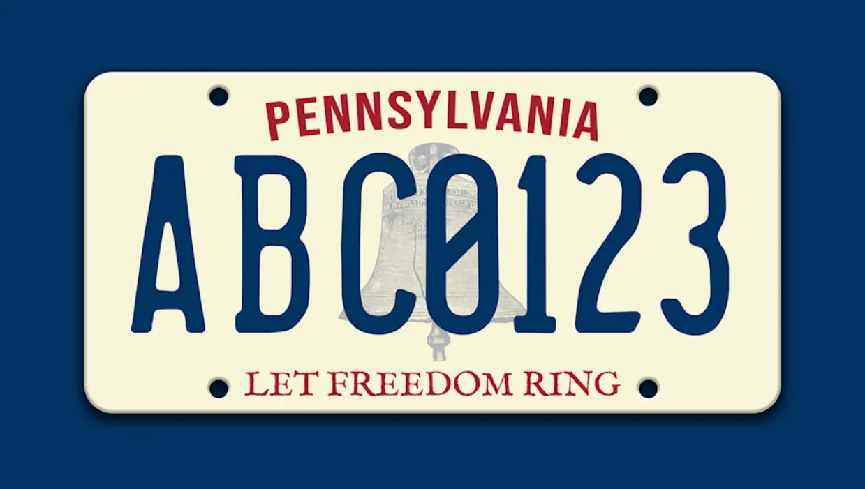
The number has a slash through its counter to prevent confusion with the letter O. Now, however, Pennsylvania toll cameras—not to mention locals—are confusing the zero for an eight.
The mix-ups are occurring even though the lettering follows industry best practices to differentiate characters that can sometimes look alike.
Why Kristi Noem’s state-funded ad campaigns ended up dooming her
From South Dakota to DHS, Noem mastered the art of attention to her benefit. Then it became a liability.