Trump's unpopularity is old news. One shape tells that story in a new way.
Plus: How Pantone picked the colors for its starter kit

The story of President Donald Trump’s first year back in office for his final term as told by his approval rating is the story of a downward sloping line. It’s one we’ve heard before, though, as Trump’s first term showed his approval in office only ever really falls. To tell that story from a different angle, The New York Times used a different shape.
The life cycle of modern presidential approval ratings in a nutshell is that a POTUS’s favorability erodes over time. They start out with a honeymoon period after their inauguration, but from Trump to former Presidents Barack Obama and Joe Biden, the general trend of presidential popularity is that it tends goes in one direction: down. Polls that find that the president is more unpopular than he was six months ago is dog-bites-man news. Typically.
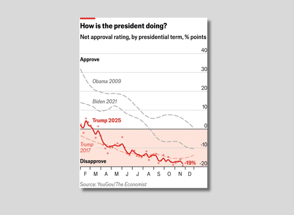
Trump is historically unpopular, though. His net approval rating fell below its lowest point of either of his terms last November, according to The Economist, and a New York Times/Siena University poll released last week that found his disapproval has risen to 56%. The reason why Trump’s negatives are spiking, however, is more than just the typical erosion that happens to U.S. presidents. His coalition is unraveling in real time.
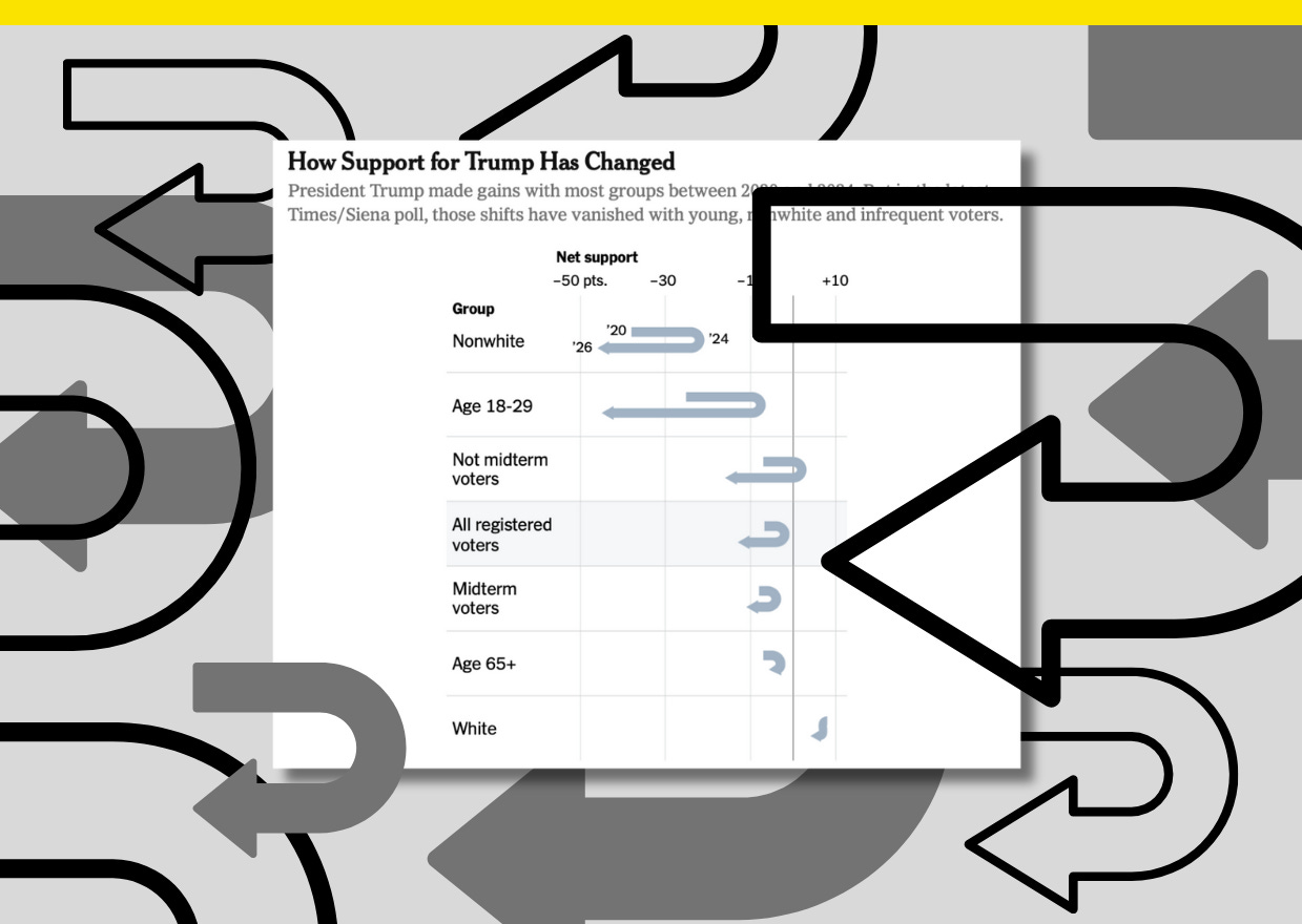
To illustrate that story for a column about the poll’s findings by the Times’s chief political analyst Nate Cohn, the paper reimagined a typical approval rating line over time into a U-shape that shows net support for Trump rising and falling.
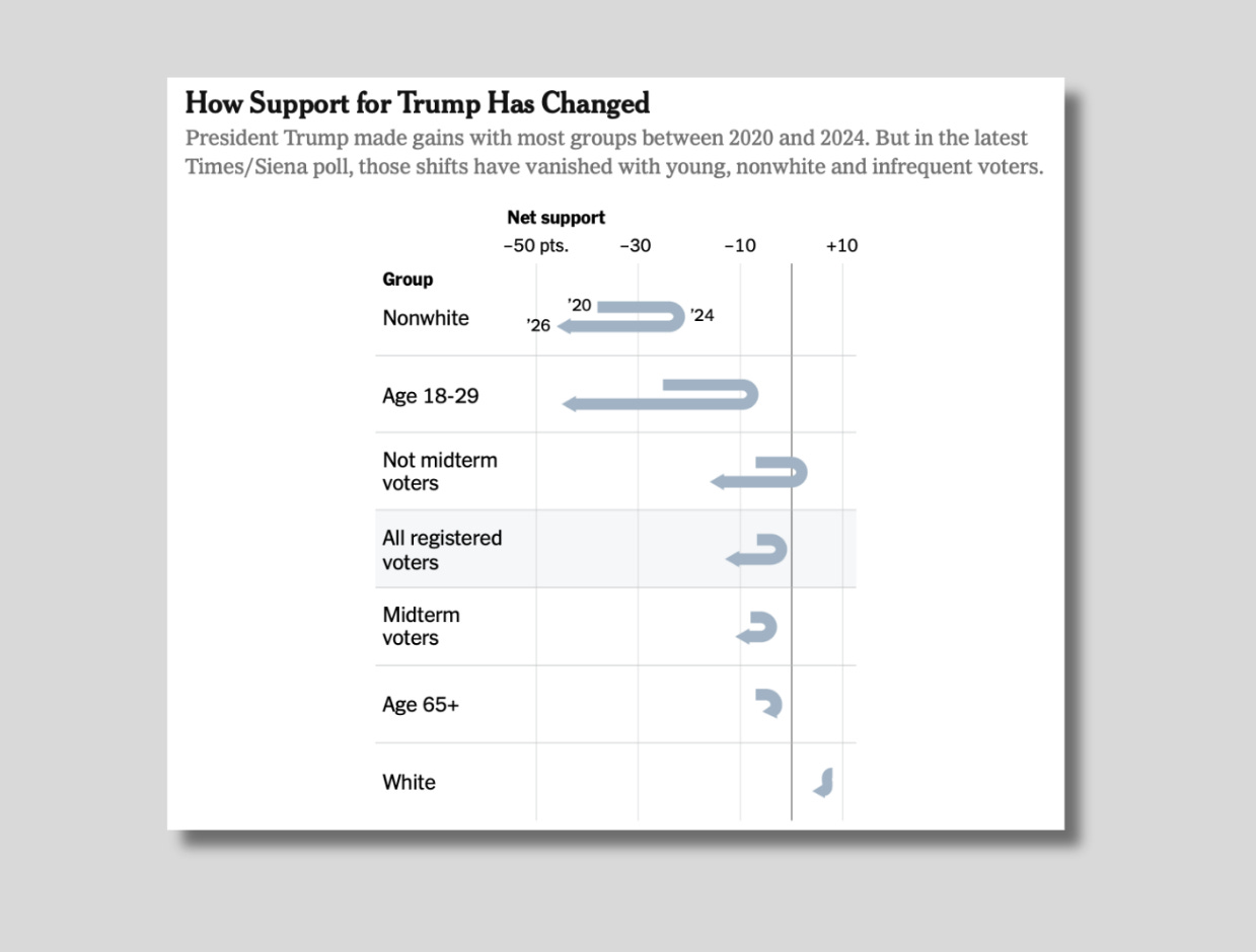
The chart tracks support for Trump by demographic group from October 2020 to October 2024 to January 2026, or from right before Trump’s election loss to Biden to right before his comeback victory to then-Vice President Kamala Harris to now. The shape’s only possible because across so many groups, Trump’s approval in that time period has gone up and then way down.
Among all registered voters — and particularly among groups that helped shift the last election for Trump, like nonwhite voters and voters ages 18 to 29 — Trump’s approval peaked in 2024 and has since fallen below the point it was at when a record number of voters turned out to vote him out of office at the height of a pandemic most thought he was mishandling.
Cohn in his column writes that “there’s no shortage of explanations” for why Trump has lost so much ground, since he has an unfavorable view among voters across “almost every issue tested in the poll, including his handling of immigration and the economy” as well as foreign relations.
“Still, there’s more evidence that the economy is driving voters away from Mr. Trump than anything else,” Cohn wrote. “On question after question, voters give him negative marks on his handling of that issue, including just 34% who approve of his handling of the cost of living, compared with 64% who disapprove. This is his second-worst result in the poll, trailing only his handling of the Jeffrey Epstein files.”
Though Trump won in 2024 by a slim 49.91% plurality of the popular vote, he has before claimed to have won “a historic mandate to make America great again.” Polling now a year on, though, shows whatever slim popular mandate Trump once claimed to have has since evaporated. In just over a year, the U.S. has taken a U-turn on Trump.
Yes, these Minnesota brands calling for deescalation matters
CEOs from more than 60 Minnesota-based companies signed a statement.
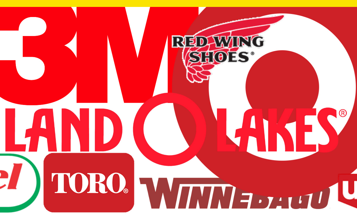
Minnesota is home to Fortune 500 companies like Target, General Mills, Best Buy, and Land O’Lakes, but until this weekend, they’ve been silent on the escalating federal policing of Minneapolis and the killing of Minnesota mom Renee Good. When journalist Joe Berkowitz reached out earlier this month for comment for Fast Company, where I’m a contributor, none responded. On Sunday, after the killing of VA intensive care nurse Alex Pretti, though, these companies finally spoke out.
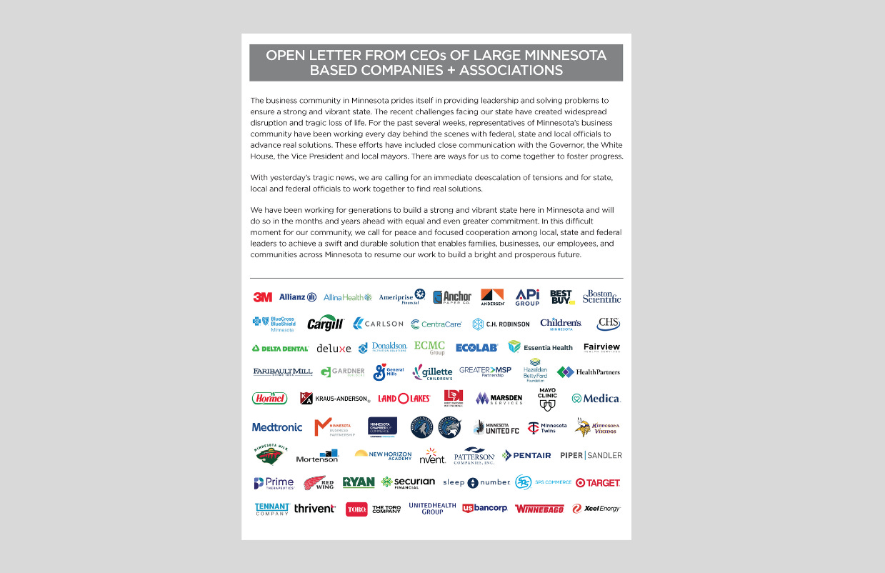
In a letter from the Minnesota Chamber of Commerce on behalf of more than 60 CEOs on Minnesota-based companies, the chamber said it was “calling for an immediate deescalation of tensions” and asked for state, local and federal officials to find “real solutions.” The group said it has “been working every day behind the scenes with federal, state and local officials” for “the past several weeks.”
Their statement has been criticized for being too neutral, and there are indeed further steps these companies can make to take a stronger stand. Still, the statement represents a not insignificant check against the Trump administration’s otherwise escalating federal immigration enforcement operations in Minneapolis.
The dam is breaking. The Chamber of Commerce is turning. A Minnesota Republican gubernatorial candidate dropped out of the race. The situation is untenable. Country club-type Republicans who held their nose and voted Trump increasingly can no longer stand the smell. The Minnesota Chamber of Commerce may sound timid, but after a year of corporate silence, their statement still manages to speak volumes in a moment that matters, and courage is contagious.
How Pantone picked the colors for its starter kit
Pantone selected more than 600 colors from across 60 years of Pantone history.
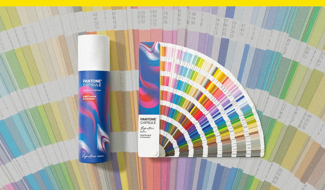
Pantone’s professional color matching kits can cost anywhere from several hundred dollars to upwards of several thousand dollars for pros who work in industries like fashion and interiors. Its newest, though, is a single-fan book with more than 600 spot colors, and it’s priced at just $99. Pantone for beginners.
Pantone last week announced its Pantone Capsule: Signature Edition. Housed in a collectible, cylindrical case that wouldn’t look out of place in a Sephora, the guide is a sort of Pantone 101 that comes on coated and uncoated paper stock with colors selected from across more than 60 years of Pantone history.
“At Pantone, we have spent a lot of time speaking with our creative community to understand how their roles have changed, the tools they need, and how to best serve them,” Ora Solomon, Pantone’s vice president of product and engineering, said in a statement. “As a result, we wanted to expand the opportunities for our design community to have a more accessible way to use our guides, especially at the beginning of their careers, and help them create with confidence.”
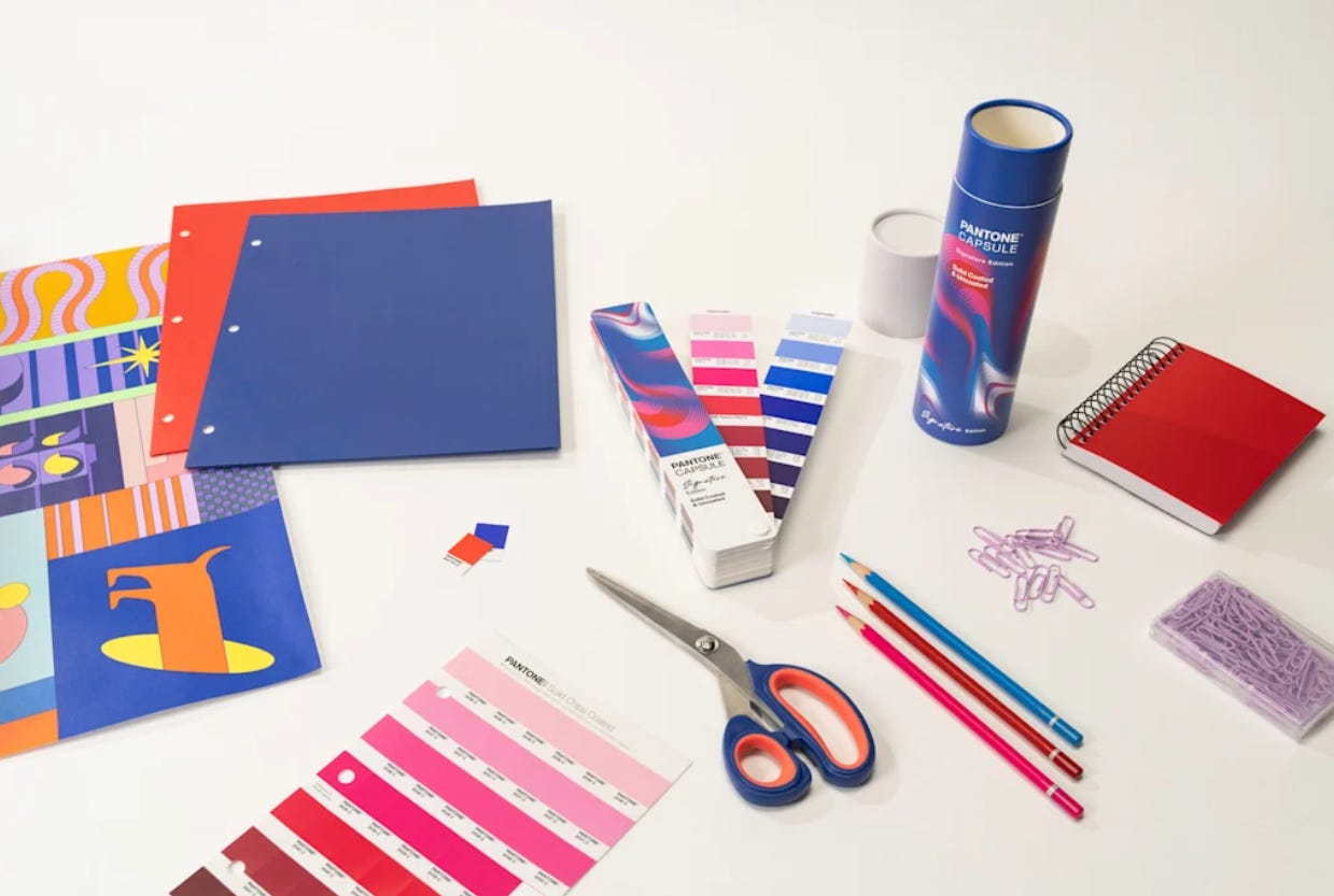
The colors for the collection were chosen for their utility, based on Pantone data about the most popular and widely used colors. There’s Pantone 6104 C, a sapphire blue that’s one of its newest colors, and retro throwbacks, like the bright yellow Pantone 102 C and the purple-pink Pantone 238, which were popular in the 1980s and ’90s.
Have you seen this?
Paris Hilton lobbies for defiance. Paris Hilton was in Washington last Thursday to speak out in favor of the bipartisan Disrupt Explicit Forged Images and Non-Consensual Edits Act, or DEFIANCE Act. Rep. Alexandria Ocasio-Cortez (D-N.Y.) wrote on X that people don’t realize how effective Hilton is with her advocacy. [Whig by Hunter Schwarz]
Trump administration removes memorial honoring people enslaved by George Washington in Philadelphia. The National Park Service began removing a slavery memorial at the President’s House in Philadelphia on Thursday afternoon — an exhibit that opened in 2010 and honored the lives of the nine people held there who were enslaved by Washington. [ABC News]
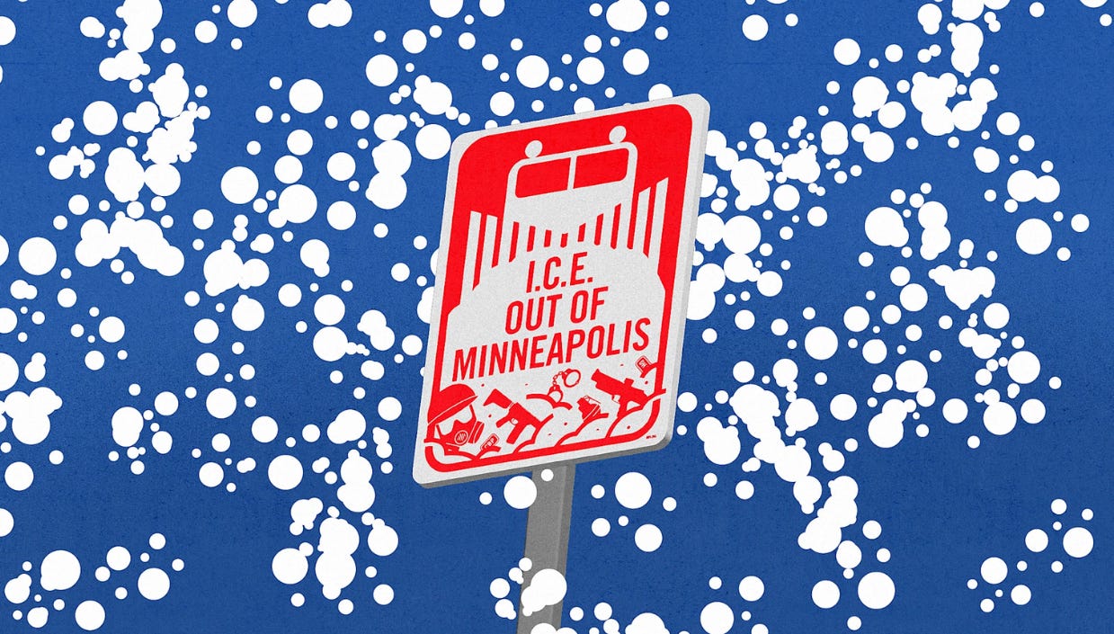
These clever anti-ICE signs are taking over Minneapolis. Meet Burlesque, the local design team behind the municipal iconography-riffing signage popping up on yard signs in and storefront windows. [Fast Company]