
How Pantone picked the colors for its starter kit
Pantone selected more than 600 colors from across 60 years of Pantone history

Hello, from Yello, a newsletter about political aesthetics, persuasion, and design by Hunter Schwarz. Subscribe:
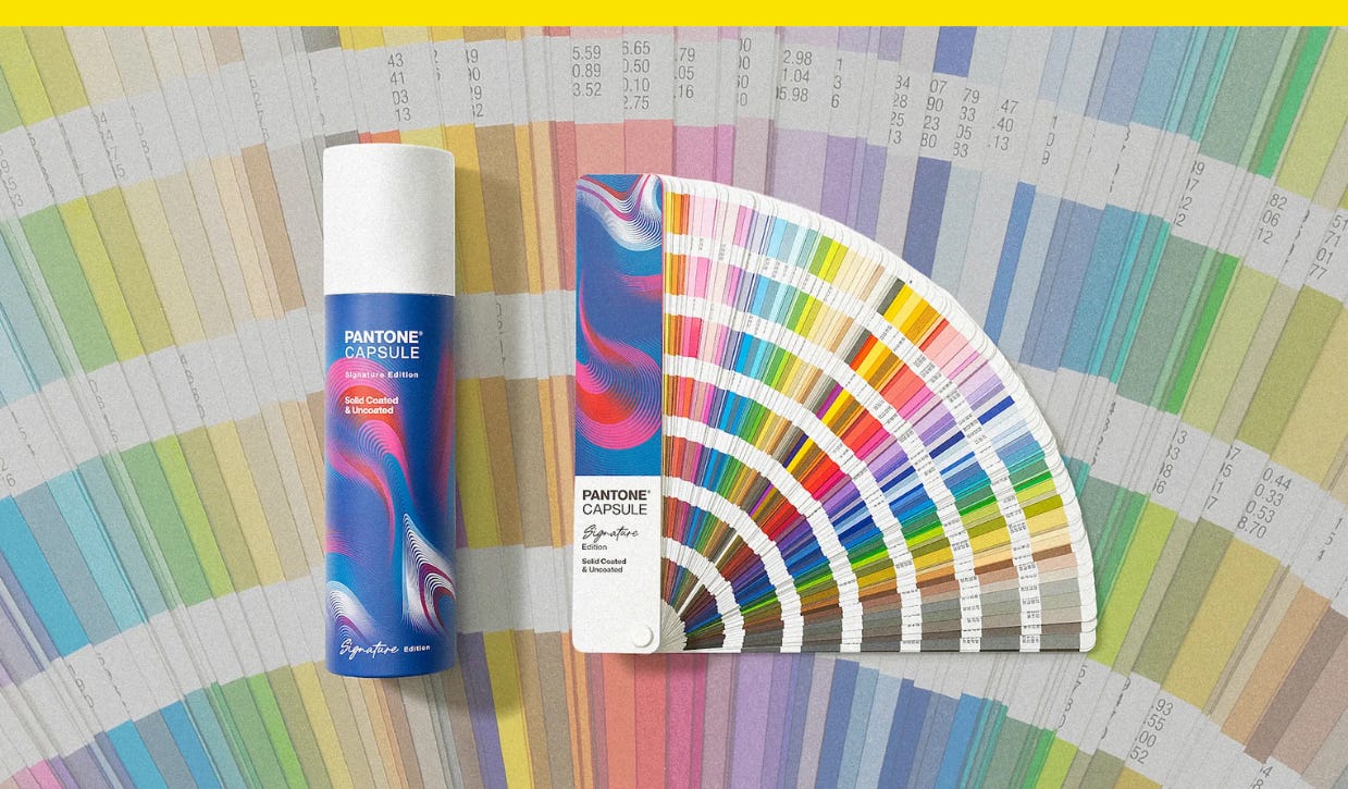
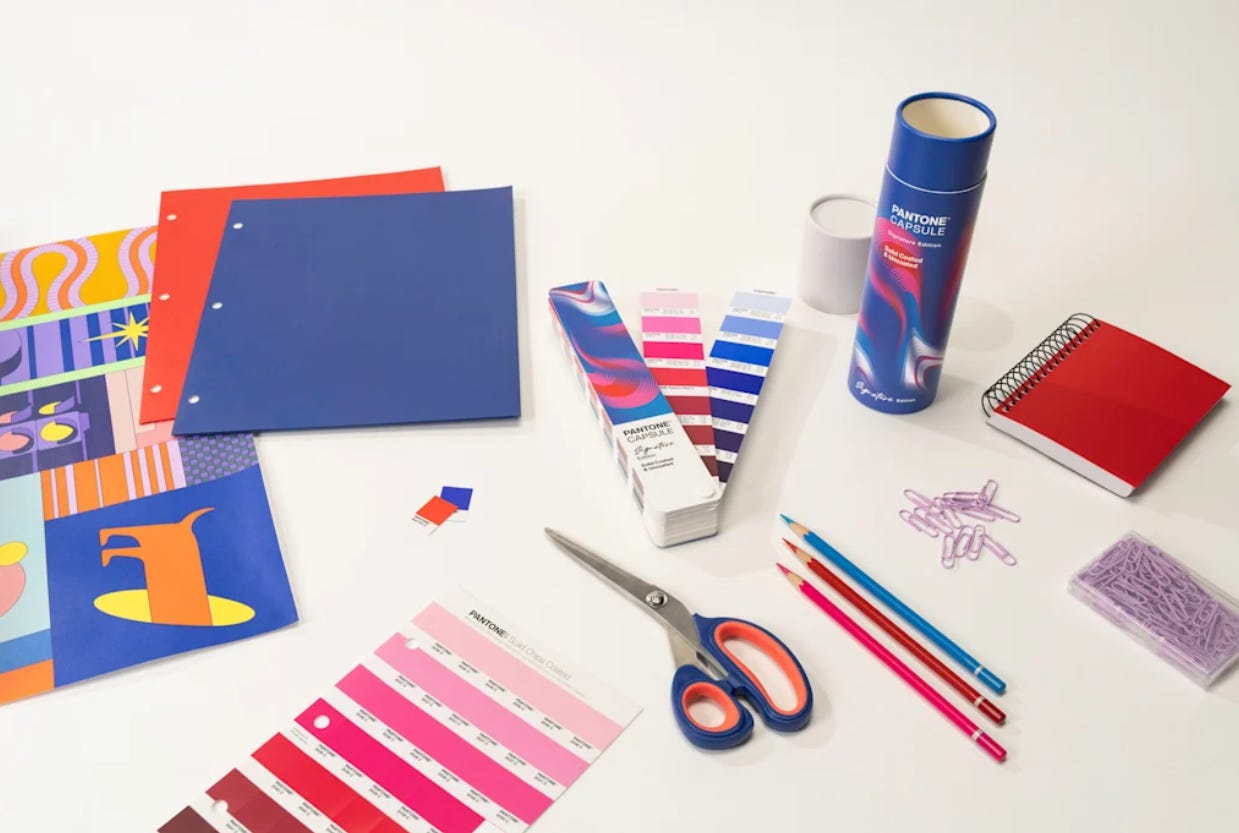
Pantone’s professional color matching kits can cost anywhere from several hundred dollars to upwards of several thousand dollars for pros who work in industries like fashion and interiors. Its newest, though, is a single-fan book with more than 600 spot colors, and it’s priced at just $99. Pantone for beginners.
Pantone on Thursday announced its Pantone Capsule: Signature Edition. Housed in a collectible, cylindrical case that wouldn’t look out of place in a Sephora, the guide is a sort of Pantone 101 that come on coated and uncoated paper stock with colors selected from across more than 60 years of Pantone history.
“At Pantone, we have spent a lot of time speaking with our creative community to understand how their roles have changed, the tools they need, and how to best serve them,” Ora Solomon, Pantone’s vice president of product and engineering, said in a statement. “As a result, we wanted to expand the opportunities for our design community to have a more accessible way to use our guides, especially at the beginning of their careers, and help them create with confidence.”
The colors for the collection were chosen for their utility, based on Pantone data about the most popular and widely used colors. There’s Pantone 6104 C, a sapphire blue that’s one of its newest colors, and retro throwbacks, like the bright yellow Pantone 102 C and the purple-pink Pantone 238, which were popular in the 1980s and ’90s.
