This state never had a tourism brand. Until now.
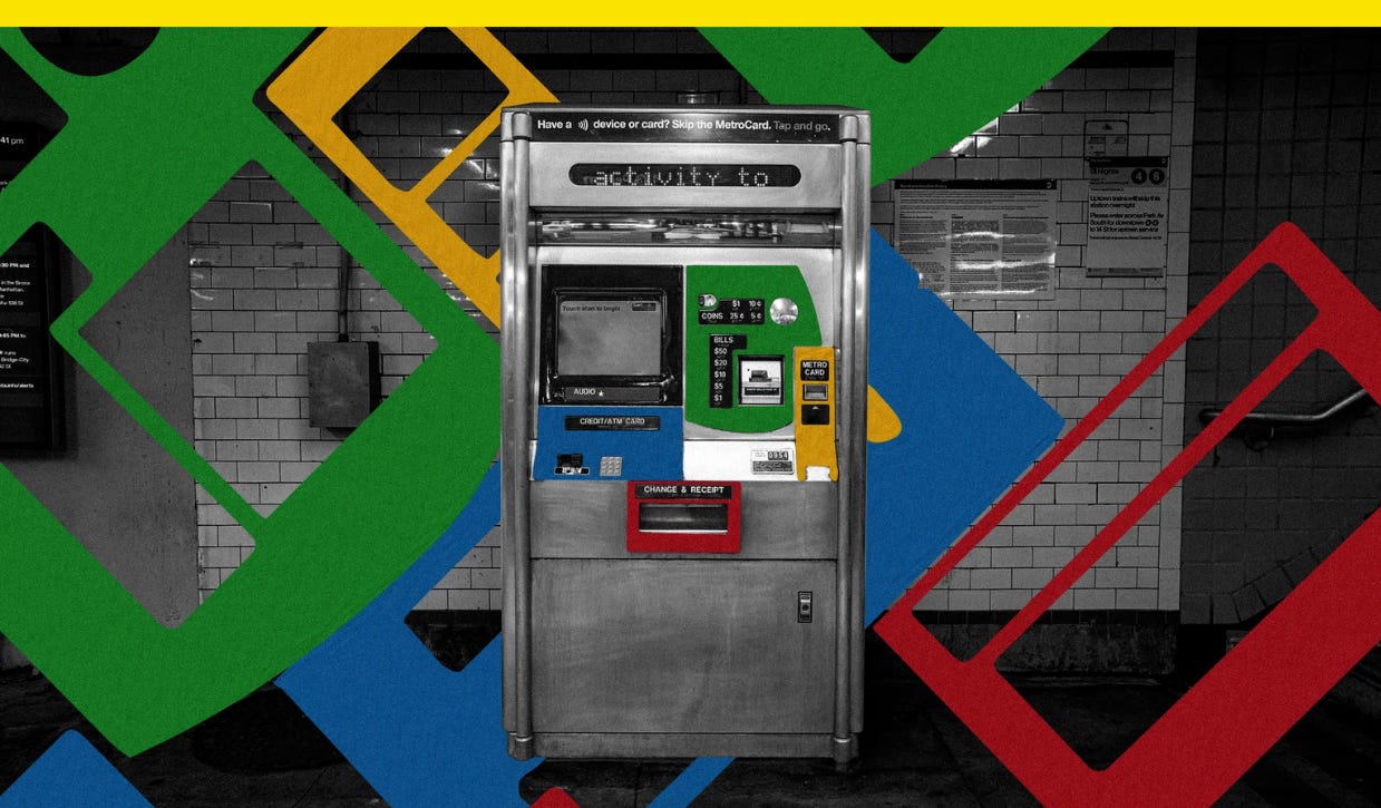
Plus: The last of the MetroCard vending machines are heading to auction. They’re an iconic — and functional — piece of civic design history.

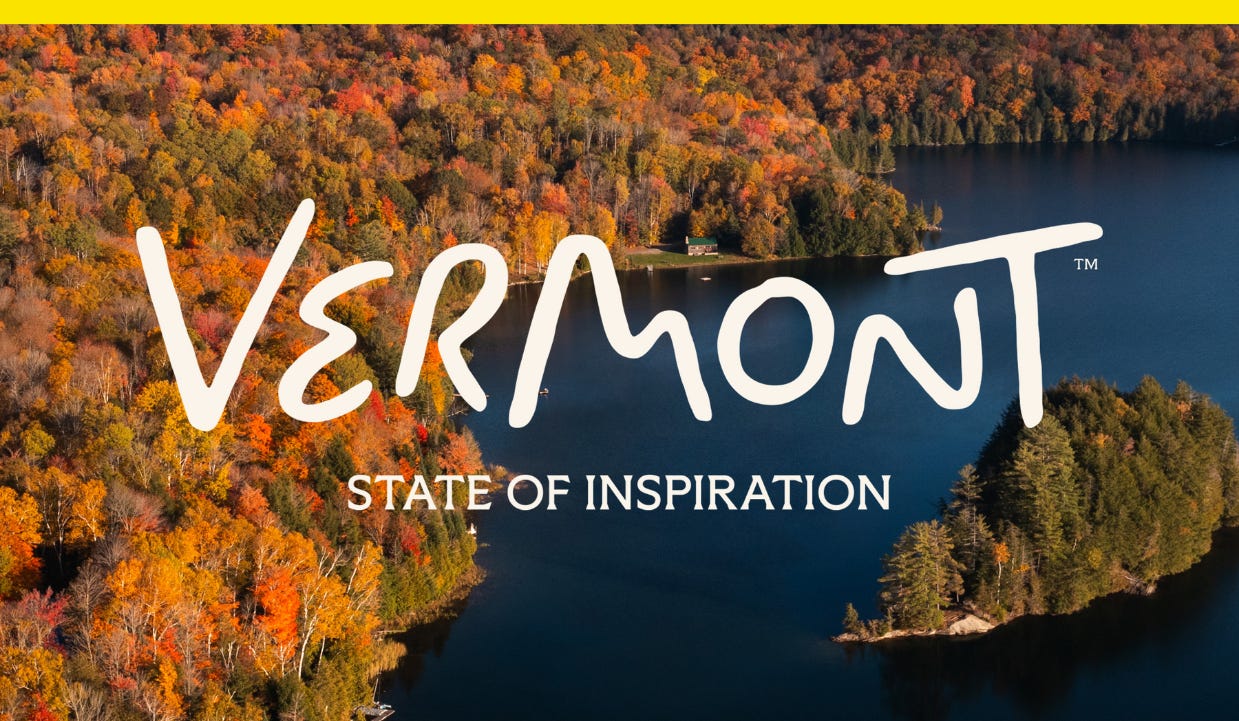
Always a bridesmaid, never a bride, the state of Vermont found that while tourists had plenty of nice things to say about it, far fewer actually had plans to visit. Its first-ever dedicated tourism brand, “State of Inspiration,” is meant to change that.
Tourism from Canada to the U.S. fell in 2025 thanks to President Donald Trump’s tariffs and sabre-rattling, and it hit Vermont particularly hard, with border crossings from Canada falling last year to their lowest point since the pandemic year of 2021.
Though numbers have begun to recover this year, the drop in foreign tourism is bad for state budgets in a place like Vermont, where tourism accounts for 9% of its GDP. To make matters more difficult, other states in the New England region had higher brand visibility, putting Vermont at a disadvantage when competing for domestic travelers too.
“A very few percentage of people could recall seeing any ads about Vermont whereas they could about a lot of other states,” says Luis Mendoza, managing director at the place branding studio DNCO, which has also designed identities for San Francisco, New York City’s DUMBO neighborhood, Denver’s 16th Street, and National Landing just outside Washington, D.C.
Nearby Maine has its lobsters and “Forged by Nature” tourism campaign, while neighboring Massachusetts launched a new “Made Possible” campaign in 2024 and has plenty of draw for history buffs, from Bunker Hill and Braintree to the actual Onyx Hotel from Britney Spears’s 2004 tour. Vermont, however, was using the same state logo for tourism that it uses for other state agencies, like its Department of Taxes and Department of Liquor and Lottery, and travelers weren’t moved by it.
“There wasn’t necessarily this intentional effort to tell the story of Vermont,” Mendoza says.
After conducting a visitor research program last year, Vermont’s Department of Tourism and Marketing found that while 79% of U.S. travelers rated Vermont as an appealing destination, just 15% spontaneously named it as a place they intended to visit.
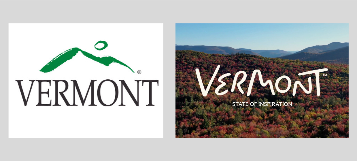
Vermont outgoing tourism logo is called “Moon Over Mountains” and it’s still used by state agencies and shows a paintbrush-style depiction of a Vermont landscape over the state name written in an all-caps serif typeface. Its new tourism mark, developed with DNCO over the course of a nine-month initiative, writes out Vermont handwriting style, with letterform like a landscape. The mountain and moon are still there, drawn as the letters M and O, while other letters were meant to evoke winding Vermont roads.
While the campaign shows imagery of mountains, lakes, and ski slopes, the team behind the rebrand wanted to depict Vermont as more than just the outdoors, by promoting things like cuisine or art too (Vermont has the highest density of working artists per ratio of any state, as well as the second highest density of working writers, behind only Washington, D.C.).
The typeface for the campaign, Meso, is a humanist font with wedge-shaped serifs that was chosen because it looks literary. It’s used in assets such as the “State of Inspiration” tagline, chosen as a play on the word “state” as a political unit but also as a frame of mind. Come to Vermont to be inspired, it suggests.
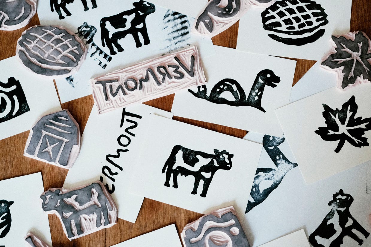
The team commissioned artist Alyssa McCabe to create a series of icons for the campaign, which she created with wood blocks and ink and then digitally rendered. The images show things like a cow, a wheel of cheese, and Champ, the mythical sea monster said to live in Lake Champlain, to use as visuals that promote the state beyond just the outdoors.
The color palette was designed for six seasons, not four. In addition to winter, spring, summer, and fall, there’s “Stick Season,” the term for the dreary time between autumn leaves changing colors and snow’s arrival. The phrase was opularized by Vermont native Noah Kahan’s 2022 album of the same name, and its palette has colors like Stick Brown a beige called Ash. “Maple Season,” which runs from about February to April, when maple sap is harvested, includes Apple Green.
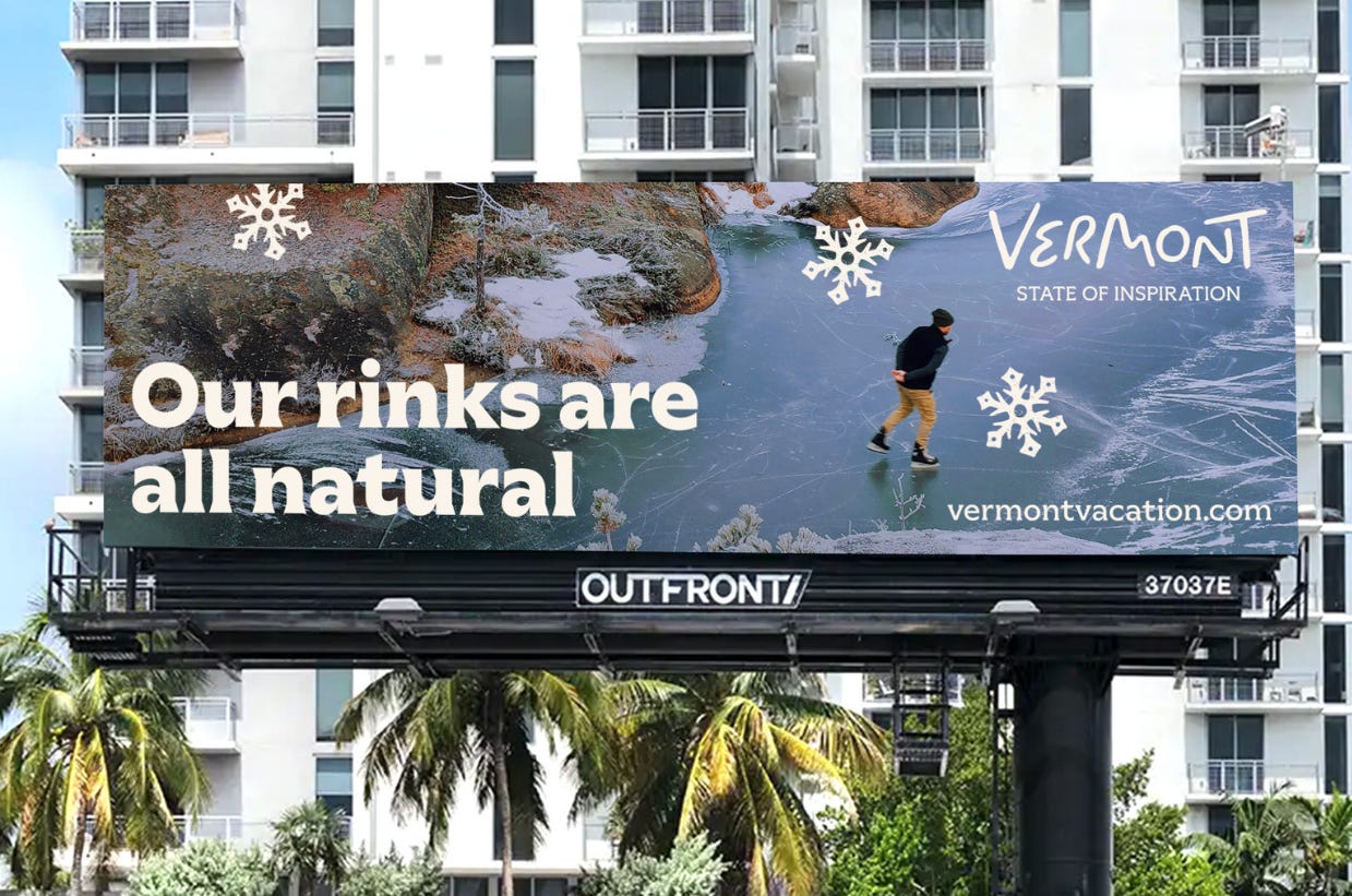
As with any tourism brand, the challenge is designing an identity system that’s actually aimed at outsiders but simultaneously feels authentic to the people who live there. How do you convey the idealized image of Vermont to non-Vermonters in a way Vermonters would say looks honest? How do you advertise a state that doesn’t have any billboards on billboards in other states?
For Vermont, that means a visual identity that looks handcrafted, not corporate.



The last of the MetroCard vending machines are heading to auction. They’re an iconic — and functional — piece of civic design history.