This government agency updated its graphics for an important public safety reason
Plus: To rebrand Frank Lloyd Wright’s Fallingwater, designers went with a wordmark because the house is “un-logoable”

When this year’s hurricane season starts in June, the federal government’s hurricane and marine forecast office will have new, more colorful maps of its forecasts than ever before in the hopes of better communicating the risks posed by oncoming storms.
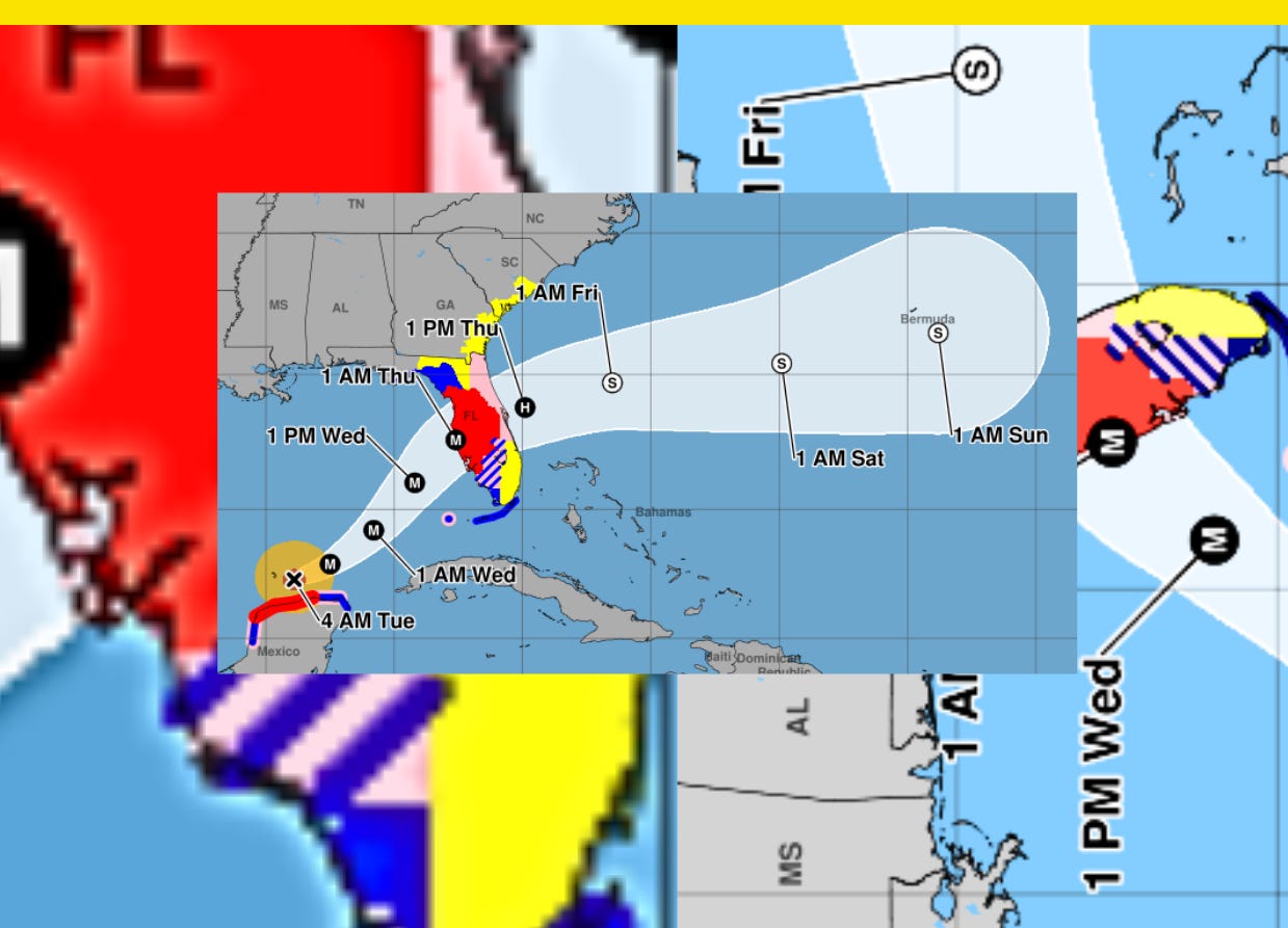
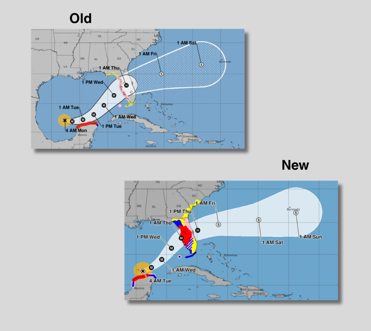
The National Hurricane Center, or NHC, announced updates to its operational hurricane track cone maps are coming. The old map shows a cone shape that charts the probable path of a storm over five days, as well as coastal areas likely to be hit. What it didn’t show was what happens inland or areas removed from the storm’s direct predicted path.
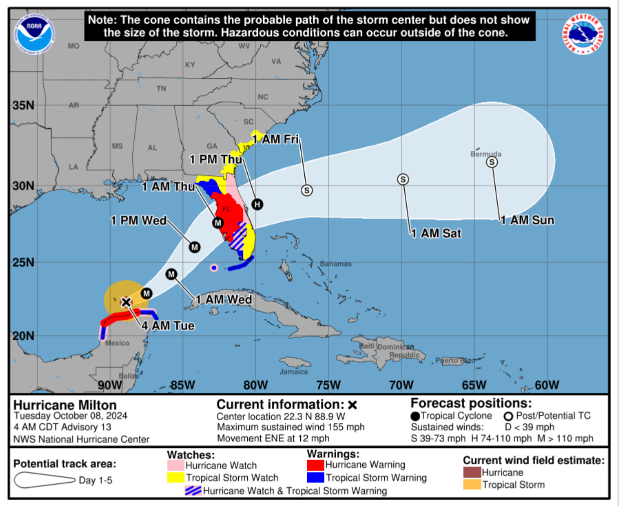
The new map, which NHC previewed with a recreation of 2024’s Hurricane Milton, seeks to remedy that with new color-coded graphics for inland areas. Tropical storm and hurricane watches are in pink and yellow to show where conditions are possible, and tropical storm and hurricane warnings are in red and blue to show where conditions are expected. The map was announced in March following an initial 2024 unveiling and pilot last year.
NHC, which is housed under the Commerce Department’s National Oceanic and Atmospheric Administration, or NOAA, introduced the cone graphic in 2002. People have been confused about the cone’s size, though, falsely interpreting it as representing a storm’s size rather than the area of its potential paths, or mistaking it for showing the fullest extent of the storm’s reach. Over the years as NHC’s forecasts have gotten better, the cone has gotten smaller, and thus so has the confusion over what the charts actually mean.
The urgency for a redesign picked up in 2022 after maps were misinterpreted ahead of Hurricane Ian in Florida. University of Miami researchers that year found a majority of Florida residents falsely believed the shaded area of the cone represented areas the storm would affect, not the range where the eye of the storm could be, and a Miami TV news station changed how it displayed its hurricane forecast maps on its own.
NHC worked with social scientists to develop the new map template, according to USA Today. Experts advised to make changes gradually, and a major challenge was limiting the amount of information that goes on the map, since too much could end up making it more confusing. The new maps, for example, still don’t show storm surge.
The new colors on the map were tweaked following feedback during the trial phase, and NHC’s warning coordination meteorologist Robbie Berg told USA Today they plan to make more frequent updates from now on rather than sit on it for a decade or two.
Clear, accurate, and actionable government communication is never more important than during storms and other disasters that threaten human life. By updating their cone maps slowly and intentionally, federal forecasters are taking steps to communicate more clearly when it matters most.


To rebrand Frank Lloyd Wright’s Fallingwater, designers went with a wordmark because the house is “un-logoable”