
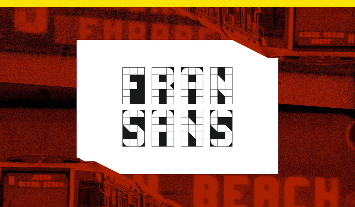
This font used public transportation for inspiration
Plus: Pantone’s Color of the Year 2026 is a shade of white for the first time

Most people don’t give the display screens on their commuter trains a second thought, but for designer Emily Sneddon, they’ve proved to be a well of inspiration.
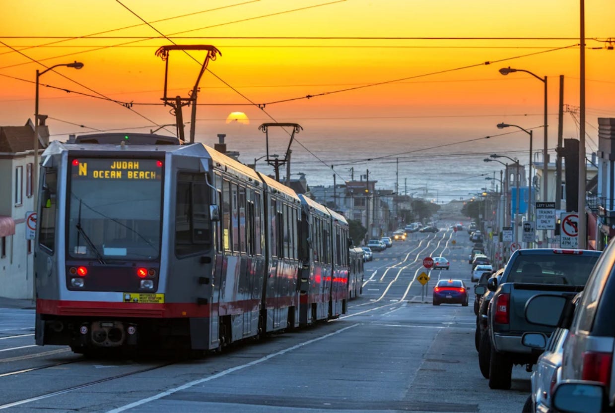
Sneddon lived in San Francisco, where she worked at the design agency Collins, from 2021 until this year when she moved back to her home country of Australia. She designed the cleverly named Fran Sans, her first ever font, after noticing the display on San Francisco Municipal Transportation Agency’s (SFMTA) recently retired Muni Metro Breda Light Rail Vehicle.
Unlike New York City, which handles its public transit through a single agency, the Metropolitan Transportation Authority (MTA), public transportation in San Francisco and the Bay Area is split between multiple independent public agencies, like SFMTA, Bay Area Rapid Transit (BART), and Caltrain, a commuter rail. That means there’s no de facto official font for public transportation in the Bay Area as there is in New York City with Helvetica, the official font of the city’s unified MTA.
The font that became Fran Sans started first as a project documenting sans typography around San Francisco. The lettering from the train car display was supposed to be used on a zine cover. Then it turned into a full-blown font.
Sneddon designed Fran Sans on a 3×5 grid after a monthslong research project that included a visit to SFMTA’s Electronics Shop at Balboa Park, consultation with Gary Wallberg, a senior engineer who designed the display signs in 1999, and a survey of modular typography curated by Letterform Archive, which is based in San Francisco.
“For me it wasn’t enough simply to create a 1:1 without digging further to find out more about the original designer that inspired this work,” says Sneddon. “It’s a myth that we’ve all seemed to have subscribed to that everything you’d want to know about is available online. But so many stories are all around us, and they haven’t been documented anywhere. The story of these displays was one of them.”
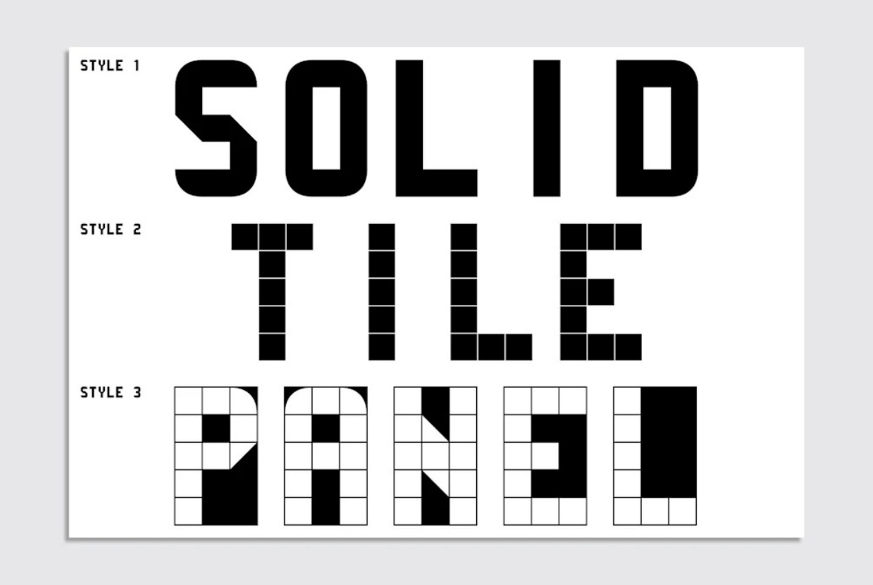
The original lettering on the displays didn’t have all the characters, as Muni had no need for Qs, Xs, exclamation points, or semicolons, so Sneddon had to make her own. For now there are no lowercase letters, as that would require a different grid, and she also hasn’t managed to come up with a suitable “@” sign yet. Fran Sans comes in three styles: solid, tile, and panel.
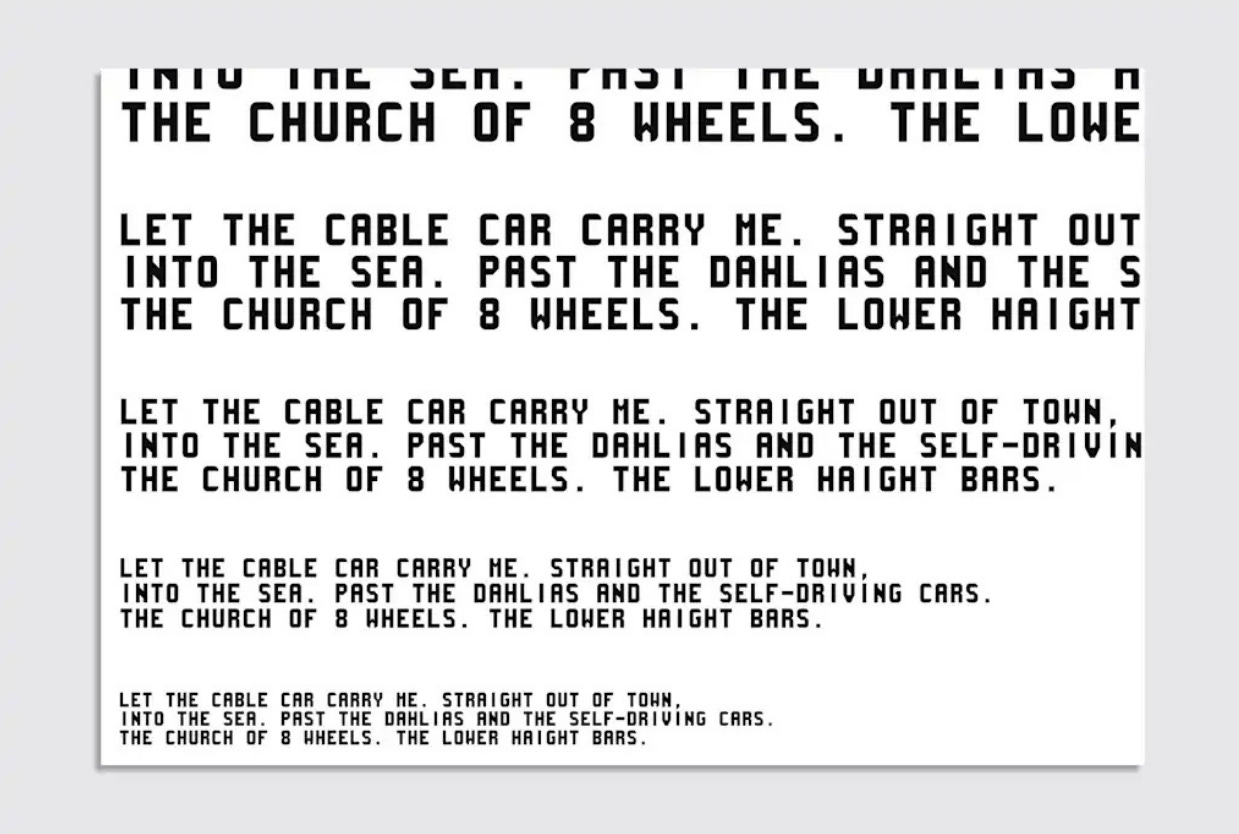
SFMTA finished replacing the Breda car with a new model this month that uses LED dot-matrix destination displays, which to Sneddon lack the character of the Breda car lettering. Fran Sans reintroduces some of those typographic quirks, like thin diagonals on the Z, 7, and M. Although those particularities can make the M look like an H at small sizes, they’re also what gives the font its charm.
The font is a love letter to San Francisco and a chance to give back. There’s a perception that the city is a place where people come to make their bread and leave, Sneddon says, from the gold rush in the 1800s to A.I. today, but moving to San Francisco taught her that there’s “a lot of community, a lot of love for the arts, and a lot of generosity” in the city.
This story was first published in Fast Company.
Ralph Lauren’s Postal Service capsule makes me want to quit my job and deliver mail for our country for a living
The collection celebrates 100 years of mail delivery in the U.S.

No disrespect to Ralph Lauren’s stylish Team USA collection for the 2026 Winter Olympics, released Thursday, but the American apparel brand’s new release that I’m most excited about is actually their three-piece capsule made for and with the U.S. Postal Service.
The centerpiece of the collection is a $1,298 double-breasted wool twill carrier coat created with USPS historians to resemble the silhouette of Postal Service coats in the 1870s. The “Mail Blue” coat features brass buttons created from the original mold and embroidery that reads “1775” and “2025” on each sleeve.
The $998 carrier bag is made of leather to resemble Postal Service messenger bags used from the 1800s to the 1970s, according to Ralph Lauren, and “U.S. Mail” is embossed on the front flap. The $79.50 mesh cap notably isn’t vintage inspired, but it does show a vintage logo on the front: the horse-and-rider emblem in use from 1837 to 1970.
Pantone’s Color of the Year 2026 is a shade of white for the first time
Pantone says Cloud Dancer provides “scaffolding for the color spectrum.”
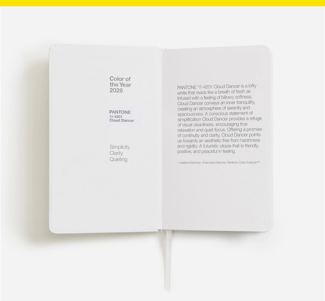
Pantone’s Color of the Year 2026 goes with anything. Cloud Dancer, or Pantone 11-4201, is the first shade of white to be named the color systems company’s annual color, and it’s all about blank canvases and fresh starts.
“At this time of transformation, when we are reimagining our future and our place in the world, Pantone 11-4201 Cloud Dancer is a discrete white hue offering a promise of clarity,” Pantone Color Institute executive director Leatrice Eiseman said in a statement.
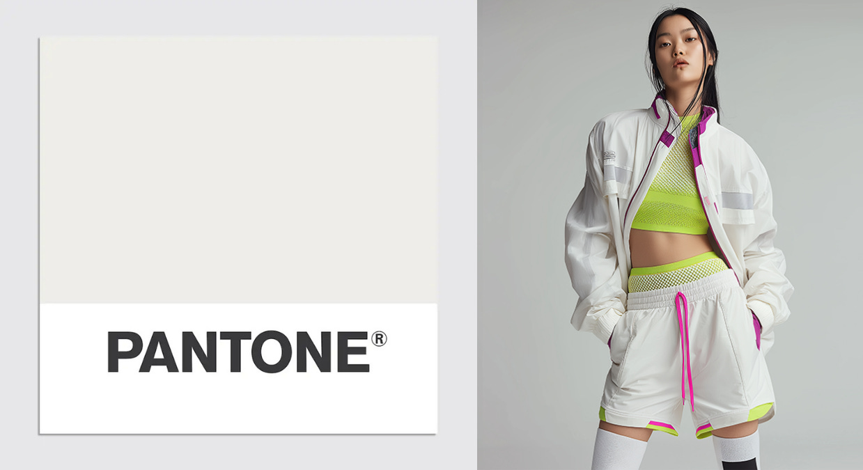
The off-white shade follows 2024’s fleshy Peach Fuzz and 2025’s muted Mocha Mousse, showing the trend towards neutrals and quiet luxury is still in vogue, and Pantone is promoting Cloud Dancer as versatile, both suitable for use on its own and with other colors. In interior design, the color “introduces a spa-like feeling into bathrooms,” Pantone says, while it gives a high-end and modern look to product packaging and provides an understated base for apparel and footwear or can be worn monochromatically.
Italian illustrator Emiliano Ponzi, the first visual artist to participate in Pantone’s new artist series exploring the color, paired Cloud Dancer with light blues for an image that appears on a limited-edition tote bag. “I was aiming for an image filled with air,” Ponzi said.
Have you seen this?
Trump is fighting the Institute of Peace in court. Now, his name is on the building. The Trump administration has renamed the U.S. Institute of Peace after President Donald Trump and has planted the president’s name on the organization’s headquarters despite an ongoing fight over the institute’s control. [NPR]
Trump hires new architect for White House ballroom. Following reports that Trump had clashed with the previous architect, James McCrery, over the size and scope of the addition, the White House said architects Shalom Baranes Associates will take over the project. [BBC]
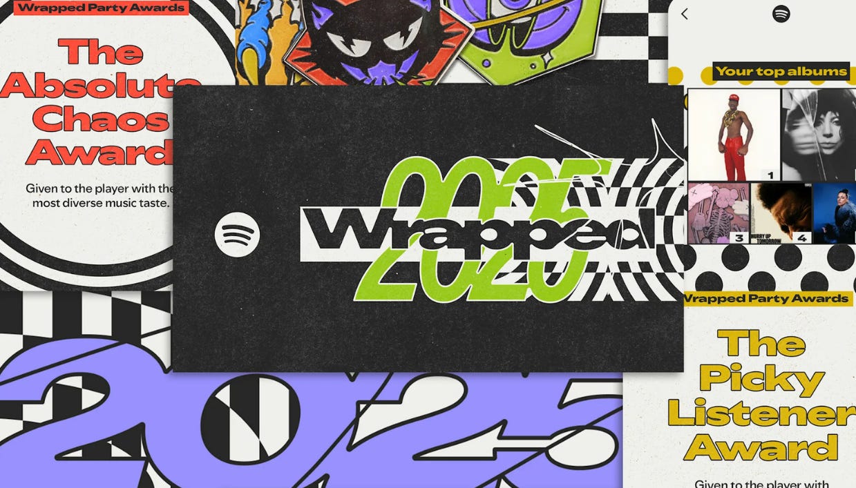
Spotify Wrapped 2025 goes “analog” in the age of A.I. Every visual is made to feel handmade, with cutouts, images, doodles, and various textures lending the platform a DIY quality. The design is grounded in a palette of black and white, with pops of color reserved for key moments like artist images and album covers. [Fast Company]
The campaign to make Richard Nixon great again. “In some ways, the reframing of Watergate seems like an attempt to try and rehabilitate the current president’s image.” [NBC News]
