
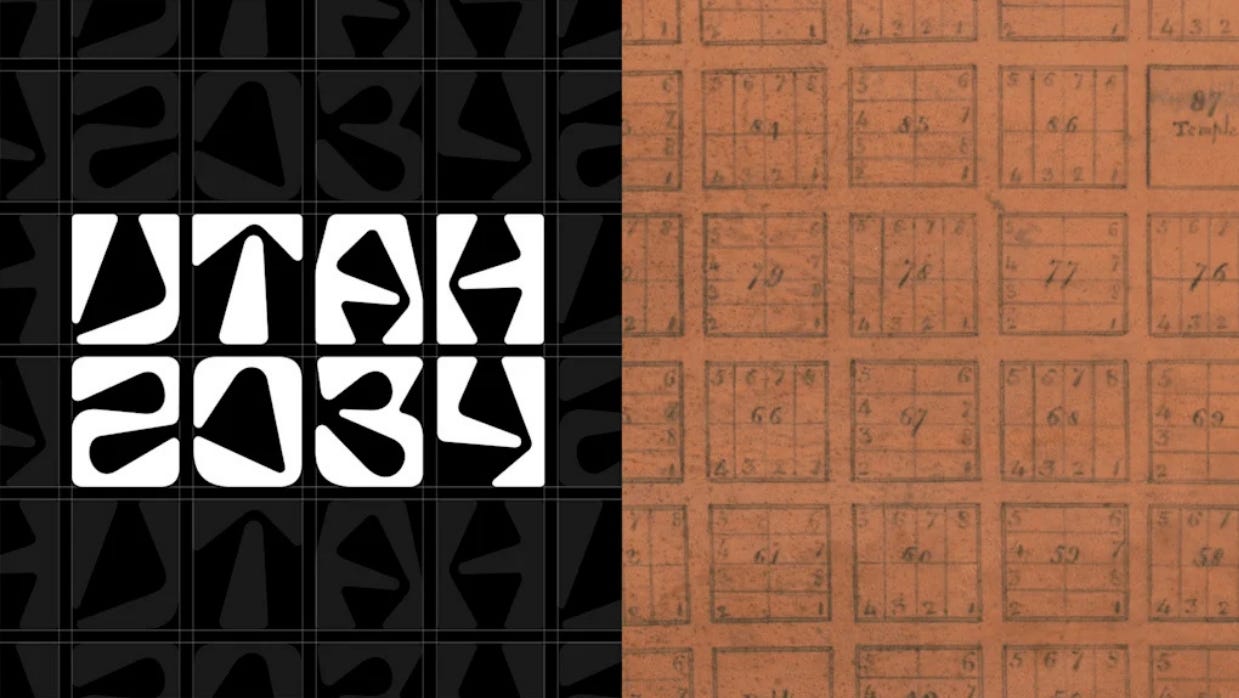
OK I'll admit it: I love the Utah 2034 logo
Plus: What’s in a political party name?

The Salt Lake City Olympics planned for 2034 are now the Utah Games after organizers announced a new logo and name to reflect the multi-community work that goes into hosting the largest winter sports event on Earth. The state’s Gov. Spencer Cox (R) says the new logo has united people, though not in a good way.
“It’s really brought people together because everyone seems to not like it,” Cox said at a recent press conference.
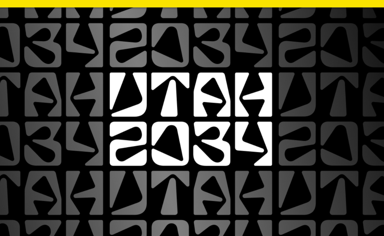
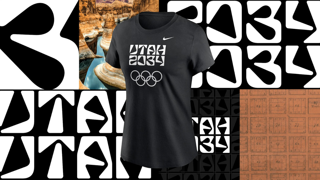
The new logo is temporary until the final emblem of the Games is released in 2029. It spells out “Utah” in irregularly shaped characters (does that say “IJTAH?”) that are stacked on top of “2034.” Its launch color palette is just black and white.
Cox called the logo bold. “I’m a little old-fashioned and it’s certainly a bold logo,” he said. The comment section of one local Utah news site included reviews like “beyond terrible,” “a marketing disaster,” and “unreadable.” Some don’t like the name change that leaves out Salt Lake City. “It hurts,” Salt Lake County Mayor Erin Mendenhall told The Salt Lake Tribune.
This bare-bones logo, though, is just the beginning of what will become an expansive visual brand expressed across venues, apparel, and more. It’s a starting point, not a finish line.
“I think that Olympics are uniquely a moment to do something new and different. And yet, many Olympics have bland and forgettable design,” Doug Thomas, an associate professor at Brigham Young University’s Department of Design and author of Never Use Futura, tells me. “Personally, I like that the Utah 2034 design team are swinging for the fences and trying something new and memorable.”
Utah organizers say the International Olympic Committee, or IOC, allows for “transition logos” to “help the host regions build early awareness and momentum,” but they’re limited to typography only.
The Utah 2034 mark, then, is a chance to introduce shapes through letters and numbers alone, the beginnings of a geometric visual language that could one day be revealed in a full Olympics brand expression.
Just as the “Crystal Rhythm” pattern of the 2002 Salt Lake City Games appeared in the snowflake-like Crystal logo and was repeated across assets like venue signage and the iconic jackets worn by volunteers, the shapes in the letterforms of the Utah 2034 mark could well be repeated in future expressions of the brand.
“The typography is recognizable, it is distinctive, and as such, opens space to create new meaning,” Thomas says. “The visual forms may not work in every application, but for a transition team logo, this is excellent as a starting point.”
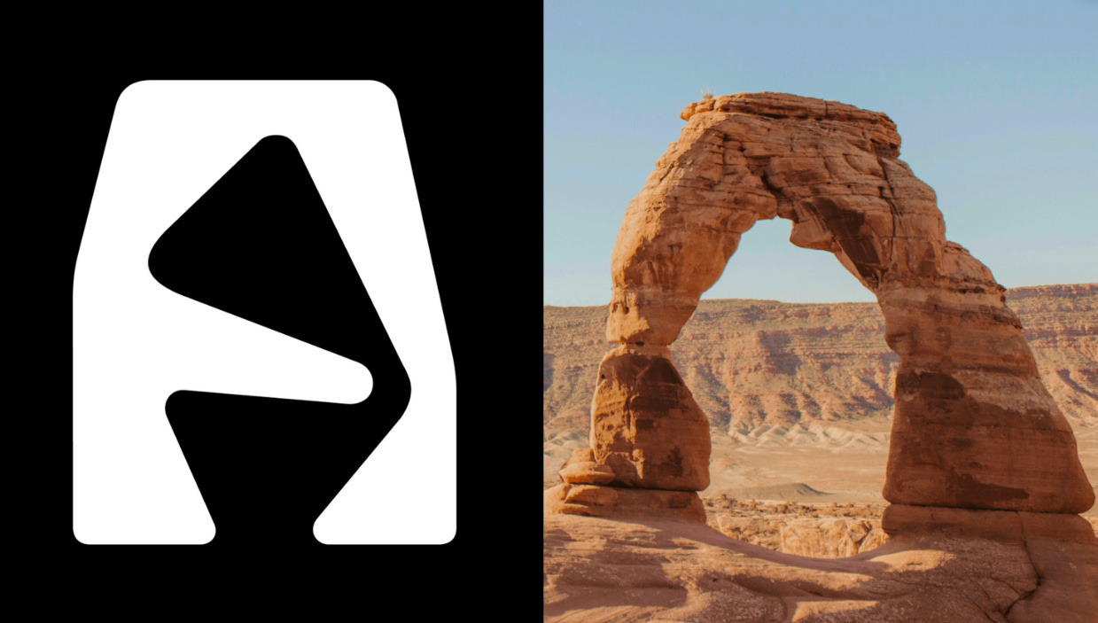
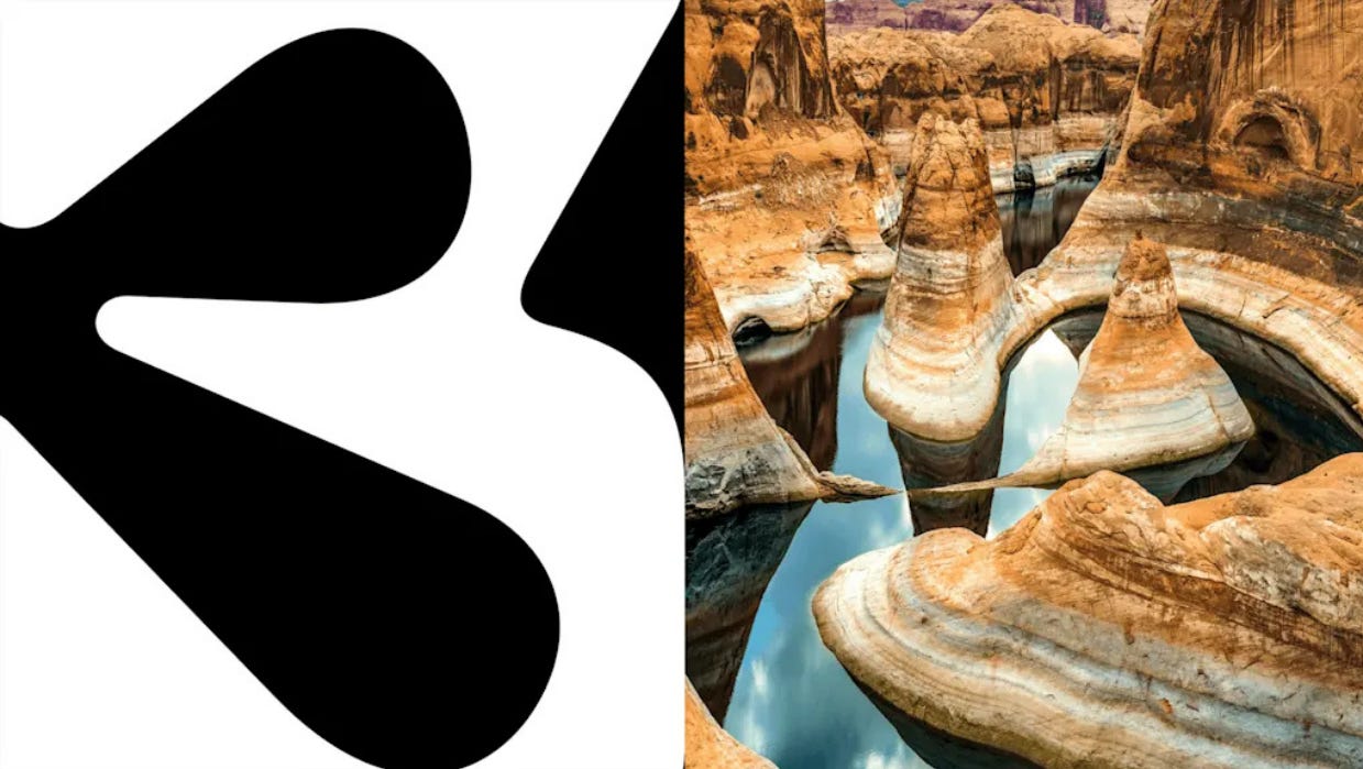
Organizers say the shapes of the letters in the logo were inspired by Utah’s landscape. It’s most noticeable in the stylized A designed to evoke southern Utah’s Delicate Arch. Other characters were drawn to resemble rivers, mountains, canyons, and petroglyphs, and one can imagine these same angles and shapes showing up in Olympic pictograms that denote sports and venues.
The letterforms are monospaced and laid out on a grid. Inspired by the urban grids that Mormon pioneers laid out in cities across Utah and the American West in the 1800s, it gives the otherwise unusual logo a sense of balance. The logo was designed by a project team led by Molly Mazzolini, cofounder of the Salt Lake City design studio Elevate Creative.
As for the name change, Salt Lake shouldn’t take it personally. Cox, the governor, says naming the Games for Utah instead of Salt Lake City was a decision made following decades of feedback from other cities and counties in the Salt Lake metro area that also hosted events during the 2002 Games but didn’t get credit. But it’s also aligned with the recent trend of Winter Olympics naming themselves after multiple cities or a region instead of a single city. The 2026 Milano Cortina Games are named for both Milan and Cortina d’Ampezzo in Italy as they’re being held across a wide region, and the 2030 Games are named for the French Alps.
In Utah, where events will be held from Provo to Park City, organizers are going with the state name. And by embedding the geography of Utah into the very letters of their new logo, designers found a creative way to begin telling Utah’s story in just a few characters.
This story was first published in Fast Company.
What’s in a political party name?
As Trump tries out new words for “MAGA Republican,” one third party in Arizona that just renamed itself is running into problems.
Like Shakespeare, there are many such cases of Trump introducing new words or phrases to our everyday speech, like “covfefe,” “fake news,” and “many such cases,” but not every one is a keeper.
Trump’s attempts to coin a new word to describe a “Trump Republican” — either “Tepublican” or “Tpublican,” as he wrote on his social network — seem doomed to join “fetch” and “panican” in the dustbin of etymology. Still, Trump’s clunky, public rebrand brainstorm session points to a wider brand problem in politics ahead of next year’s midterms. As Shakespeare’s Juliet asked, what’s in a name?
Sure you’re a Republican, but what kind of Republican are you? Are registered Democrats now DINOs in the party if democratic socialists speak for the base? And what’s an independent, really? When both major parties are unpopular and candidates run as brands of their own, our current two-party system of political labeling seems inadequate. Political communicators like Trump are left struggling for words.
Case in point: Arizona, where the state’s No Labels Party renamed itself the Arizona Independent Party effective Dec. 1. The party once had an association with the same No Labels that considered running a third party ticket in the 2024 presidential race, but it is no longer associated with that national group. The new name resolves any confusion over that, but now some worry that the word “independent” could be confusing in other ways in a state where “other” is the second-largest registered political affiliation.
The Arizona Citizens Clean Elections Commission voted last week to block the new name, arguing it’s illegal and that voters seeking to register without a party affiliation (“other”) could mistakenly sign up for the party. They point to a 2016 Los Angeles Times poll that found 73% of members of California’s American Independent Party actually identified as no affiliation as proof of how confusing an independent name can be.
Even without legal challenges, getting a new name to stick is hard, though. That makes Trump’s attempt at coining a new term for “MAGA Republican” all the more puzzling. A February Vanderbilt poll found a majority of Republicans self-identified as MAGA for the first time. But with former MAGA members like Rep. Marjorie Taylor Greene (R-Ga.) now defecting and Trump’s approval cratering, that poll could represent a high point in brand equity for Trump’s MAGA movement. Maybe that’s why he’s trying to make “Tepublicans” happen.
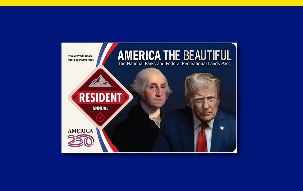
Trump slashed national parks staff and funding. He’s now the face of their annual pass.
Trump’s likeness appears on two new passes.
Oh brother. Trump’s administration has reduced staff and budget for the U.S. National Park Service, or NPS. That includes his 2026 budget, which the National Parks Conservation Association says will cut more than 5,500 jobs and reduce funding by more than $1 billion.
That didn’t stop the Interior Department from putting Trump’s face alongside George Washington’s on one design for the 2026 NPS resident annual pass. The pass costs $80 for U.S. residents and $250 for nonresidents. A photo of Trump saluting troops also appears on a military pass, and other pass designs show nature scenes, animals, or Teddy Roosevelt.
In a press release, the agency said there would be eight “resident-only patriotic fee-free days,” including Flag Day, which they note is Trump’s birthday, and Roosevelt’s birthday on Oct. 27.
The NPS has lost 25% of its permanent workforce since January, according to the National Parks Conservation Association, and the association’s polling found just 12% of Americans support budget cuts for the agency.
Have you seen this?
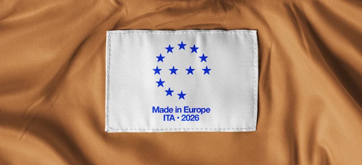
This “Made In” label could give Europe’s brand a boost. A Copenhagen-based think tank has proposed a ‘Made in Europe’ label to set Europe apart during the global trade war. [Fast Company]
Trump’s campaign upcharged its Cyber Monday “sale.” Emails sent to Trump’s mailing list show prices for a MAGA Merry Christmas hat and 2026 calendar that his campaign claims are discounts, but they’re actually $6 more expensive than Trump’s online storefront. [hunterschwarz/Bluesky]


I also like it! The idea of modeling the letters on the landscape was very clever