The worst campaign logo of the midterms could actually be the best
Plus: The missing piece in this new Frank Lloyd Wright logo tells an important story


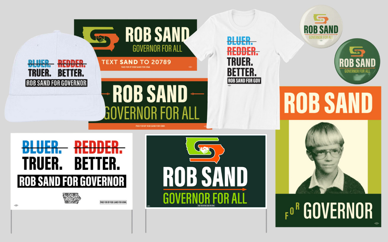
Iowa Auditor Rob Sand’s (D) gubernatorial campaign logo doesn’t follow the standard best practices of campaign logo design. But that’s exactly why it works.
Sand’s logo shows two arms curving through a map of the state of Iowa in the shape of a letter S for Sand, and they meet in the middle in a handshake. It looks more like a Boys & Girls Club-inspired logo than a standard campaign brand. The only time the visual identity uses a red, white, and blue color scheme is to cross them out in merch that bears the slogan “ ̶B̶l̶u̶e̶r̶. ̶R̶e̶d̶d̶e̶r̶. Truer. Better.” Instead, Sand’s campaign colors are green and orange.
“Rob doesn’t want to be the typical politician, that’s not how he looks at this thing,” Sand campaign digital director Ben Cobley tells me. “The visual identity is the idea of unity, and the idea that we can all come together and put our differences behind.”
Sand is Iowa’s only statewide elected Democrat, and he was first elected auditor in 2018 with a similar brand strategy that used unconventional aesthetics in service of a larger message. His blue-and-green visual identity in past campaigns used an arrow to reference his love of hunting, and it leaned into the double meaning of the word “buck” to convey his campaign promise to “find bucks” if elected by rooting out fraud and abuse.
Sand’s new visual identity in the race to replace Iowa Gov. Kim Reynolds (R), who announced last year she won’t seek a third term, was designed with Agency Strategies, a firm that’s also done work for candidates like Reps. Lauren Underwood (D-Ill.) and Pramila Jayapal (D-Wash.).
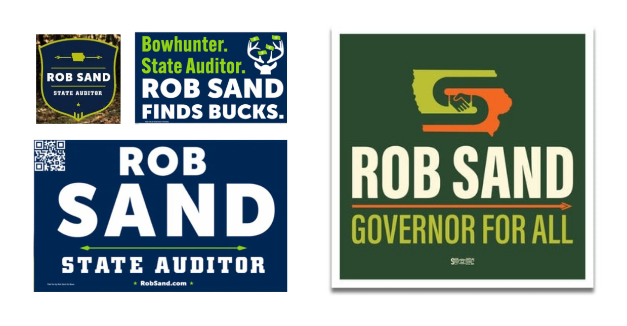
Through color, the new brand reinforces Sand’s hunter identity, and those same colors also help his signs stand out in a race where at least three of his Republican opponents, including Rep. Randy Feenstra (R-Iowa), use their own Iowa map logos in red, white, and blue. The icon of shaking hands reinforce Sand’s campaign message as he’s laid it out everywhere from the MeatEater Podcast late last year to an interview with a local Des Moines station after announcing his candidacy last May: “We need to get back to public service over partisanship and over politics.”
“It fits in with the ‘Governor For All’ message and hands-holding-Iowa-logo image,” says Mike Draper, founder and owner of the Iowa-based apparel brand Raygun. “So I think it all pretty clearly broadcasts the lane he’s picked, which is great for consistency!”
Research from the Center for Campaign Innovation found voters rank traditional campaign logos with standard signifiers like U.S. flag-inspired iconography and colors more favorably than those that look non-traditional. But sometimes, breaking the rules can work. For Sand, it certainly doesn’t seem to have hurt him. A poll last fall from Z to A Research, a progressive public opinion research firm, found Sand narrowly leads the Republican Feenstra 45% to 43% in a state that President Donald Trump won in 2024 by nearly 220,000 votes.
“What makes the branding effective is alignment,” says Shannon Zenner, an assistant professor of communication design at Elon University. “Sand’s campaign uses orange, green, and brown, colors that feel closer to Cabela’s or Carhartt than to standard Democratic visual language. That seems deliberate.”

Noting that traditional red, white, and blue colors immediately cues party politics, she says that candidates who move away from them can signal their distance from national polarization if voters believe their claim to be independent is genuine.
“My own research on political typography and visual branding helps explain why this works: voters assign political meaning to design choices very quickly, especially low-information settings like yard signs and social media,” Zenner says. “When visuals, message, and perceived candidate identity align, unconventional branding tends to read as authentic. When they don’t, it can feel manufactured.”
Sand’s logo may not be “good” in the traditional sense, but as a piece of visual communication, it’s great. Sand’s campaign breaks the rules of what makes a typical U.S. campaign brand, but it’s doing so in a way that reinforces his larger message that he intends to reach across the aisle and break from politics as usual. Sand’s campaign slogan says “governor for all.” His campaign logo shows it.
The missing piece in this new Frank Lloyd Wright logo tells an important story
The new logo was designed to communicate the urgency of preserving Wright’s work.
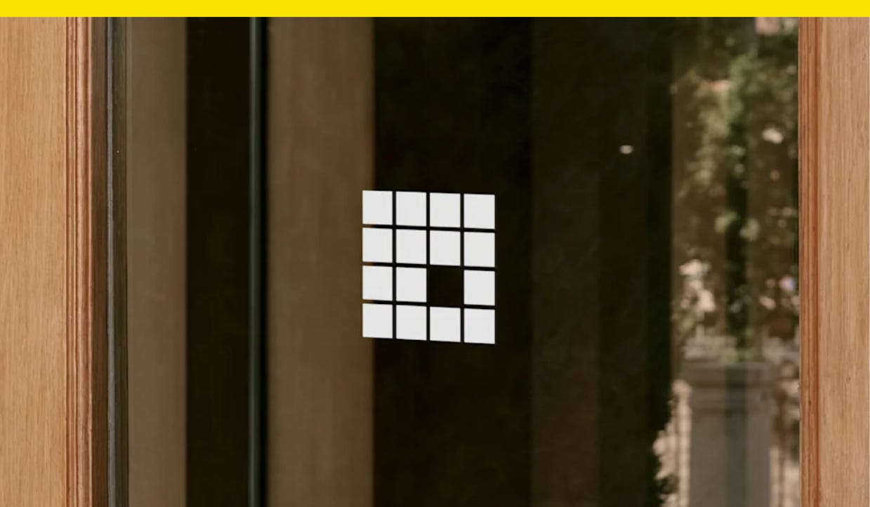
Nearly 500 buildings designed by Frank Lloyd Wright were built during his lifetime, but almost 15% of those have been demolished or lost through neglect, according to the Frank Lloyd Wright Building Conservancy, an organization that works to preserve the famed architect’s work
Now, a new logo for the organization serves as a reminder of how important it is to protect architectural history. Designed by the studio Order, the Conservancy’s new logo features a missing square that’s meant to represent the void when one of Wright’s buildings is lost or neglected.
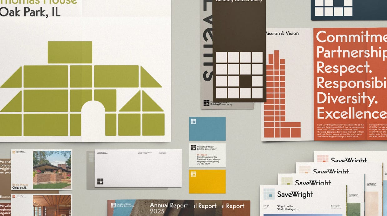
The Conservancy’s previous logo was a representation of the Lark Administration Building in Buffalo, New York, which was demolished in 1950. But Order hoped to design a new system for the group that could evolve and move forward.
“Though this building’s story is, of course, important, our goal was to expand what the identity could capture by bringing in the full breadth of their community,” says Garrett Corcoran, a design director at Order.
The new logo is a four-by-four square grid that references one of Wright’s visual signatures, a red square. Wright used the shape as his own “stamp of approval” on designs, letters, and buildings, and the shape has been used widely in logos for groups associated with his work, like the Frank Lloyd Wright Foundation and the Frank Lloyd Wright Trust.
That widespread use, though, was the reason Order initially explored logo approaches that were slightly different, “to help identify the Conservancy within the landscape,” Corcoran tells me. That approach didn’t last long, though.
“There was an undeniable truth the square brought when representing Frank Lloyd Wright,” Corcoran says. “Ultimately we came back to it as a foundation we could illustrate through as opposed to a crutch to lean on, embracing it but adapting it to make it the Conservancy’s own.”
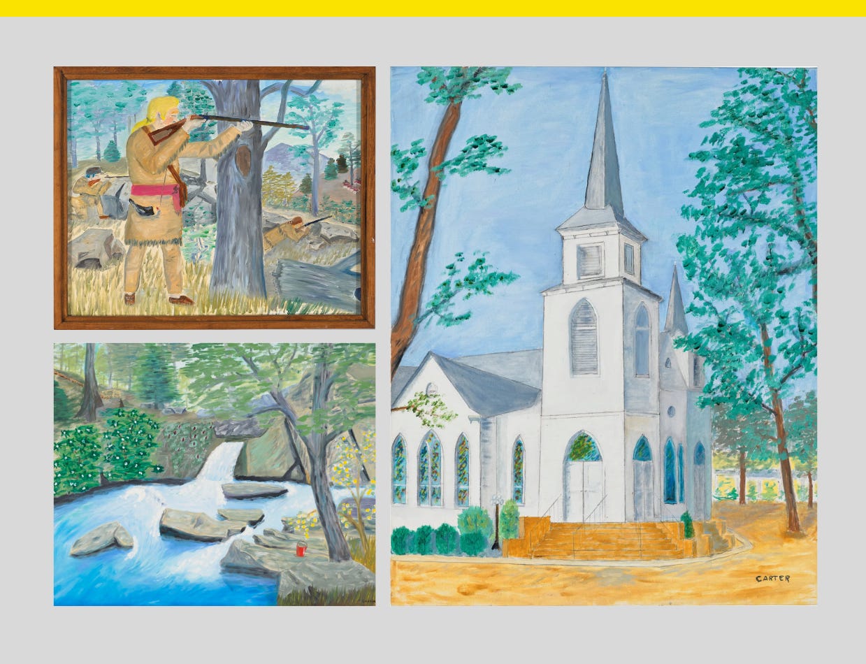
These Jimmy Carter paintings are being auctioned off
Carter painted some 100 paintings in his lifetime.