
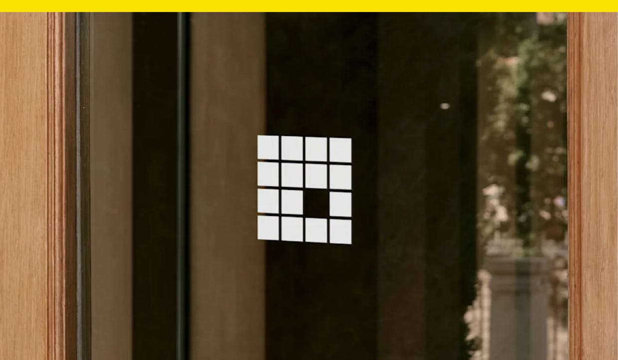
The missing piece in this new Frank Lloyd Wright logo tells an important story
The new logo was designed to communicate the urgency of preserving Wright’s work

Hello, from Yello, a newsletter about political aesthetics, persuasion, and design by Hunter Schwarz. Subscribe:
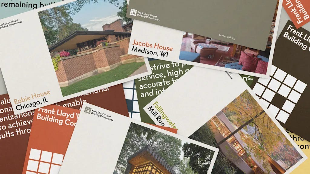
Nearly 500 buildings designed by Frank Lloyd Wright were built during his lifetime, but almost 15% of those have been demolished or lost through neglect, according to the Frank Lloyd Wright Building Conservancy, an organization that works to preserve the famed architect’s work.
Now, a new logo for the organization serves as a reminder of how important it is to protect architectural history. Designed by the studio Order, the Conservancy’s new logo features a missing square that’s meant to represent the void when one of Wright’s buildings is lost or neglected.
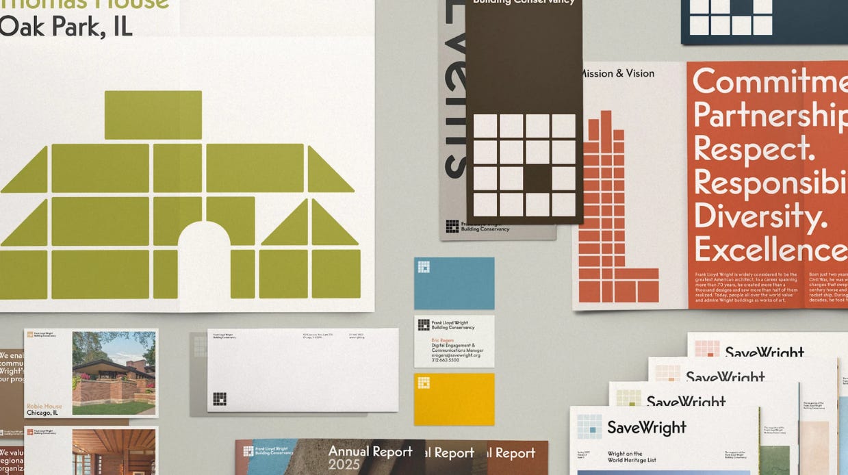
The Conservancy’s previous logo was a representation of the Lark Administration Building in Buffalo, New York, which was demolished in 1950. But Order hoped to design a new system for the group that could evolve and move forward.
“Though this building’s story is, of course, important, our goal was to expand what the identity could capture by bringing in the full breadth of their community,” says Garrett Corcoran, a design director at Order.
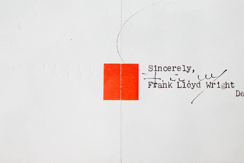
The new logo is a four-by-four square grid that references one of Wright’s visual signatures, a red square. Wright used the shape as his own “stamp of approval” on designs, letters, and buildings, and the shape has been used widely in logos for groups associated with his work, like the Frank Lloyd Wright Foundation and the Frank Lloyd Wright Trust.
That widespread use, though, was the reason Order initially explored logo approaches that were slightly different, “to help identify the Conservancy within the landscape,” Corcoran tells me. That approach didn’t last long, though.
“There was an undeniable truth the square brought when representing Frank Lloyd Wright,” Corcoran says. “Ultimately we came back to it as a foundation we could illustrate through as opposed to a crutch to lean on, embracing it but adapting it to make it the Conservancy’s own.”
