
How a half-finished logo for climate activism was designed to move you to action
Plus: Harris wishes she responded to Trump’s “they/them” ads with “we”

Earth Day is getting a sequel, and it comes with an unusually engaging logo.
Founded by environmentalist Bill McKibben and Earth Day founder Denis Hayes, Sun Day was a global day of action that was held Sunday, September 21. The iconography of the first Earth Day was “fascinating,” says McKibben. “There were a lot of things people were protesting against—you know, oil spills off Santa Barbara, the Cuyahoga River catching on fire.”
The most important design element, though, “was the picture that had come back from Apollo 8 about a year before, the first vision of the Earth as seen from space, and this fragile, blue-white marble in the black void, arguably the most important photograph ever taken,” McKibben tells me.
How do you compete with that?
For Sun Day, McKibben wanted to do something perhaps less iconic but equally impactful. Thus, the logo is unfinished and invites us all to fill in the rest.
Before it was called Sun Day, McKibben says he had the idea for “Sky Day.” After turning to the team at the consultancy Collins, the realization was that there was no good way to draw a picture of the sky, but everybody was drawing the sun.
“In this case, the design element is the sun, which is, if you think about it, literally the one object on the planet you can’t look at,” he says.
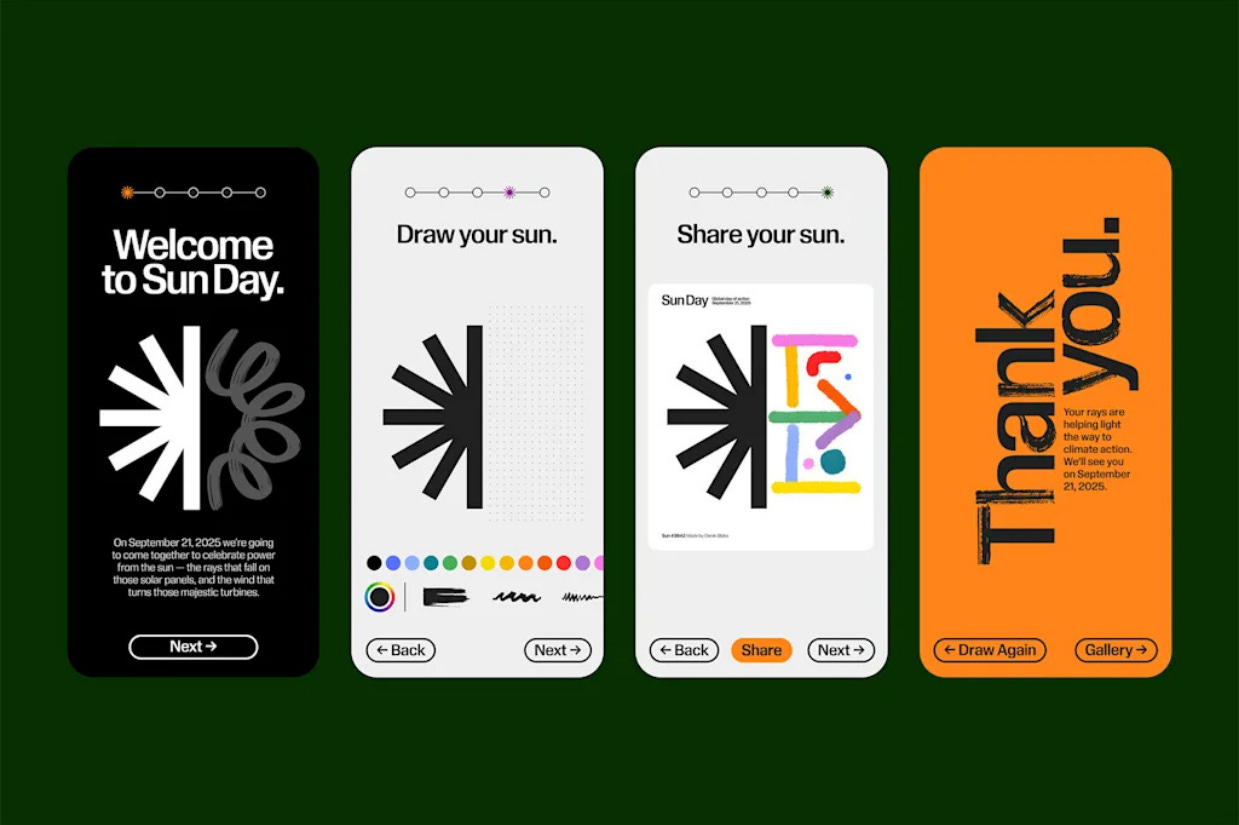
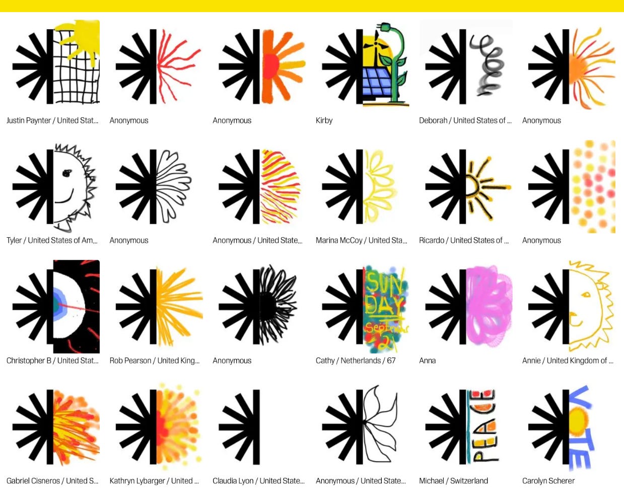
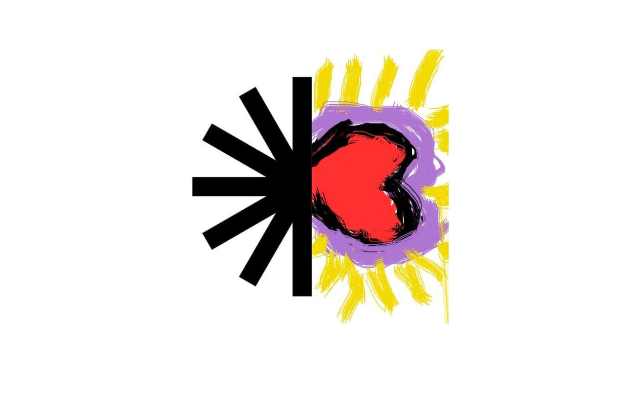
The resulting logo represents only half the sun, with an asterisk-style mark on the left side and a blank space on the right for people to fill in their own drawing. As a symbol, the sun is simple and easily abstracted; as a work of advocacy, it gives people a first thing to do. It’s participatory by design.
“The basic message becomes we have half of what we need, we now have the technology. We live on a planet where the cheapest way to make power is to point a sheet of glass at the sun,” McKibben says, noting that what’s lacking is the political will to make clean energy work.
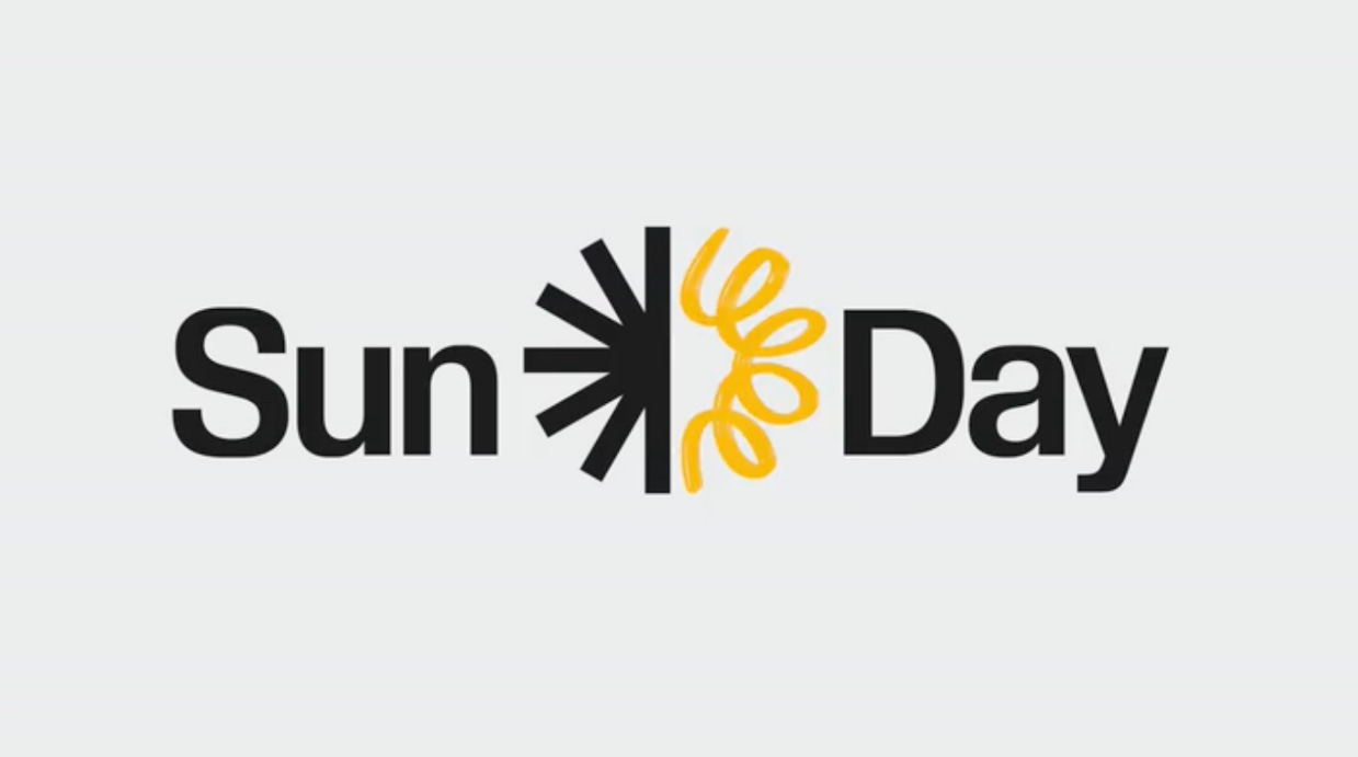
Collins created the branding for Sun Day with Commercial Type, which designed a custom Sun Day typeface that comes in print, brush, and outline weights. Garden3d built an application that lets users make their own sun drawings directly in the browser with MS Paint-like ease.
The resulting brand is one that’s meant to look more DIY than professionally designed. Already about 10,000 people have made their own logos, including Jane Fonda, who drew a heart while in the rainforest of Ecuador doing advocacy work.
“So many of these protests . . . when really well-meaning designers get involved, they end up looking like national design conferences instead of something where people make shit,” designer Brian Collins says. “I think part of what people need to see is their own voice in these things, whether it’s their children . . . their parents, their aunts, their friends. What’s important is giving people a voice to participate collectively.”
This isn’t climate activism as visualized through sad polar bears on ice caps or images of a cause that’s lost and a planet that’s too far gone. It’s optimistic, and something everyone can latch on to.
As Collins sees it, “Hope is a strategy, and hope is our strategy here.”
This story was first published in Fast Company.

Harris wishes she responded to Trump’s “they/them” ads with “we”
The former Veep talks about the 2024 campaign’s most infamous ad in her new book.
“With the tagline ‘Kamala is for they/them. President Trump is for you,” they thought they had landed on a winning message,” former Vice President Kamala Harris writes in her book 107 Days about the Trump campaign’s series of “they/them” ads. “Unfortunately, they were right. Although not to the extent that has become conventional wisdom. Why didn’t I punch back harder?”
Harris noted that only two federal prisoners have received court-ordered gender-affirmation surgery that she was criticized in the ad for supporting, and the law was also in effect under Trump. She also said the ad’s claim that she supported “biological men competing against our girls in their sports” was not her position and she believes factors like muscle mass and unfair athletic advantage should be taken into account and through “goodwill an common sense, I believe we can come up with ways to do this.”
Harris wrote that she doesn’t think the “they/them” ads were the knockout punch some pundits think they were, but even still, she regrets “not giving even more attention” to mitigating Trump’s attacks even as she says she doesn’t regret her decision to follow her “protective” instincts. “I wish I could have gotten the message across that there is’t a distinction between ‘they/them’ and ‘you.’ The pronoun that matters is ‘we.’ We the people. And that’s who I am for.”
The fatal stabbing in Charlotte is now in an attack ad
The ad is airing in North Carolina against Democratic Gov. Roy Cooper, who’s running for U.S. Senate.
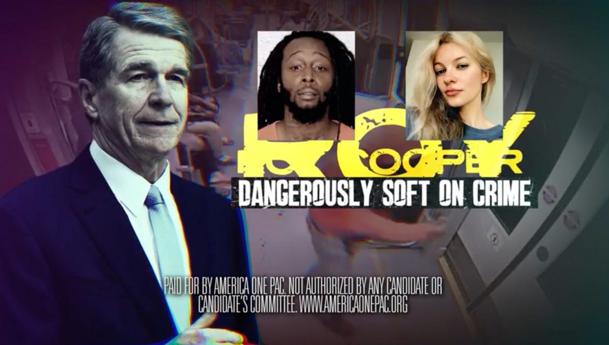
Sen. Tom Cotton’s (R-Ark.) leadership political action committee America One PAC is running a six-figure ad buy of an attack ad in the North Carolina Senate race linking Cooper to the murder of Ukrainian refugee Iryna Zarutska, who was fatally stabbed on a train in Charlotte, N.C., last month. The ad calls Cooper “dangerously soft on crime” and previews Republican attacks on crime in the midterms.
“We think crime is going to be a major issue in the midterms. And Sen. Cotton will spend millions to highlight Democrats who took soft-on-crime positions when they thought it was politically popular,” Cotton campaign adviser Brian Colas told Politico.
A Cooper campaign spokesperson said the ad was “wrong” and multiple media outlets rated them false.
Here’s what Cracker Barrel’s CEO said about the company’s reversed rebrand.
Cracker Barrel’s sorry for messing with its logo.
On the company’s earnings call last week, CEO Julie Felss Masino said Cracker Barrel “conducted extensive research” to inform their strategic plan and rebrand, but what it didn’t capture in data was “how much our guests see themselves and their own story in the Cracker Barrel experience, which is what's led to such a strong response to these changes.”
“We want longtime fans and new guests to experience the full story of the people, places, and food that makes Cracker Barrel so special,” Masino said. “That's why our team pivoted quickly to switch back to our old-timer logo and has already begun executing new marketing, advertising, and social media initiatives, leaning into Uncle Herschel and the nostalgia around the brand, with more to come.”
Cracker Barrel reported declining revenue of nearly 3% year-over-year.

Have you seen this?
Group organizing America’s 250th birthday fires executive director. The bipartisan commission terminated Ariel Abergel after an Instagram post related to Charlie Kirk, he says. [Wall Street Journal]
BMW’s new rebrand is so quiet you might miss it. BMW is looking to keep the heritage but bring more precision. [Fast Company]
This newsletter is not authorized by the administration. I’m not the biggest Jimmy Kimmel fan because I think taking Halloween candy away from kids is mean, but I sure do love living in a country where the freedom to believe what we feel, speak what we want, peaceably assemble, and petition our government for a redress of grievances is Constitutionally protected. [Whig by Hunter Schwarz]
