
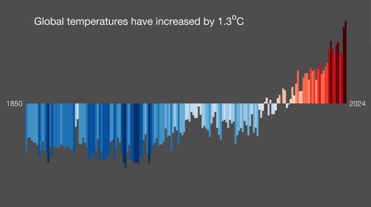
Here’s the famous climate change graphic “Warming Stripes” like you’ve never seen it before
Plus: Tesla’s new Robotaxi logo suggests Musk’s EV company is staying the course post-DOGE

Here’s the famous climate change graphic “Warming Stripes” like you’ve never seen it before

People in some parts of the U.S. experiencing the heat wave that peaked today are enduring triple-digit temperatures, but spare a thought for our friends in Tucson, Ariz. Though they get to enjoy the dry heat of relatively mild temperatures in the mid 90s this week without the humidity that makes East Coast summers so brutal, it’s been getting especially hot there. A localized version of “Warming Stripes” (above), a 2018 red-and-blue barcode-like climate change graphic that visualizes a rising average global temperatures through color, shows a city that’s been getting hotter earlier than the global average (below).
“Warming Stripes” was designed by Ed Hawkins, a climate science professor at the University of Reading in the U.K., and it’s a smart piece of data visualization that breaks down a complex topic for the viewer simply. Each stripe represents a year, and as temperatures have risen since 1850, the stripes change from cool blue to deep red hot to show a rising average. It communicates the urgent threat of a warming planet more plainly and memorably than any dense academic paper ever could.
“Warming Stripes” has been quickly and widely adopted, and to observe a “Show Your Stripes Day” campaign last week to raise awareness, organizers found new ways to expand the data and design of the graphic, now updated with data through 2024 for global and local versions (check for your local area here).

The Museum of Modern Art included “Warming Stripes” in its exhibition Pirouette: Turning Points in Design, which is open through Nov. 15. The graphic’s place alongside significant works of contemporary design, like Milton Glaser’s 1976 “I ♥️ NY” concept sketch, an original 1983 Apple Macintosh home computer, and the first emoji released for cell phones in 1999 by Shigetaka Kurita, gives a sense of its perceived place in modern design history at just seven years old. “Warming Stripes” was adopted for use in the logo of the U.S. House Select Committee on the Climate Crisis that met from 2019 to 2023, as well as on a lapel pin worn by its members. The graphic has also been turned into scarves, including one gifted to the late Pope Francis.
As local graphics for cities like Tucson show, even in place that are known for being warm, temperatures have risen dramatically over the past quarter century. Localized versions helps bring the data home, and additional visualizations offer fresh points of view. A new version of “Warming Stripes” for temperature in the atmosphere and oceans by height and depth is visually blockier and takes a wider lens, while another another that shows the stripes of the global average as a traditional graph chart (below), gives viewers another way to understand the data.
“The more people understand the rising harms of our changing climate to the people, places, and things they love, the more they will move toward action,” Bernadette Woods Placky, chief meteorologist and vice president of engagement at the nonprofit Climate Central participating in the campaign said in a statement.
It’s clear Hawkins’s graphic resonates, but by updating it with new information annually and finding additional ways to extend the visuals, “Warming Stripes” has new life.
Previously in Yello:

Can I count on you? Yello is a reader-supported publication and I rely on paid subscriptions from readers like you to keep publishing. If you haven’t already, consider upgrading your subscription today to support this newsletter. Are you with me?
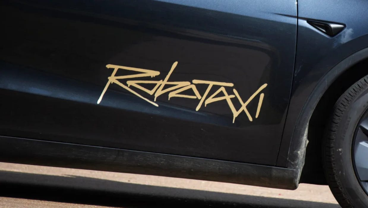
Tesla’s new Robotaxi logo suggests Musk’s EV company is staying the course post-DOGE

Tesla launched its Robotaxi service Monday in Austin, Texas, with a limited pilot featuring a small fleet of self-driving cars. Tesla has encountered challenges getting its Robotaxi service up and running, and now it’s facing a new hurdle of its own making: the Robotaxi logo.
The self-driving taxis feature a “Robotaxi” wordmark written out in a graffiti style on the car’s front doors. The scrawled typeface is reminiscent of the branding for the video game Cyberpunk, and hearkens directly back to the Tesla Cybertruck logo, a puzzling choice considering how poorly the Cybertruck has been received.
With its sharp edges and careening forward slant, the logo doesn’t exactly scream “safe.” And yet, that’s exactly what a new autonomous vehicle brand should be doing. AVs require a higher level of consumer trust than your average product or service, since you’re putting your life in its hands. A logo that looks spray-painted doesn’t communicate that, nor does the pilot program’s flat $4.20 ride fee.
The logo “looks sloppy and casual, not reassuring,” Eben Sorkin, art director of the type foundry Darden Studio, tells me, calling it “aesthetically anachronistic and out of sync with current cultural vibes.”
“Would you board a flight with an airline logo that looks like this?” he asks.
The Robotaxi rollout represents a chance for the beleaguered electric vehicle company to change the narrative after CEO Elon Musk’s unpopular foray into government. And indeed, after the Robotaxi announcement, Tesla’s stock rose.
From a branding perspective, though, the Robotaxi wordmark isn’t suggestive of a company moving away from the Cybertruck aesthetic that has now become associated with Musk’s DOGE efforts. Rather than using a visual identity that communicates safety, trust, or reliability, the logo is a sign that the company sees the graffiti-style cyberpunk aesthetic of its Cybertruck as the model for branding future products and services.
“A good logo always tries to convey the brand promise,” says type designer and Hoefler & Co. founder Jonathan Hoefler. “And this one definitely foreshadows the tragic collisions ahead.”
Have you seen this?
Gold phones, meme coins, and Instant Pots: Trump’s MAGA economy is taking shape. Trump Mobile is just the beginning. The president is building a MAGA goods empire to turn political supporters into loyal customers. [Fast Company]
Levi’s and Nike blend denim and sport in new apparel collection. The campaign features hip-hop artist Larry June, WNBA star Paige Bueckers, NFL player Keon Coleman, and designer Daniel Buezo. [Hypebeast]

War. And peace? Trump had two used-car-lot-sized flagpoles installed at the White House just in time for all the live shots there as he entered the U.S. into Israel’s war with Iran. Outrage over the strikes without Congressional authorization has members of both parties up in arms. [Whig]

History of political design
Gay Citizens for McGovern button (1972). The button for the Democratic nominee in 1972, Sen. George McGovern of South Dakota, is believed to be the first LGBTQ+ campaign button for a presidential candidate at the national level in U.S. history. In a fundraising pamphlet put out by group Gay Citizens for McGovern, organizers asked potential donors to "Make America Happen Again" and argued McGovern was the best candidate for "Gay Civil Rights."
A portion of this newsletter was first published in Fast Company.
Like what you see? Subscribe for more: