
The creative typography of New York’s mayoral campaign ads spells it all out
Plus: The meaning and message of Trump’s new headshot

The meaning and message of Trump’s new headshot
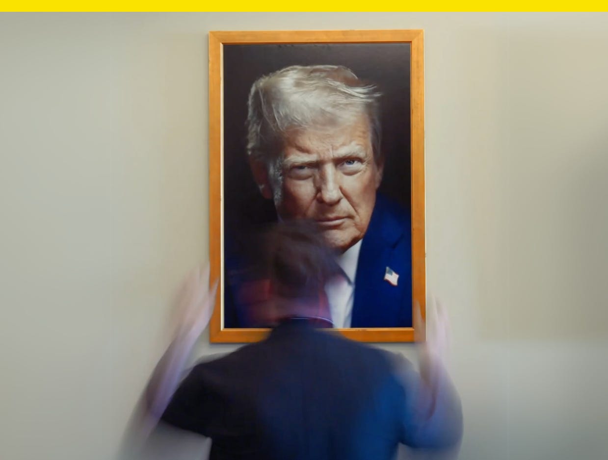
This diva. Just months into the new job, and President Donald Trump wanted a new headshot.
The White House unveiled a new official portrait of Trump this week in a Monday social media post that showed a framed version of the new portrait going up in a busy hallway, and the White House website and POTUS social media account avatars were all updated with the latest pic. It’s Trump’s second official White House portrait of his second term, and fourth overall. Of the four, it’s the least traditional presidential portrait of the bunch.
The last president to serve two terms before Trump, former President Barack Obama, updated his official portrait days before his second term began in 2013. The first was taken with a nondescript background and flag, no smile, while the second was shot in the Oval Office with a big grin, arms folded. In the second, Obama’s hair was visibly more grey than four years before. Each of Obama’s photos were taken by his then-chief official White House photographer Pete Souza.
This is the government’s official graphic representation of its head of state, portraiture as government document (it hangs in federal buildings). They’re professional, the presidential equivalent of a LinkedIn headshot. But Trump’s trying for a different look. Viewed as a series, Trump’s official portraits are less a testament to the passage of time and the physical toll the office takes on its holder like they were for Obama (Trump’s hair doesn’t seem to have changed since his first term) than they are a story of a man breaking from the norms of the job. Increasingly non-traditional portraits for an increasingly non-traditional president.
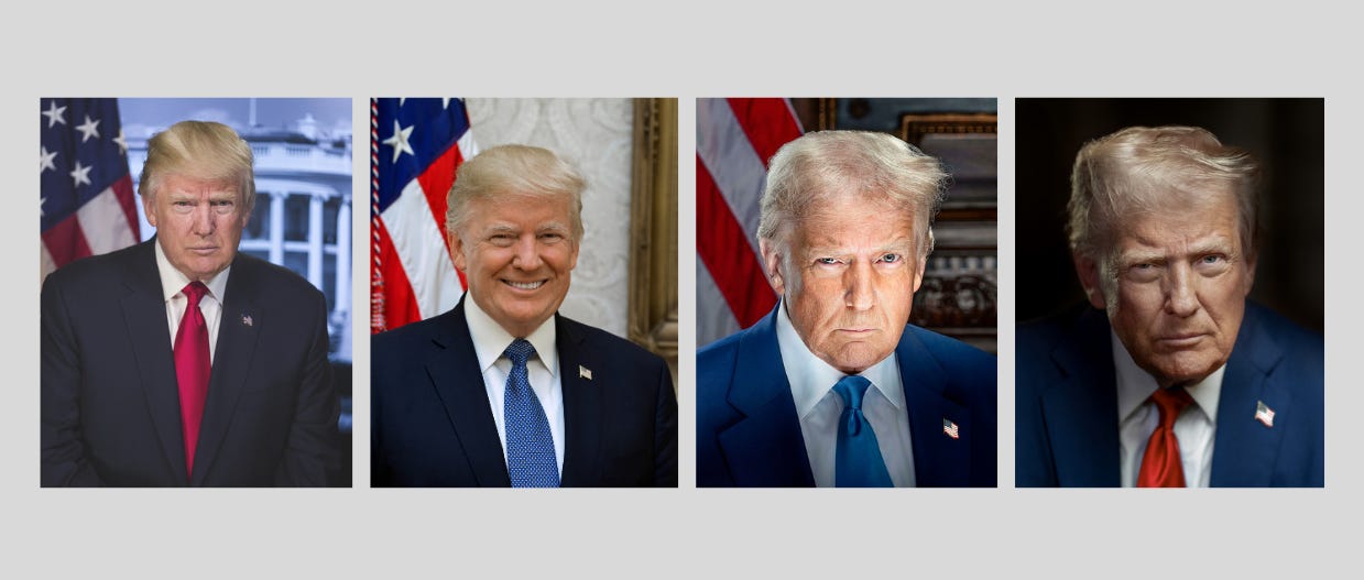
Trump scowled in his first official White House portrait, which was uncredited and released for his first inauguration. His second, released in October 2017, was shot by Shealah Craighead, his former chief official photographer, and it followed the formalities of the portraits of Trump’s predecessors. He smiled, it was brightly lit and set in front of a flag, and there was plenty of headspace above him.
Trump’s two latest official photos were both taken by White House chief official photographer Daniel Torok who’s taken unconventional approaches. For the third portrait, released in time for Trump’s second inauguration, the dramatic lighting and a pose were purposefully meant to recapture the angle and expression of his 2023 mugshot. He looked like he was holding a flashlight under his face to scare the kids, but he was really just doing his booking photo over, now with the final say on lighting.
His latest portrait is the first of Trump’s to be missing a U.S. flag in the background, and except for his flag lapel pin, it’s absent any details that would communicate it’s an official U.S. government portrait. “What’s interesting is they’ve removed all references to the White House setting,” Mount Holyoke College professor of fine art Paul Staiti told the New York Times. “To be sure, this makes it more personal. But I do wonder whether this is suggesting that Trump is not exactly an office holder, or not to be seen solely as the current representative of the United States.” This isn’t Trump taking the same picture as everyone else. It’s meant to look singular.
Rather than look like a government headshot, Trump’s new official photo looks editorial, like a Time cover shoot or an asset for CNN’s debate night coverage. The lighting is softer than the last portrait, and by comparison, the mugshot-inspired pic looks like an especially ham-fisted attempt to conjure something iconoclastic. (We get it, you’re a felon!) Instead, the new portrait speaks in the visual language of media and entertainment for our first reality star president.
Finally, Trump has his official glamor shot.
Previously in Yello:

Unlock the rest. Get every issue of Yello in full and see what you’ve been missing. The best in politics, civics, and design with no paywalls:
The creative typography of New York’s mayoral campaign ads spells it all out
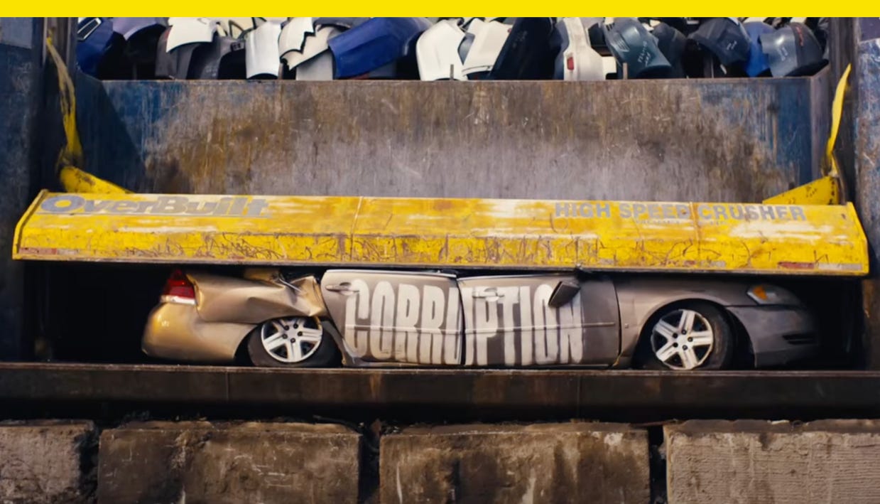
In “Corruption Crusher,” New York City comptroller and mayoral candidate Brad Lander crushes cars with all-caps words painted on the sides to send a message: he’s the candidate who will stand up to corruption, Trump, and Elon Musk. Even with the ad on mute, he gets his point across.
The race to replace incumbent Mayor Eric Adams in New York is the highest profile mayoral race in the U.S., and with nine candidates who made it to this week’s Democratic debate, it’s also crowded. Former New York Gov. Andrew Cuomo (D) is running for the job with a super PAC on his side that’s outspending the rest of the field, a New York Times review of ad spend found, so other candidates are getting creative to stand out. Two in particular have turned to typography.
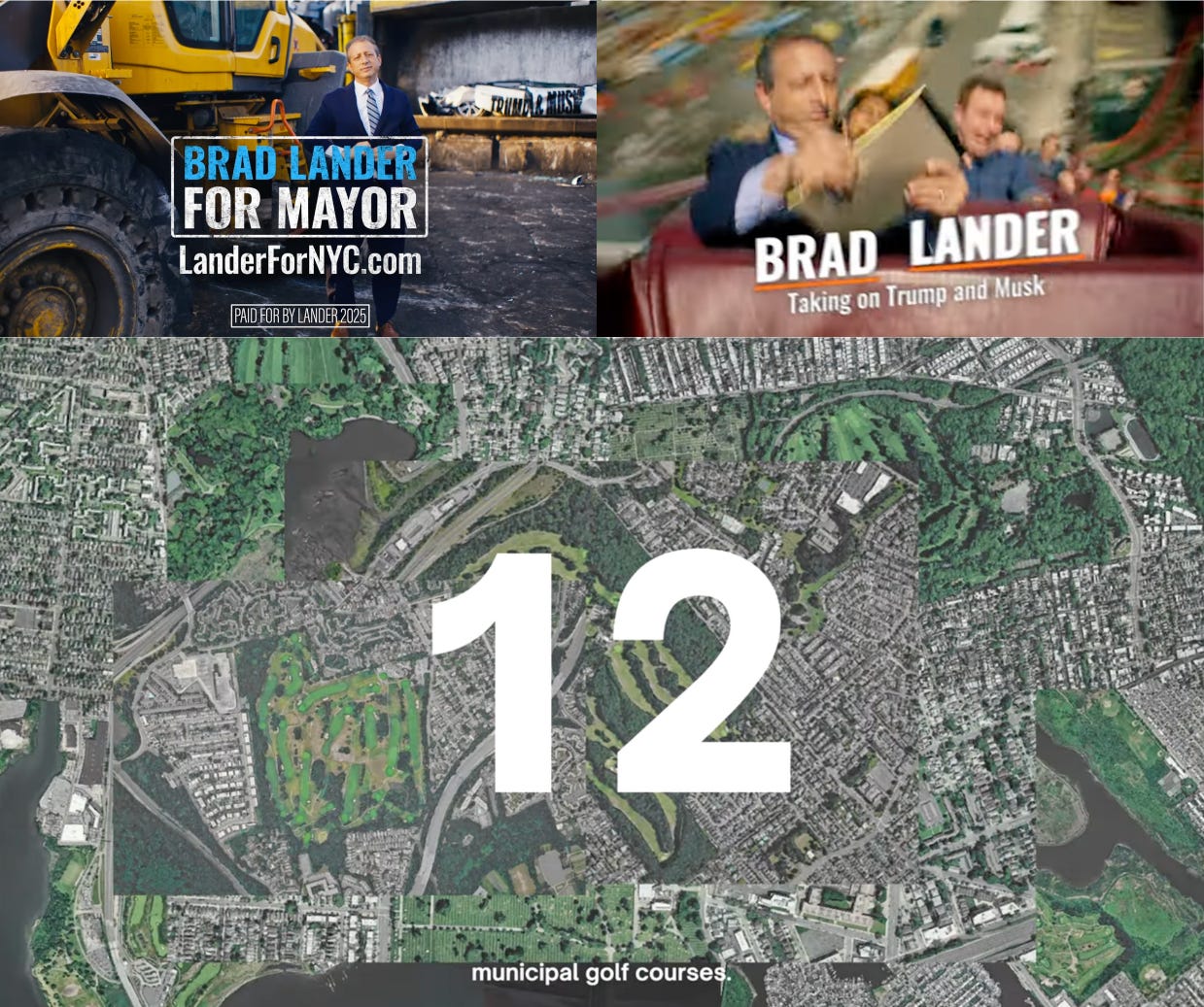
For Lander, his ad’s narrator accuses Cuomo of spending millions in taxpayer dollars to defend himself in court as a grey sedan with “Corruption” written on the passenger-side doors is put into a compactor. Next comes a white Tesla with “Trump & Musk” written on the side as the narrator plays up Lander’s credentials standing up to the pair and the EV gets crunched. It’s an eye-catching and memorable stunt ad designed to make its point visually in an analog, physical way. At the end of the 30-second spot, Lander is shown with the crumpled “Trump & Musk” car in the background.
In his humorous “Cyclone” spot, Lander makes a point about staying cool under pressure as he rides front row on Brooklyn’s Coney Island Cyclone roller coaster all while taking a call, checking his notepad, and having lunch. The text of his name jerks around from right side of the screen to left to match twists of the ride.
Then there’s Lander’s ad about building housing on municipal golf courses, which is produced like a Vox video. With white, serif text on screen highlighting figures like “2,500 acres,” and “4” of the city’s “12” golf courses, plus areal shots of the course that change on screen with the sound of a click, it turns a wonky video about policy into a digestible vision of abundance rendered in a visual style for voters who read too much Ezra Klein.
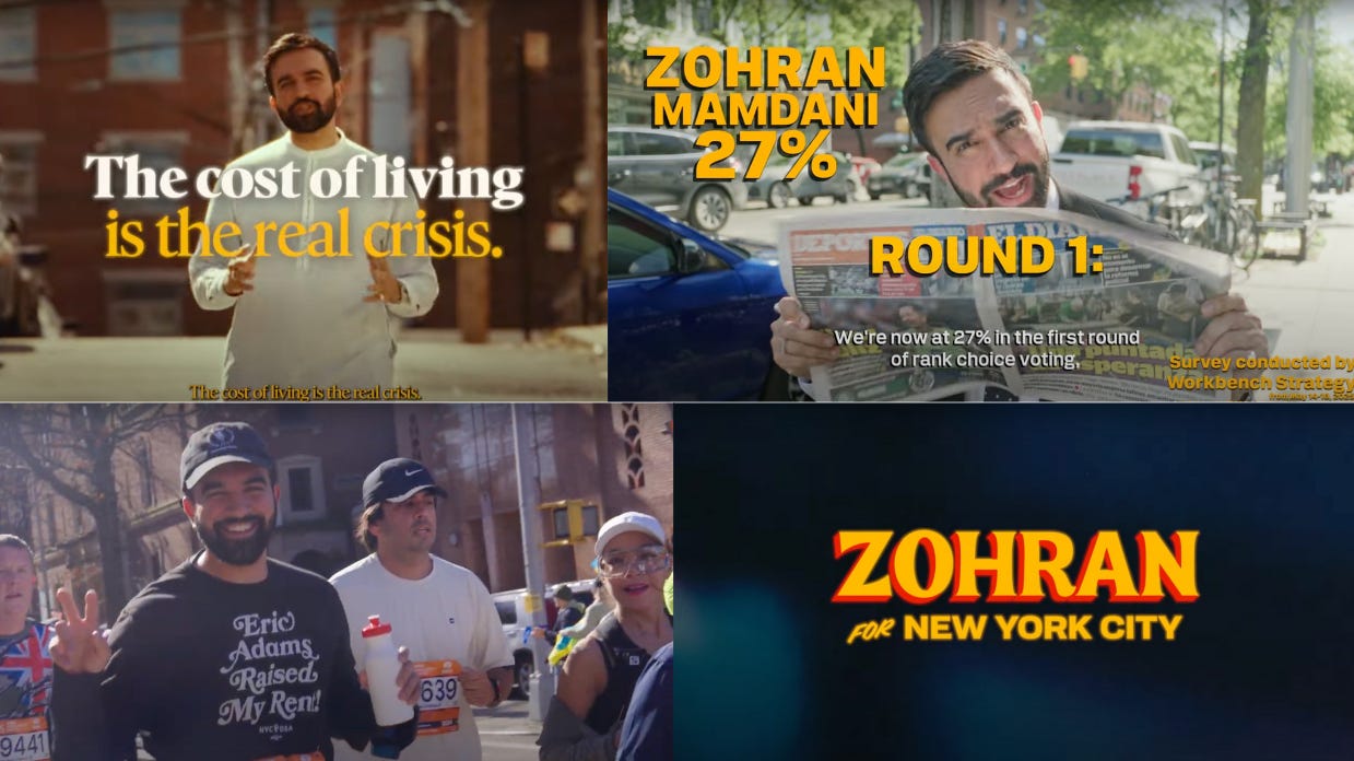
The typography for Zohran Mamdani, the state assemblyman who won Rep. Alexandria Ocasio-Cortez’s (D-N.Y.) coveted endorsement Thursday, is elevated, with various typefaces in red, yellow, and white to caption his campaign ads and videos and give them a distinctive look and voice. His “Zohran for New York City” logo mark was made to look like hand-drawn store window lettering, and in an ad about his rent freeze proposal shot while Mamdani ran a marathon, he wore a shirt that said “Eric Adams Raised My Rent” in a gorgeous serif. The back said, “Zohran Will Freeze It!”
Lander, Mamdani, and other contenders are up against the pro-Cuomo Fix the City super PAC, which has aired $8.1 million in broadcast advertising with an tough-on-crime message, more than any other campaign. The super PAC doesn’t use typography so much as a creative force in its ads as it does a blunt force, hammering home stats like how many more cops Cuomo would put on the streets.
Ahead of the city’s June 24 Democratic primary Election Day, the pro-Cuomo super PAC is betting a consistent anti-crime message will work. Meanwhile, Lander and Mamdani are running campaigns to stand out with typography that’s sharp, creative, and intentional. Their type sends a message, and in a city that’s home to some of the world’s best graphic design, voters may find that persuasive.
Have you seen this?
Trump-Musk split could leave Tesla politically homeless. The Tesla CEO has spent months alienating EV buyers. Now, his company stands to lose federal support and contracts from an angry Republican president. [Politico]
MillerKnoll just unveiled its sprawling design archive — here’s how to visit. The 12,000-square-foot space at its Michigan headquarters is the permanent home for over one million objects from Herman Miller and Knoll’s archival collections. [Hypebeast]
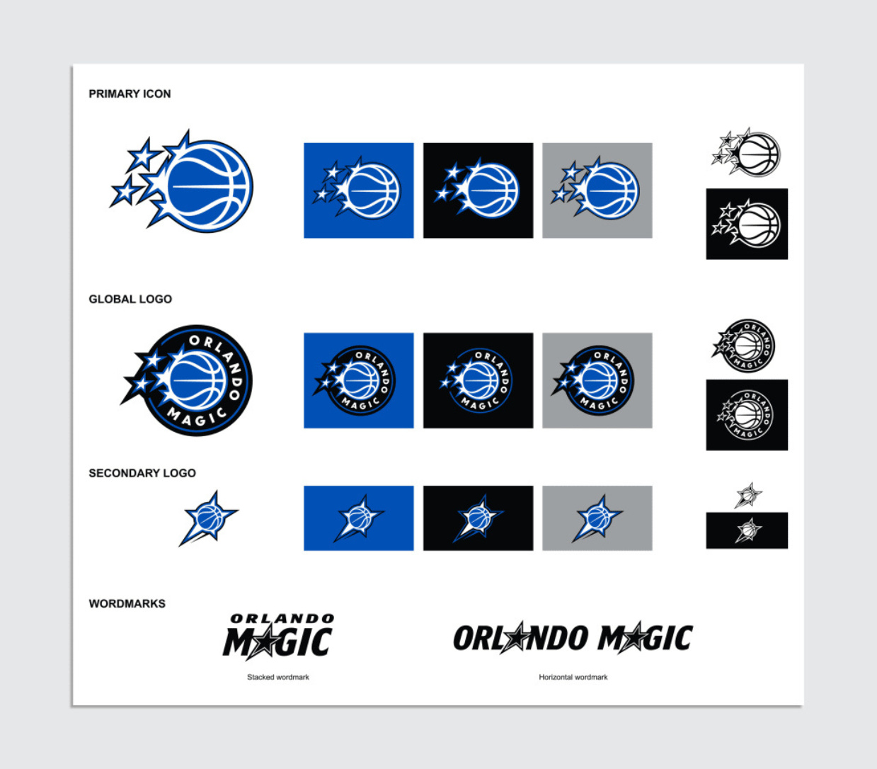
The Orlando Magic rebrand shows why nostalgia sells in sports. The team unveiled a new logo and uniforms designed to be a modern take on a classic fan-favorite era. [Fast Company]

History of political design
"Hands Across America" pinback button (1986). The button commemorates the May 25, 1986 charity event in which 5 million people held hands to form a chain across the U.S. for 15 minutes to raise $15 million for the homeless and hungry.
Like what you see? Subscribe for more: