
Why the future of fonts could be personalized
Machine learning could help you find your fastest font

Reading in the future could be a whole lot faster.
In an earlier era of paper-only reading, the experience was designed by content producers, like publishers and designers. The growth of digital reading means today, though, digital platforms increasingly decide things like font and type size. What if that experience could be customized for individual readers? It’s a question researchers are trying to answer.
Earlier this year I wrote about a study that found changing fonts can improve reading speed by as much as 35%. Shaun Wallace, one of the study’s authors and a PhD candidate at Brown University, said his fastest font was Noto Sans, an open-source, sans-serif Google Font.
It was one of 16 fonts used in a study with researchers from Adobe, Brown University, and the Virtual Readability Lab accepted to be published in the peer-reviewed journal ACM Transactions on Computer-Human Interaction. Like earlier studies, it found there is no one-size-fits-all font.
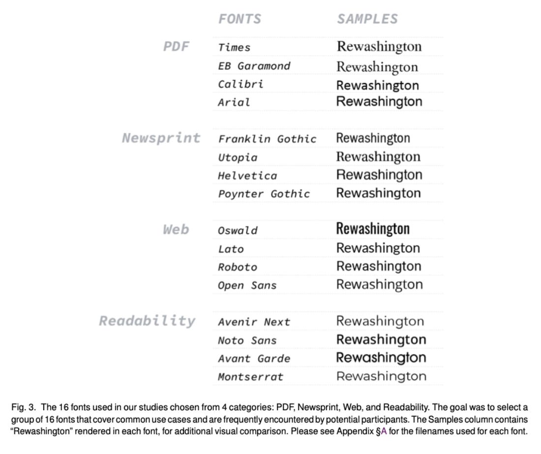
Fonts used in a study on increasing reading speed:
“It isn’t like there’s one font that’s faster than all these others, which is kind of the idea of universality, like saying that everyone reads faster on average in Times New Roman compared to Georgia,” Wallace told me.
“I mean, obviously everyone reads faster in Times than Wingdings, but that’s an easy comparison,” he said.
Many earlier studies assumed some fonts were faster for everyone, Wallace said, and they didn’t test as wide a range of fonts. For this study, they used top fonts across a range of reading experiences.
The study included four most common fonts used in PDFs, courtesy Adobe, which has data on the most popular; four top fonts used in newspapers and print media; four fonts recommended by readability experts; and four of the most common fonts used on websites, according to Google Fonts Analytics. Fun fact: more than 50% of website views are in Roboto or Open Sans.
They found on average, readers prefer bigger fonts, but only up to a point.
“If the font’s a little bit bigger, people prefer it a little bit more,” Wallace said. “The font needs to be big enough for someone to read fast, then after a certain extent, if it gets bigger, it doesn’t really matter.”
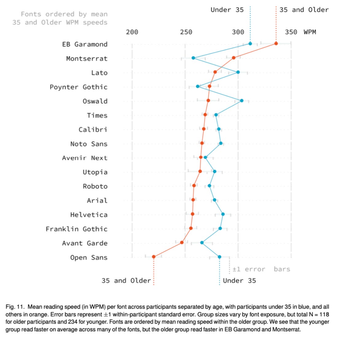
The number one thing that changes is a reader’s age, he said.
“Qualitative evidence from a lot of these studies show younger people want smaller, tighter fonts to fit as much information on a page, where as you get older, you’re like, oh, I want less eye strain,” he said.
Fonts including EBGaramond and Montserrat improved reading speeds for some readers over the age of 35, but the study found those recommendations couldn’t be made for everyone. Other relevant factors include readers’ self-reported reading speed, reading frequency, and font familiarity.
Earlier studies of younger readers found font personalization could be helpful in the classroom. “The pacing, the confidence, the number of stutters, these things dropped and the number of correct words they could say per minute went up,” Wallace said. “And it wasn’t just for struggling readers, like really good readers improved as well.”
Mean reading speed for readers 35 and older and readers under 35:
To recommend personalized fonts at scale would require machine learning, since researchers found readers aren’t good at picking the best font for themselves (“You can’t just allow somebody to pick a font and then be like, yeah, you’re going to do great in this,” he said. “Like, they’re not going to do bad, but on average it’s not going to be their fastest.”) A majority of respondents told researchers they’d trust a font recommendation if it was generated by a computer algorithm, and it’s something Wallace wants to help build.
“I hope to create something compelling enough that people will test their fonts and how to design text and information to help people over time,” he said.

Have you seen this?
“Avatar” has its own font called Toruk. The film was mocked for using Papyrus, but producer Jon Landau said after “Avatar” expanded from one-off movie to franchise, they invested in type. “When we realized that the movie was going to expand into a franchise and we'd have other IPs, we went out and created our own font that we're now using, and we call it Toruk, and it's available for people to use,” he said. [Entertainment Weekly]
The U.S. Postal Service just announced a John Lewis postage stamp. The late civil rights leader and U.S. congressman from Georgia will be honored in a stamp out next year. It features a photo of Lewis taken by Marco Grob for a 2013 issue of TIME.
These are the most popular art and culture searches on Google in 2022. Users searched for A.I. art, immersive art experiences, Netflix’s “Inventing Anna,” and Art Basel Miami Beach. [Artnet News]
Michelle Obama is redefining the possibilities of post-FLOTUS fashion. Obama has become more adventurous with style since her husband left office, but her promotional tour for her latest book, “The Light We Carry,” is another level. [𝘠𝘌𝘓𝘓𝘖]
Like what you see?
Subscribe for more: