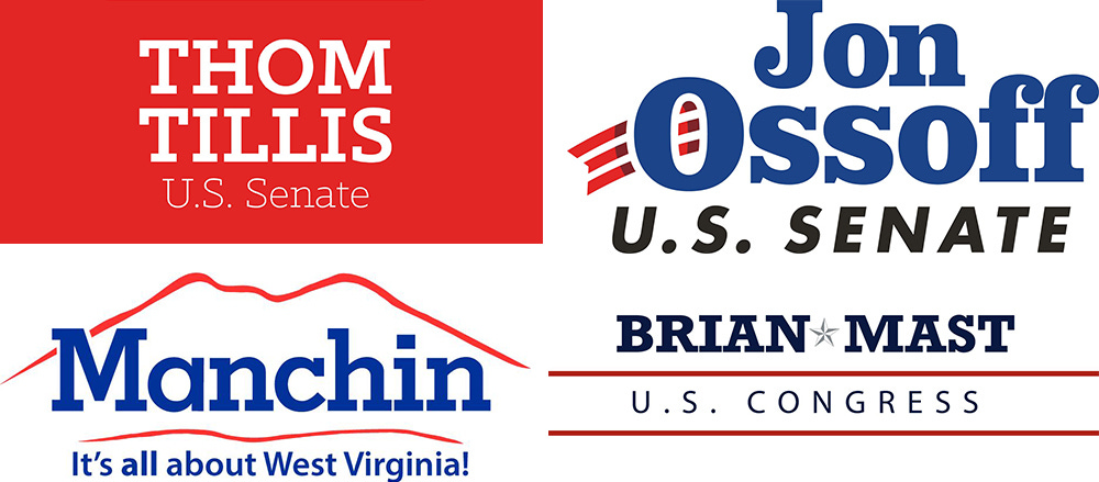
Why political designers use certain fonts for specific candidates
"You can't do anything about the name. That's your canvas."

If you browse the campaign signs that accumulate around busy intersections in any American city before an election, you’ll see all kinds of design approaches. Some signs are good, most are unremarkable, and a few give me a headache. Whatever they look like, though, they were most likely designed intentionally.
“It’s important to understand that this is deliberate,” said Katherine Haenschen, an assistant professor at Northeastern University who studies graphic design in political campaigns.
The design choices made in politics are meant to convey information to voters, and quickly. A sign at an intersection, a poster taped to a bodega storefront. Political designers pick their fonts on purpose to communicates things like gender, party, and age.
Campaign logos and design assets are “doing work in the same way that the speeches and the television ads and everything else is trying to do work in a campaign,” Haenschen told me. She co-authored a study on the perceived partisanship of typefaces in 2019, and new research published in the 2021 International Journal of Communications digs deeper into the politics of type.
The study argues that typeface selection is a form of political communication unto itself, drawing on interviews with eight graphic designers and an analysis of 908 U.S. House and Senate candidate logos from the 2018 midterms, via the Center for American Politics and Design’s database. It was co-authored with Daniel Tamul at Virginia Polytechnic Institute and Jessica Collier at UT Austin.
The study divided congressional candidate logos into four typeface families:
serif - fonts with strokes known as serifs at the end of letters
sans serif - “without serif”
slab serif - serifs that are thicc
script and handwriting - 𝓁𝒾𝓀𝑒 𝓉𝒽𝒾𝓈

Designers stressed to researchers that typefaces aren’t inherently political in and of themselves, but chosen to convey information about a candidate within a wider cultural context of local design style. One Virginia print shop owner said the sans-serif logo used by Rep. Alexandria Ocasio-Cortez (D-N.Y.) wouldn’t be well received in rural areas. Seven of the eight designers said typeface selection was a carefully considered aspect of their work.
Here are some reasons designers use certain typeface families for candidates:
Incumbency

Years in office can be an indicator of type choice, the study found, with incumbents more likely to choose serifs than their challengers.
Serifs were more popular from 1996 to 2012, but former President Barack Obama’s use of Gotham in 2008 popularized the geometric sans serif and created a generational divide in political type.
The finding suggests many long-timers stick with their old logos even as political design trends change for a new generation of challengers. If it ain’t broke, don’t fix it, like the serif logos from incumbent members of Congress first elected in the 1990s above.
The study found longer terms in office increase the likelihood a candidate uses serifs and script or handwriting over sans serifs. Incumbency accounts for 8% of variation in typeface family for last names in logos.
Party

The look of politics today is sans serif, with 69% of candidates using them in 2020, including majorities from both parties. Still, serifs are seen as more conservative and Republicans are more likely to use them, the study found. Republicans are also likelier to use them as the competitiveness of their race increased.
Democrats are more likely to use sans serifs.

Gender

Female candidates are more likely than male candidates to put their first names in their logos, and they’re also more likely to use script or handwriting. In fact, women often write only their first name in script and use a different type family for the rest of the logo. A woman’s name in a typeface that reads feminine shouts her gender proudly. "Without a female first name on a sign, voters might assume that the candidate is male,” the study found.
“Not everybody puts their first name on their sign,” Haenschen said. “One of our consultants pointed out that if he’s working with a female candidate, he definitely wants to put the first name on the sign, because in Austin, Texas, being a female candidate in a Democratic primary will help you get more votes, so he wants the voters to know, hey, this candidate is a woman.”
But even Republican candidates use the style, like Rep. Jaime Herrera Beutler of Washington, who’s “distinguishing herself, like marking herself as a woman, and doing so with an aesthetic choice that has a femininity implied to it,” Haenschen said.
The study found male candidates are significantly more likely to use slab serifs, which one Texas designer said feel “folksy.”

Geography
One category that didn’t make a difference in type selection was geography. The study found no meaningful evidence of typeface variation based on region or population density. Despite regional political differences, font trends, it seems, are nationalized.
The study did find, however, that candidates are more likely to include their first names in their logos as population density increases, which could say something about the candidates who run in cities and urban areas.
Functionality
Above all, political designers are designing for functionality. Most of these signs aren’t headed to a museum, they’re going on the side of a highway, and their job is to promote a candidate.
“They’re not designing for pure aesthetics,” Haenschen said. “It has to be clear, it has to work in a multitude of formats. Ideally it works in black and white or monochromatic prints as well was full color. It has to work on a sign, a button, a shirt, a website, and it has to convey the person’s name, then beyond that, it needs to convey qualities about that person.”
Designers can make choices about whether to include first and last names, but they’re limited to working with the letters they got.
“You can’t do anything about the name,” Haenschen said. “That’s your canvas.”


