Why Newsom’s “Make America Gavin Again” trolling is working
Plus: Taylor Swift’s Life of a Showgirl font is a tall, condensed sans-serif designed by a heavy metal fan
Why Newsom’s “Make America Gavin Again” trolling is working
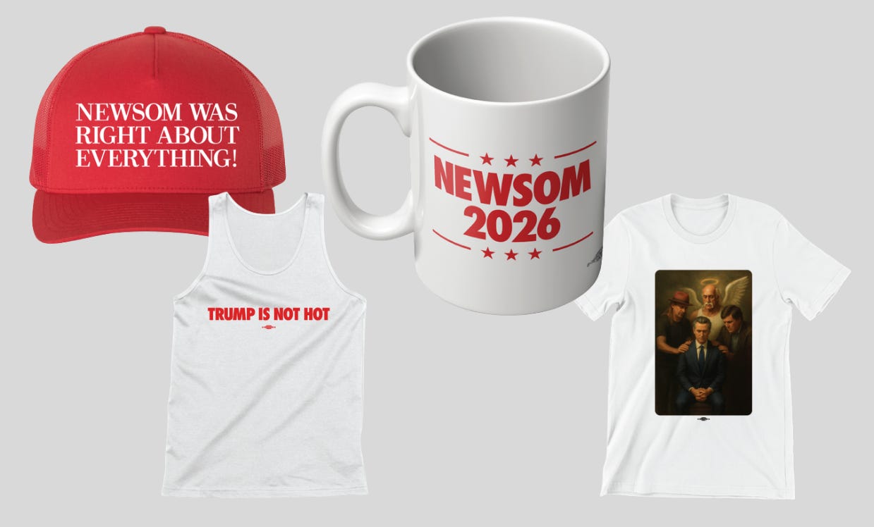
Is there any way to wear a “Newsom Was Right About Everything!” hat but ironically? Even if you’re an earnest fan, it’s still meant as a joke.
California’s Democratic Gov. Gavin Newsom’s political action committee Campaign for Democracy launched merch that parodies President Donald Trump’s on Saturday. Dubbed the “Patriot Shop,” the storefront sells items that aren’t very serious, but the stakes are.
The shop features apparel like the $32 hats designed in the style of a Trump hat, a $20 “Newsom 2026” mug, and a two-pack of California-flag themed “Don’t Poke the Bear” stickers for $6. Newsom said the store made more than $100,000 in a day, and that’s with leaving money on the table. The “sold out” $100 Bible was never actually for sale (Trump’s, for $60, still is, however, and that seems to be the point), and though Newsom tweeted an image of a “Make America Gavin Again” flag suitable for boat parades, the flag is not actually available on the site.
The new merch turns memes into fundraising by taking on the tone and content of Newsom’s GovPressOffice account on X. In mocking Trump’s social media phrasing, sentence structures, and capitalization through imitation, Newsom’s office has used the account to trick Fox News hosts into criticizing Trump’s behavior without realizing it. Now you can get the insane A.I. image of Kid Rock, Tucker Carlson, and an angel Hulk Hogan praying around Newsom in the fawning style of Jon McNaughton that Newsom’s office account tweeted out on a $32 t-shirt.
As the highest profile elected officials in their states, governors are inherently brand ambassadors, and their jobs offers them a unique platform to build a national profile. In the lead up to the 2024 presidential campaign, Florida’s Republican Gov. Ron DeSantis built name ID for himself as governor through culture wars fights like his war on Disney, and selling merch like a Florida gator Gadsden flag that said “Don’t Tread on Florida.” DeSantis’s “Make America Florida” message didn’t help him win, but with a Florida Man in the White House today, it’s not clear campaigning on the Floridization of America was the reason why.
Newsom now offers Californication, and with the Election Rigging Response Act, his job as Californian-in-chief has taken on new urgency. The legislation, which passed the California legislature and now heads to voters, will determine whether the state throws out districts drawn by a nonpartisan redistricting commission for new maps more favorable to Democrats through 2030, and it comes after Texas redrew its maps at Trump’s request to favor Republicans.
For Newsom, this isn’t just about building a brand as governor, he’s building a bulwark against Trump that Democrats nationwide are noticing. California’s politics are again nationalized, and Newsom is leading the fight. His merch and memes may be a joke, but in taking trolling seriously, Newsom’s found a way to trigger the cons and fundraise off it by holding a mirror up to MAGA over Trump’s own behavior.
Previously in Yello:
Taylor Swift’s Life of a Showgirl font is a tall, condensed sans-serif designed by a heavy metal fan
Swifties have a new favorite font.
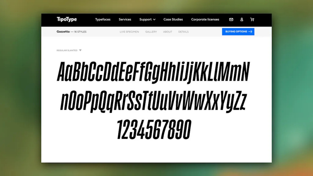
Gazzetta is the tall, sans-serif type family by Nicaraguan type designer Edwin Moreira that Taylor Swift is using on her forthcoming The Life of a Showgirl album, out Oct. 3. The award-winning typeface spells out the album’s name and tracklist across multiple variants.
Moreira, a heavy metal fan, tells me that he found out Swift was using his font after a Swiftie friend told him.
“At first, I couldn’t believe it, but then I confirmed it really was Gazzetta,” he says in an email. “It has been an incredible surprise to see a typeface I designed connected to such a huge cultural moment; it’s surreal but deeply rewarding.”
Unlike artists like Mariah Carey or the Rolling Stones, who tend to use consistent branding from album to album, Swift switches things up between eras, choosing type styles from Blackletter font for Reputation to marker handwriting for 1989 in order to best suit the mood of each album.
For The Life of a Showgirl, with her Las Vegas showgirl-style wardrobe for the album photo shoot and the jagged collage-style treatment for the album art, Swift is using a font that’s loud. In all-capital letters, the album title is rendered in tabloid headline style, and the letters are filled in with glitter.
Swift said on the podcast New Heights that the album is about her inner life while on tour, and fiancé Travis Kelce said it has “bangers.” But even without hearing the music yet, the album already has a clear visual aesthetic. Swift is introducing a visual world to reinforce the storytelling of her music on the album — table stakes for any big pop music release today — and Gazzetta will typeset it.
Gazzetta was released in 2022, and it’s published by the type foundry TipoType, which says the font’s condensed, Neo-grotesque letterform is perfect for book covers, newspapers, magazines, posters, and large-format materials. Like a vinyl record. Moreira, who was an apprentice in editorial design, says it was “inspired by the aesthetics of grotesque, condensed typefaces used in many newspapers, as a way to honor the legacy of the printed press.”
“My intention was to reimagine that functional, utilitarian style for contemporary use, keeping its strong and compact character but giving it a somewhat contradictory visual voice—energetic yet friendly,” he says.
Moreira says it’s been fascinating to watch Swifties embrace Gazzetta. “They were actually the ones who almost immediately investigated which font it was, and who its author was,” he says. He adds that it shows “how typography can transcend boundaries and create unexpected connections,” like food and architecture. It also convinced a heavy metal fan to post about Swift’s 12th studio album.
Swifties have recreated The Life of a Showgirl look themselves, as has Elmo. Moreira—who says some of his favorite heavy-metal logos are for the bands Dimmu Borgir, Hecate Enthroned, and Carach Angren—re-created it, too, on an Instagram post for his birthday in which he’s sporting heavy metal-style face paint with black and orange glitter. And, in his Gazzetta font, the caption reads: “The Life of a Birthday Boy.”
Have you seen this?
Giant Donald Trump portrait draped over Department of Labor building in D.C. The portrait provoked reaction on social media, with some comparing the move to display it to those made by dictators. [Newsweek]
Cracker Barrel stock rebounds after it ditches its new logo. It’s not the first brand to walk back a redesign. After several days of contentious online discourse, the restaurant chain seems to have decided that it shouldn’t try to fix what isn’t broken. [Fast Company]
Trump suggests hosting pre-midterm GOP convention. The president's message comes just a day after a report that senior Democratic officials were considering a similar move. [Politico]
History of political design
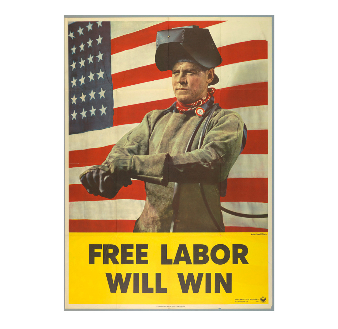
“Free Labor Will Win” poster (1942). This poster was produced by the War Production Board. Happy Labor Day.
A portion of this newsletter was first published in Fast Company.
Like what you see? Subscribe for more:


