
This font was designed to be eco-friendly
Plus: To combat book bans, this publisher released a hypebeast, pro-reading capsule collection

This font was designed to be eco-friendly

Can a font help the planet? Sans Waste is trying to do its part.
To mark Earth Day last month, the creative agency INNOCEAN Canada released a customized font that was specifically designed to do more with less. From a distance Sans Waste looks like a normal, low-contrast sans-serif font, but take a closer look and you’ll notice the creative approach designers took to filling in the letterform. Instead of a solid fill, the characters are all made from small wavy lines.
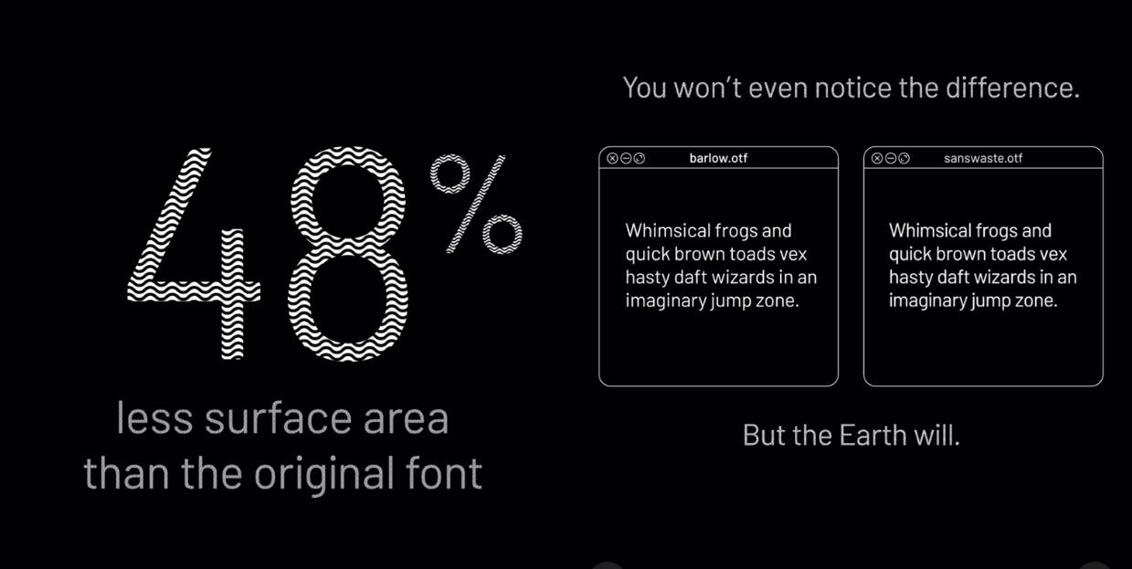
The resulting font takes up 48% less surface area than it would if the characters were filled in normally, meaning it requires nearly half as much ink and half as many pixels to render it on the screen, the agency says.
Sans Waste is based on Barlow, a rounded open source Google Font by type designer Jeremy Tribby that was released in 2017 and inspired by the typography of California license plates, road signs, and public transportation. INNOCEAN Canada has used Barlow in its brand identity since last year, and the agency says it adopted the font into Sans Waste “as a practical, design-led response aimed at reducing consumption without sacrificing clarity or functionality.”
“With Sans Waste, everything that wasn’t essential was removed — so that every print, presentation, invoice, or email becomes a small act of conservation,” INNOCEAN Canada executive creative director Ian MacKeller said in a statement. The font is available as a free download, and the agency says it distributed it for use internally to cut down on the ink it takes to print out its high volume of presentations, mock-ups, advertising, and other documents.
The idea to hollow out fonts to save on ink without sacrificing readability isn’t new. Released in 2008, Ecofont took the typeface Vera Sans and punched holes in it. Its designers claimed it saved about 50% of ink, but in 2010, the University of Wisconsin found switching its default email font from Arial to Century Gothic saved even more.
One study in which researchers filled in oversized words written in different typefaces with ballpoint pens found Garamond and Courier were the most ink-efficient fonts in their survey. Both are relatively thin, while on the other end, the thicc Cooper Black and bold Impact used the most ink. Those results seem obvious, but they have implications.
The publisher HarperCollins has slashed its ink-and-paper usage with thoughtful font design. After its Christian division developed a compact typeface called NIV Comfort Print that saved them 350 pages per Bible in 2017, HarperCollins turned that lesson back to the rest of their catalog. After testing 50 widely available fonts on more than 600 pages, the publisher found 15 fonts that were the most eco-friendly. As of last month, their efficient font library has saved them 245.6 million pages, or the equivalent of 5,618 trees, according to Fast Company.
Using Sans Waste is a clever way to reduce consumption through design, but in situations where custom fonts are impractical, there are off-the-shelf font options that are more than fine. If you want your ink cartridges to last longer, print in Garamond, Courier, or Century Gothic.
Previously in Yello:

Will you take the Yello reader survey?
To combat book bans, this publisher released a hypebeast, pro-reading capsule collection

