
The visual language American women used in the fight to vote and get elected

The struggle for women’s political power in the U.S. has been a fight illustrated with bold typography and conscious color choices. Through symbols and imagery, women from suffragettes to modern female politicians have built their own visual language.
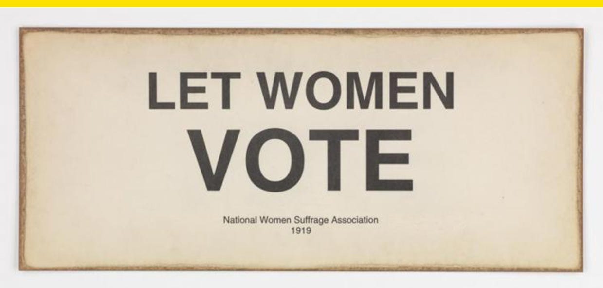
A century ago, the ratification of the 19th Amendment was certified, giving women the right to vote. In the 1800s and early 1900s, women of the suffrage movement were often depicted in cartoons, magazines, and other media as ugly, masculine, weak, and sexless. To fight back, suffragettes embarked on a visual campaign to overhaul their image in the popular culture. They distributed portraits of movement leaders and marched in white dresses as a show of traditional femininity and a symbol of the purity of their cause.
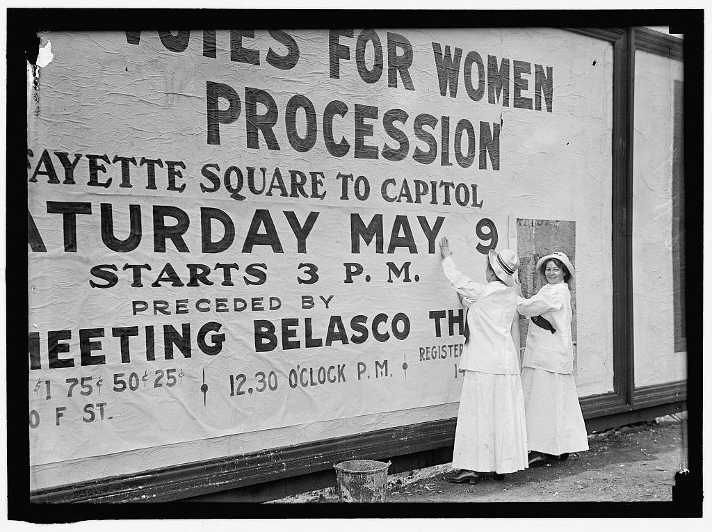
Suffragettes in Washington, D.C. in 1914. Credit: Harris & Ewing, Library of Congress
The color white has endured as a symbol of female political power today, with female politicians from Hillary Clinton to members of the 116th Congress making public appearances in all white.

But white was far from the only defining symbol of the suffrage movement. Purple was used to symbolize “loyalty, constancy to purpose, [and] unswerving steadfastness to a cause,” according a 1913 National Woman’s Party newsletter, while gold stood for “light and life … the torch that guides our purpose, pure and unswerving.” Other symbols include birds, cats, and sunflowers.

A purple, white, and gold suffrage flag, and a “Votes for Women” bluebird from Massachusetts. Credit: National Museum of American History
Suffragettes also made their own American flag edits as a statement, only displaying stars for states that granted women the right to vote, like in this 1900 flag pillowcase with four stars for Wyoming, Colorado, Utah, and Idaho.
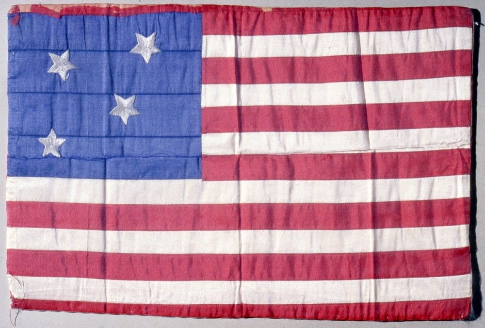
Flag pillowcase by Mrs. Douglas Reinicker. Credit: National Museum of American History
The 19th Amendment was just the beginning of a long road to gender equality in politics. In many cases the suffrage movement wasn’t inclusive to women who weren’t white, not to mention the fact that female representation in government still trails male representation a century later.
Subscribe to Yello for the latest news on the culture, branding, and visual rhetoric of politics, delivered each week:
When women did begin running for office, their posters and other campaign assets didn’t necessarily have overt design cues related to their gender, although simply showing a portrait of the candidate could be revolutionary enough.
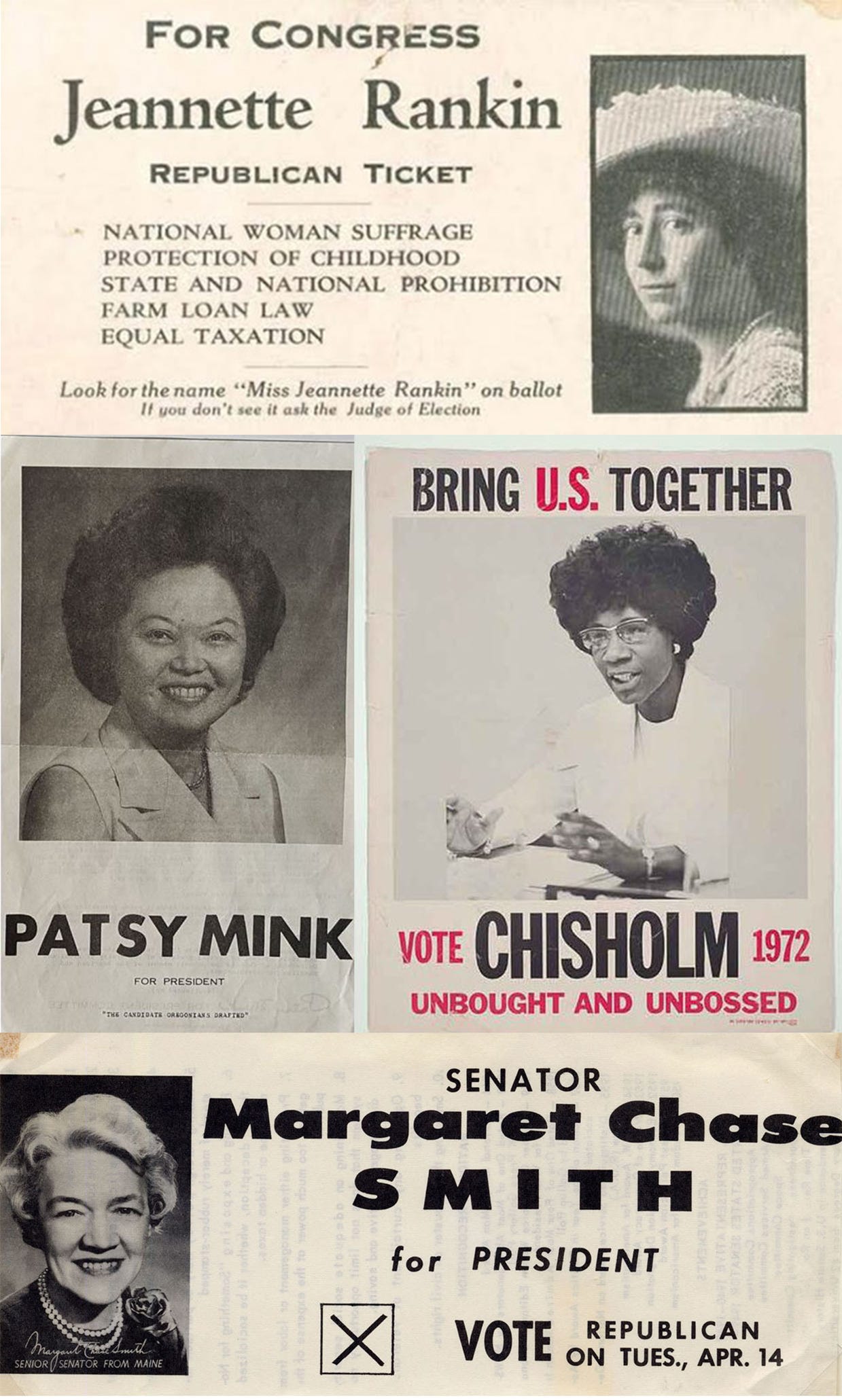
Campaign material for Jeannette Rankin, the first women elected to Congress; and presidential candidates Patsy Mink; Shirley Chisholm; and Margaret Chase Smith.
Today, female politicians use brand identities that break the mold. It’s interesting to track campaign logos for female presidential candidates from Hillary Clinton in 2008 to 2016, and then to the multiple women who ran for president in 2020. As more women run for president, their logos have gotten more colorful and expressive and they stand apart from the logos of the male candidates they ran against.

Clinton’s 2016 logo wasn’t specifically designed with gender top of mind, Pentagram partner Michael Bierut told Yello, but it “was supposed to be able to be dressed any way you wanted for any occasion.” Its simplicity allowed it to be easily modified, including for a special “19th” edition to commemorate the passage of the 19th Amendment.
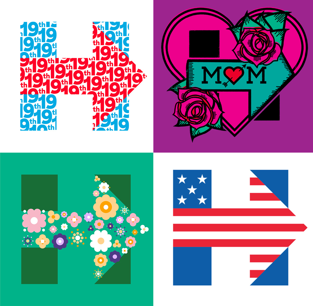
Credit: Hillary for America Design
By 2020, more female candidates ran for president than ever before, each with her own unique visual identity. Sen. Kirsten Gillibrand of New York and author Marianne Williamson even used pink, a color not typically seen in politics outside activism.
“It was Sen. Gillibrand herself who was the main advocate for pink,” said Jessica Teal, the principal for Teal Media, which designed Gillibrand’s identity. “We of course explored other accent colors with that pink, but pink was definitely going to be the central color in the palette.” Gillibrand wanted to use the color because the concept of “running as a women for women” was a central theme of her candidacy.
Other than Clinton, the only other times a woman’s name has been included on a major party nominee’s logo was when Geraldine Ferraro, Sarah Palin, and now Kamala Harris were added to their respective tickets.
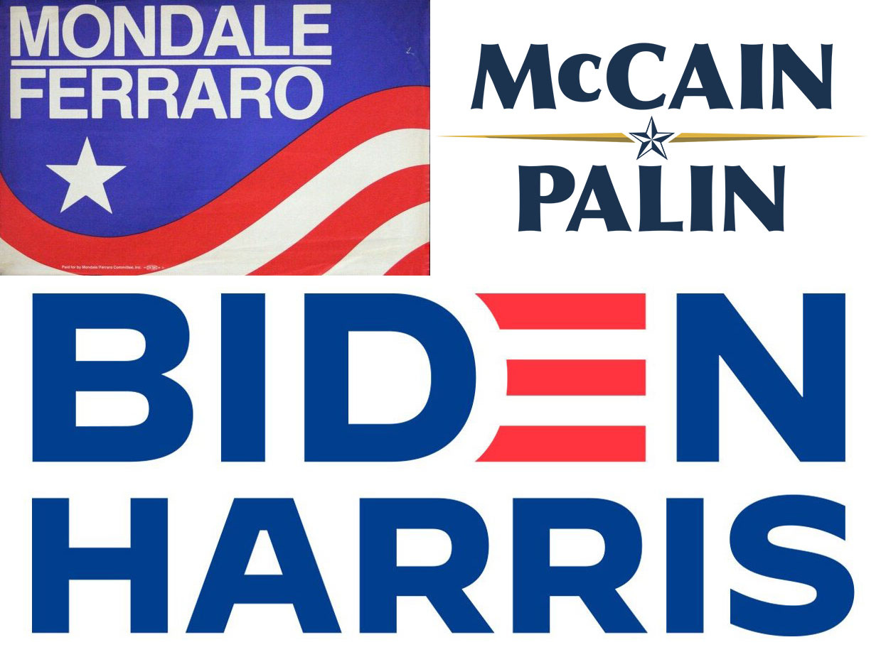
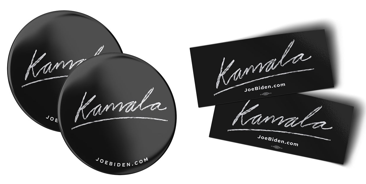
When it comes to running mates in logos, their names are subsumed in the nominee’s font choice and color palette. The Biden campaign, though, carved out space for Harris to have her own distinct visual presence, through buttons, shirts, bags, and bumper stickers with a “Kamala” signature on sale in their campaign shop.
Teal said she believes female candidates can use design to get noticed in a space where they’re all too often overlooked or undervalued, and there’s a reason women are often visual trendsetters.
“I do think there is a connection between the female candidates who are the ones taking the lead and taking more risks when it comes to brand and visual design,” she said. “You have to take more risks and decide to make bolder moves because you’re up against a lot more than your traditional candidates, especially your white male counterparts.”
“To get noticed and heard and most importantly, taken seriously, you have to show you’re a force to be reckoned with,” she said.
Top image credit: Virginia Museum of History & Culture