
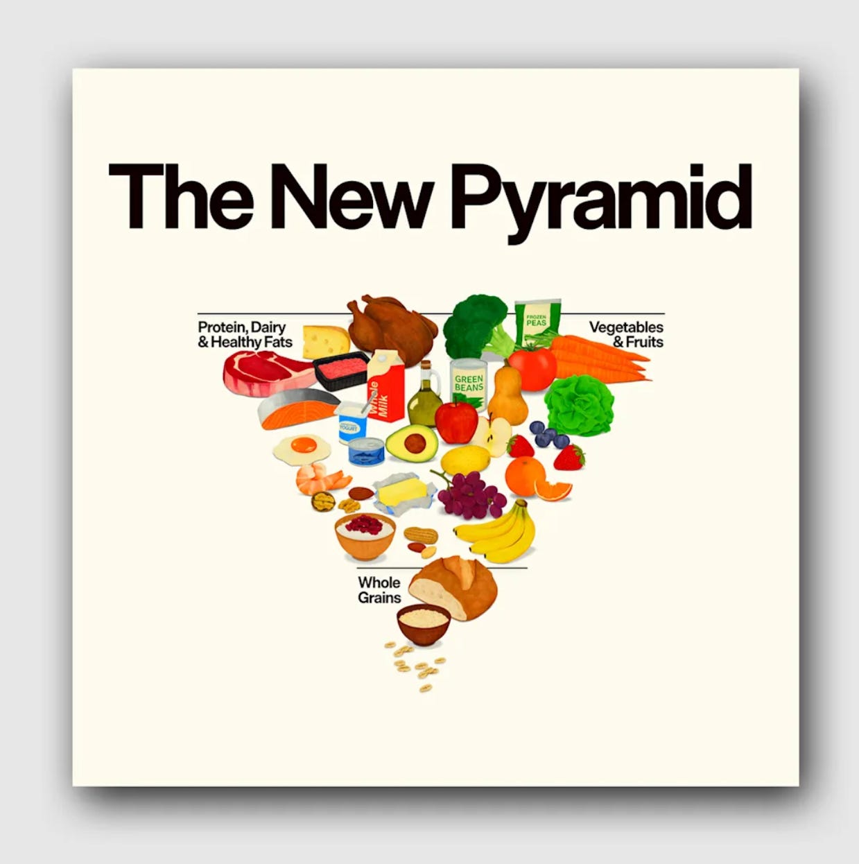
The new Trump food pyramid is upside-down
Plus: Trump’s new Smithsonian display removes references to his impeachments

President Donald Trump’s administration has introduced a new, inverted food pyramid with fewer food groups.
The new three-section food pyramid is part of the administration’s new nutrition policy announced last Wednesday, which encourages Americans to eat whole or minimally processed foods, which it calls “real food,” and has been a longtime interest of Health and Human Services Secretary Robert F. Kennedy Jr.
Kennedy’s policy interests also shine through on the initiative’s new website, realfood dot gov, which features copy that reads like a MAHA manifesto. The National Design Studio gave the website a minimalist design that takes cues from consumer companies like Chobani and Sweetgreen, with clean, sans serif typefaces and playful illustrations.
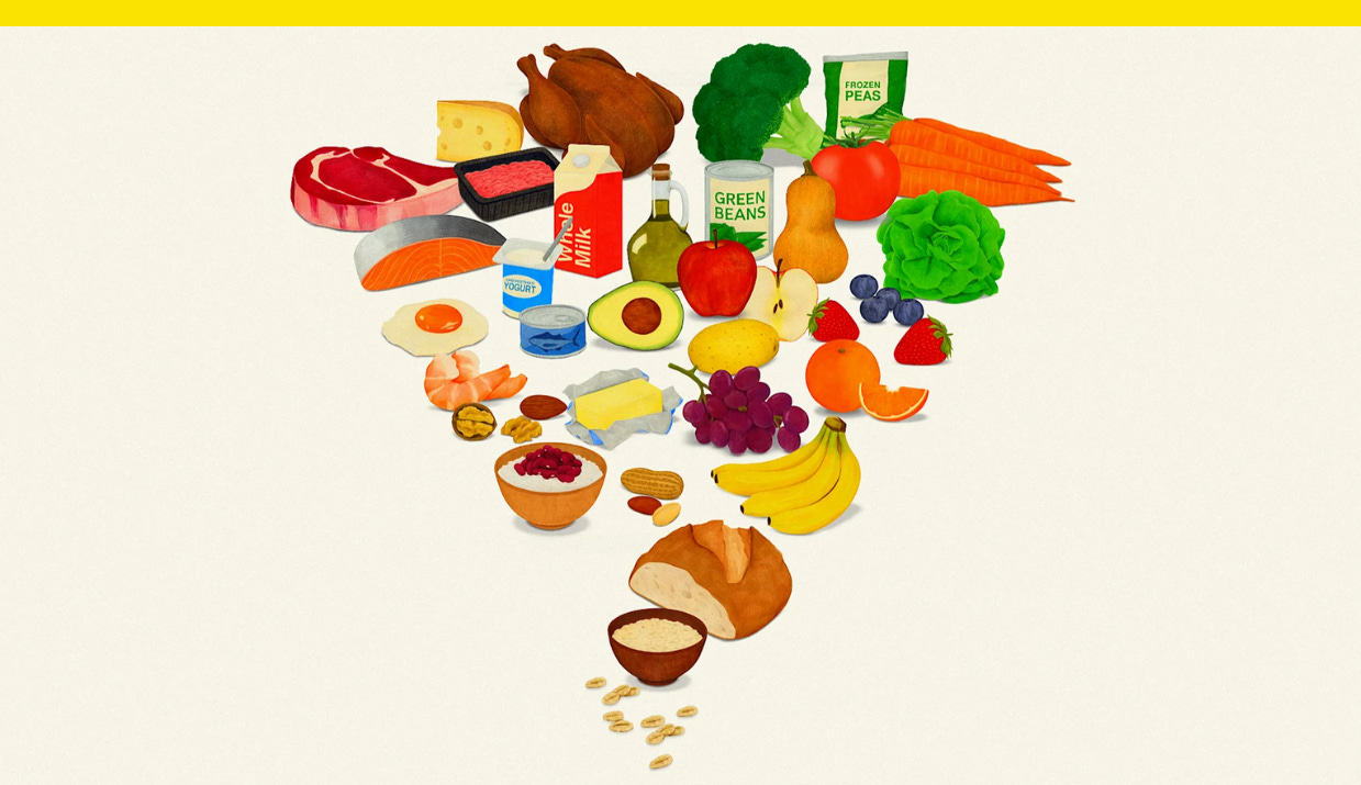
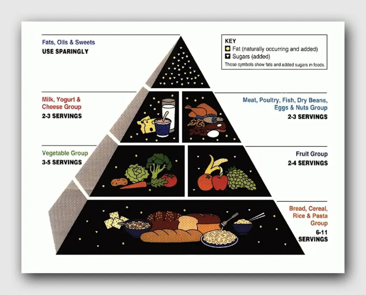
The original pyramid, released by the U.S. Department of Agriculture, or USDA, in 1992, featured six sections. The new version is flipped and has three: protein, dairy, and healthy fats; vegetables and fruits; and whole grains. Sweets have been removed.
“It’s upside down, a lot of people would say,” Kennedy said at a White House press conference. “But it was actually upside down before, and we just righted it.”
The new pyramid graphic makes do with fewer groups by combining categories from the original food pyramid. Whole grains, once included in the base of the original pyramid, now make up the smallest portion of the new version, while old categories — fruits and vegetables, and meat and dairy — are combined.
The graphic is colorful, with eye-catching, painterly illustrations of example foods that might appear in a 1970s health food magazine. But the infographic is less successful as a piece of communication design. It’s not clear how literally the placement of foods within the graphic is meant to be. And although supporting documents about the new pyramid offer specific guidelines, like suggesting that saturated fat consumption should not exceed 10% of total daily calories, the new pyramid does not communicate specifics itself.
Users can hover over each section of the pyramid for additional information, but it doesn’t provide much. The pyramid doesn’t indicate how many servings of dairy or healthy fats you should have. And to determine your protein target, realfood dot gov asks Americans to take on the additional step of first calculating their weight in kilograms. (Quite frankly, a lot of us don’t know what that is.)
The federal government’s new guidance, which gets updated every five years, also removes specific recommendations about daily alcohol consumption and only suggests to drink less. In addition, it calls for more protein and full-fat dairy.
Government designers have worked to improve upon the food pyramid before. In 2005, an updated graphic made the food segments slice upward instead of dividing the shape horizontally. In 2011, they ditched the pyramid altogether for MyPlate, a skeuomorphic representation of dietary guidelines that used a circular graphic to represent portions as they would appear on a plate.
Reaction to the new pyramid has been mixed. The American Heart Association, for example, welcomed “the emphasis on increasing intake of vegetables, fruits, and whole grains while limiting consumption of added sugars, refined grains, highly processed foods, saturated fats, and sugary drinks.”
But the group also said it was concerned its recommendations about salt and red meat consumption “could inadvertently lead consumers to exceed recommended limits for sodium and saturated fats, which are primary drivers of cardiovascular disease.”
The new 2026 pyramid represents the Trump administration’s “Make America Healthy Again” priorities under Kennedy’s Health Department and came two days after the agency cut its number of recommended vaccines for children, worrying medical groups.
The new recommendations are not meant to be a strict diet, according to its website, but “a flexible framework meant to guide better choices.”
It’s minimalist, for sure, but whether Americans find it a useful guide to healthy living remains to be seen.
This story was first published in Fast Company.
Iran got a new flag emoji. At least on X.
The new emoji is based on a historic flag used by some opposition groups and at protests against the Iranian regime.
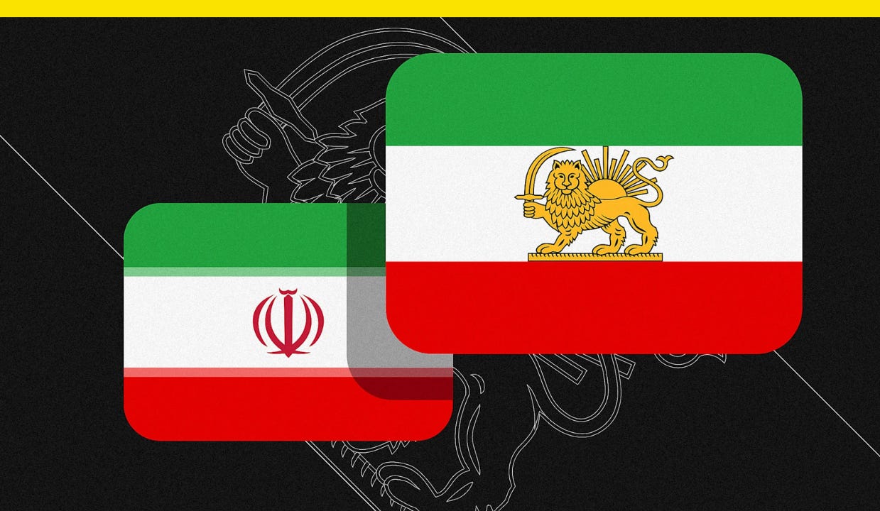
Iran hasn’t changed its flag, but the emoji for it has changed on the social network previously known as Twitter.
Iran’s tricolor flag features green, white, and red horizontal stripes, with the country’s national emblem displayed in its center white stripe. But some opposition groups use a historical flag that instead shows a golden lion holding a sword in front of a sun.
Since ongoing anti-government demonstrations erupted in Iran in December, that lion-and-sun version of the flag has been used as a symbol of protest around the world, including in demonstrations over the weekend in Los Angeles and London, where one protester held the flag at the Iranian embassy after taking down the national flag. Now it’s also on X.
After an X user asked the site’s head of product, Nikita Bier, to update the flag last Thursday, Bier responded, “Give me a few hours.” The updated emoji appeared first on the web browser version of the site before rolling out to iOS devices.
Other emoji vendors like Google and Facebook still use the standard emoji of Iran’s national flag, so the lion-and-sun flag isn’t available on most platforms, and it’s also not available for X on Android devices.
Trump’s new Smithsonian display removes references to his impeachments
In my opinion, his old portrait for the exhibition was better.
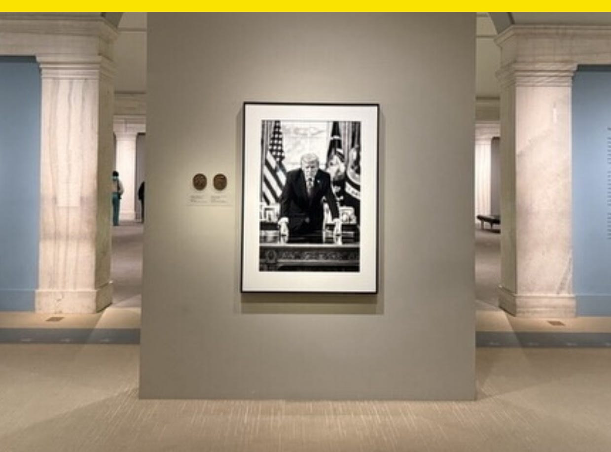
The Smithsonian’s National Portrait Gallery has a new portrait of Trump in its excellent, permanent America’s Presidents exhibition, but the placard leaves out some very recent history.
The new black-and-white portrait was taken in the Oval Office and shot by White House photographer Daniel Torok, who also took Trump’s mugshot-inspired official White House portrait.
The placard notes things like Trump’s MAGA slogan, his first-term Supreme Court nominees, and the COVID-19 vaccine, which was developed under his administration’s public-private partnership Operation Warp Speed.
But it leaves out one sentence that previously appeared in the original version: “Impeached twice, on charges of abuse of power and incitement of insurrection after supporters attacked the U.S. Capitol on January 6, 2021, he was acquitted by the Senate in both trials.”
Trump’s pose in the new portrait — with his fists on the desk — at first glance to me makes him look like he’s using a walker, and in my opinion, his old portrait for the exhibition was better. Shot by Washington Post photographer Matt McClain, the old portrait was dramatic and captured Trump’s unmistakable mop and signature red tie.
The new portrait and placard were installed following a December letter from the White House to the Smithsonian requesting documentation of its exhibitions. That documentation was due today to comply with an earlier executive order that asked the institution to “remove improper ideology.”
For the National Portrait Gallery, “improper ideology” would seem now to extend to inconvenient historical facts for the president.
Have you seen this?
Trump says his power is only constrained by his morality. Here’s something you don’t want to hear from a convicted felon who was accused of paying a porn star hush money in connection to an alleged affair when his third wife was pregnant with their only child. [Whig by Hunter Schwarz]
From Airbnb to the White House: Joe Gebbia is reshaping the government in Trump’s image. “You can’t talk about people losing their Medicare and have a slick website,” says Paula Scher. “It just doesn’t go.” [Fast Company]
The MAGAfication of Norman Rockwell. Over the past several months, the U.S. Department of Homeland Security has been lawlessly appropriating Rockwell’s Leave It to Beaver-esque paintings to promote its Gestapo tactics. [The Bulwark]
ICE’s new-age propaganda. Traditional military calls to action, sometimes combined with white-supremacist tropes, are being deployed in the many memes and A.I.-generated images that the DHS and the White House post daily to TikTok, X, and Instagram. [The New Yorker]
Trump plans to make the White House ballroom addition as tall as the White House itself. Architect Shalom Barnes told the National Capital Planning Commission the project’s footprint was estimated to be roughly half the size that the administration has described since announcing the project in July. [The Washington Post]

Huh? That’s all I got.