
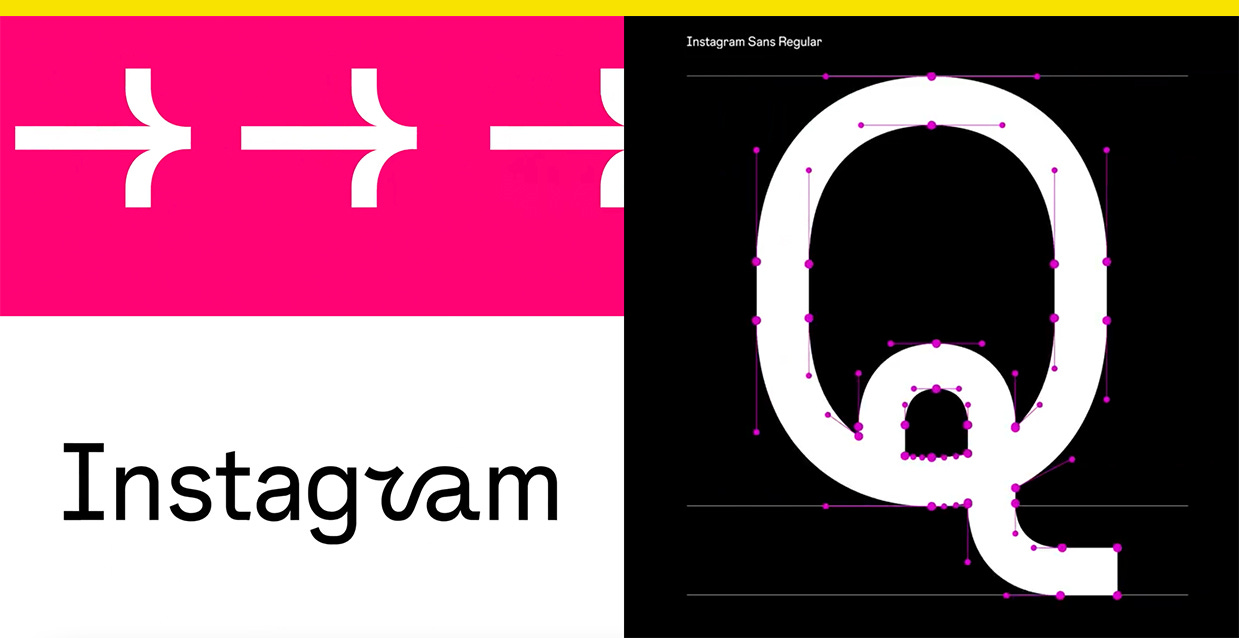
The new Instagram Sans font is inspired by the app's logo evolution
They're trying to make "squircle" happen

It’s not just you, the Instagram app icon really is brighter.
Instagram rolled out a visual rebrand this week that includes a brighter gradient, new layouts, and Instagram Sans, a custom typeface with details inspired by its logo history.

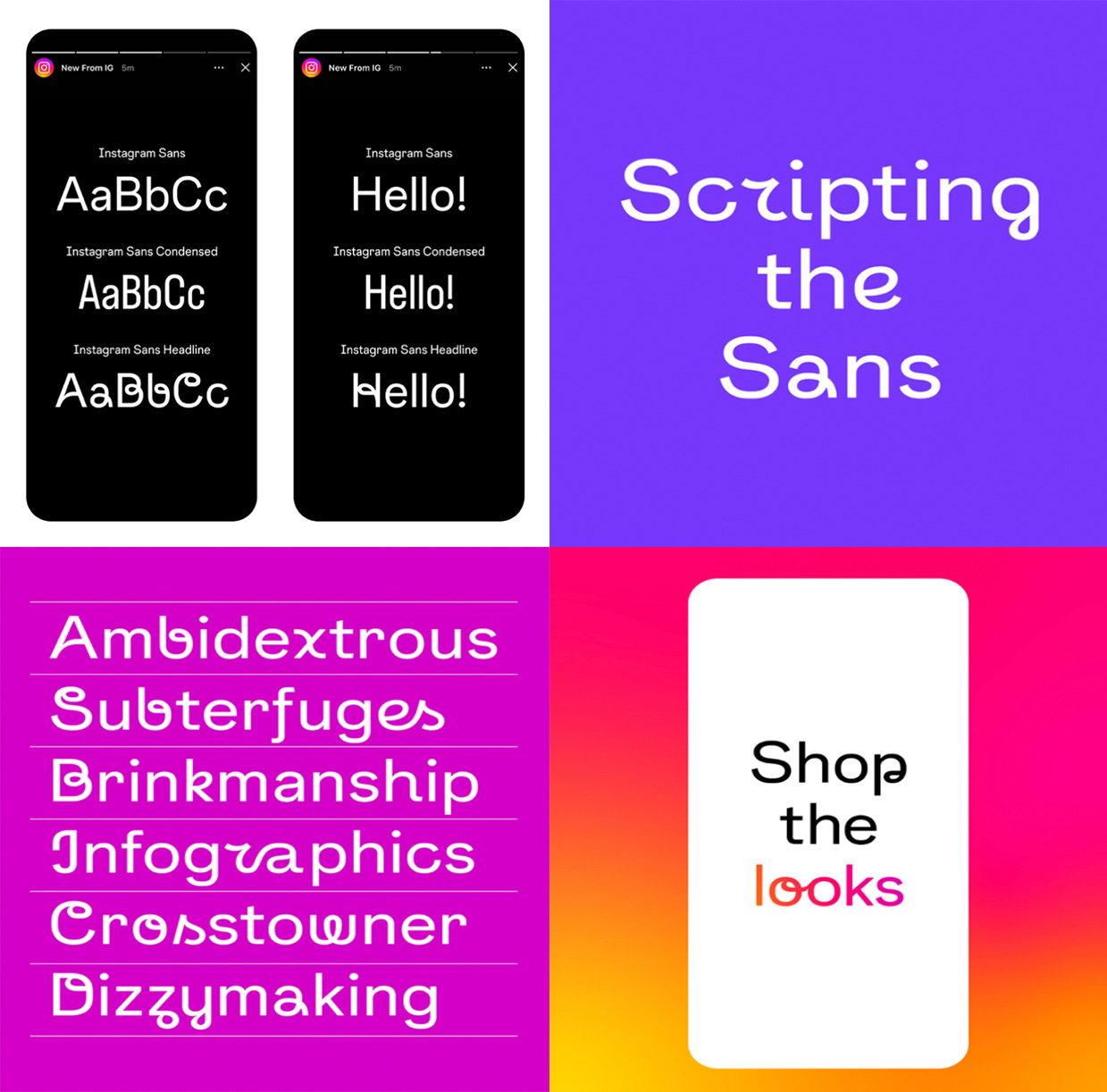
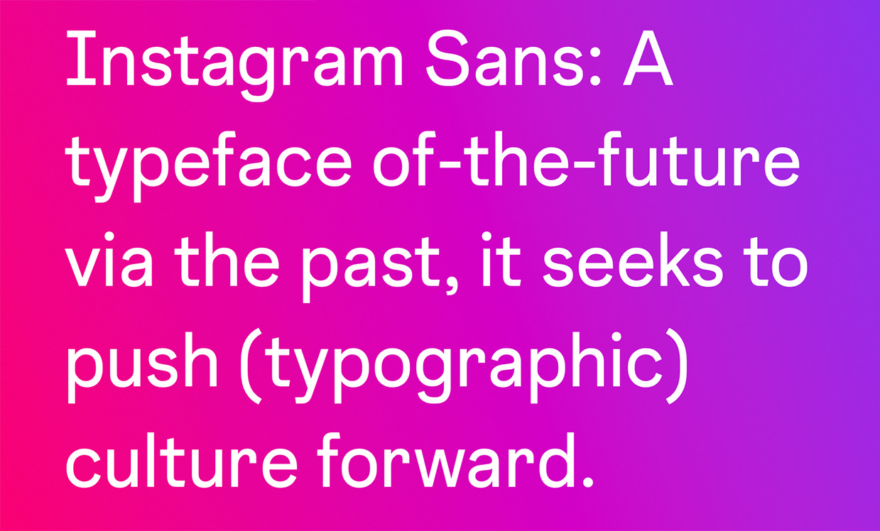
Meta described Instagram Sans as a contemporary remix of grotesque and geometric styles. It comes in regular, bold, light, medium, condensed, and condensed bold, but its personality is most visible in script and script bold.
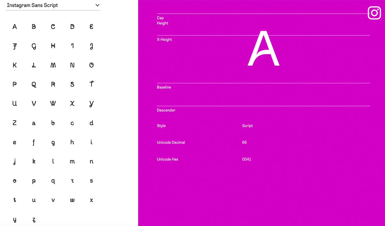
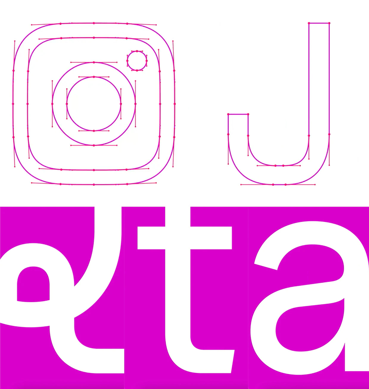
In the letterform for the Instagram Sans script fonts, you can see the inspiration from Instagram’s logos, with a playful sans serif that looks like it was hammered out of the script Instagram logotype.
Instagram creative Christy Silva said during an Instagram Live that the script letters “are supposed to be peppered in inside Instagram Sans Regular.”
“I wanted something that felt very eccentric and very unique,” she said. “The idea here is we’re adding these spark moments.”
The titles, punctuation marks, and rounded parts of the letterform are based on Instagram’s rounded square glyph logo.
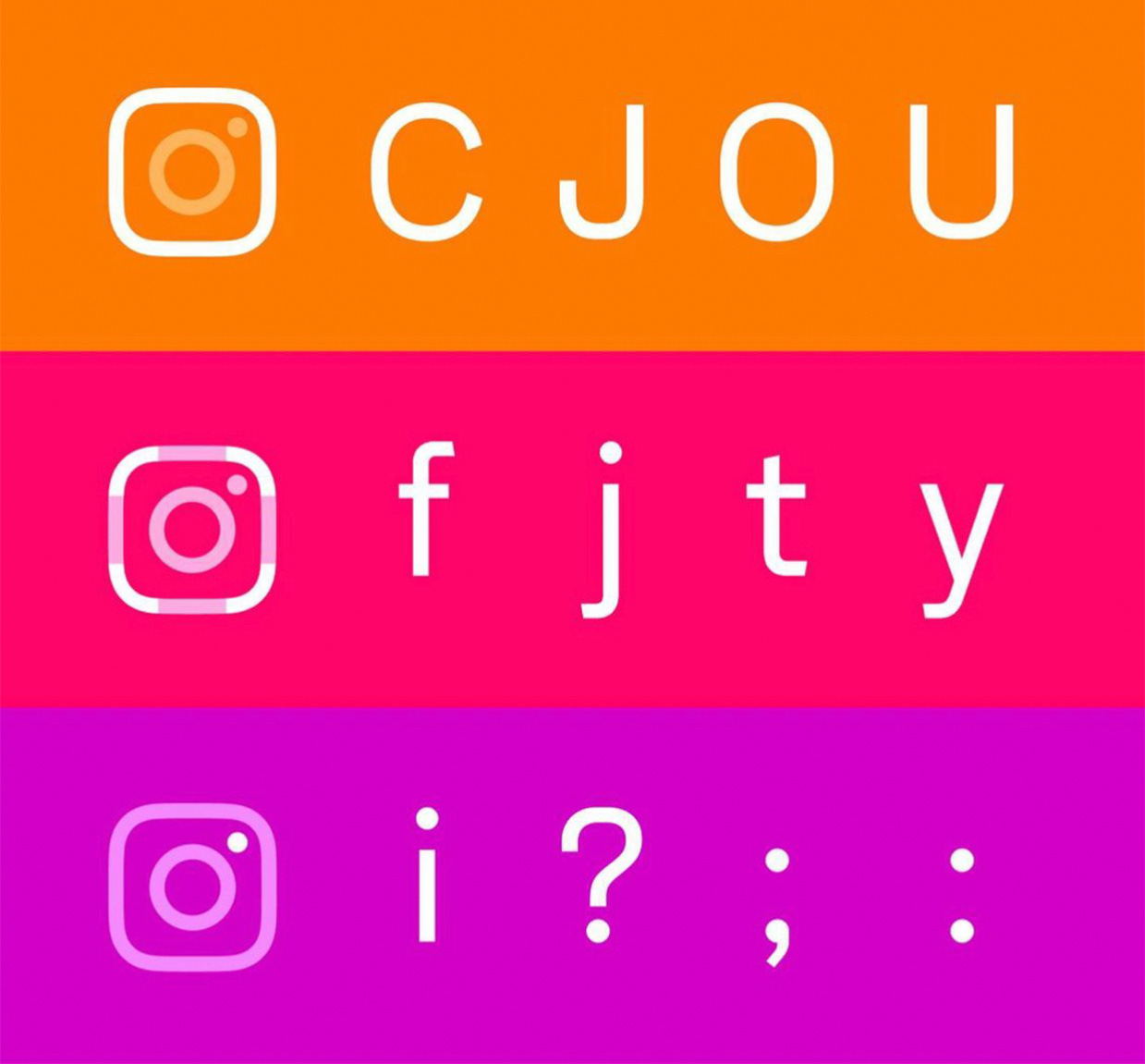
Meta calls the in-between moment where circle meets square a “squircle,” and it appears throughout the fonts, as does a teardrop motif, like in the interior of the lowercase “a.”
Instagram Sans Condensed was designed specifically for being used in-app, said Colophon Foundry, which collaborated on the typeface. It appears in Create mode as the first font option when drafting Stories, as well as in stickers.
Instagram Sans is available in languages including Korean and Arabic, and a team of 40 typographers and language experts audited the fonts to make sure they worked in different alphabets, according to It’s Nice That. Meta said the typeface was designed with accessibility and global scripts at its core “to express a range of styles in any language.”
Silva, the Instagram creative, said the new typeface was central to the rebrand.
“A lot of the assets that we had been using were never really considered to be these hard-working tools for us. We immediately knew that typography is a brand asset that users interact with the most,” she said. “Type is that one constant.”

The rebrand comes at a crucial moment for Instagram and parent company Meta. Its stock fell a record 26% in a single day in February, which it attributed to slow revenue growth forecasts and Apple privacy changes. Young people would rather be on TikTok, Snapchat, or YouTube, recent surveys from Piper Sandler and Pew have shown, and Facebook had the second-lowest favorable rating among 12 major consumer tech and social media companies in last year’s Verge Tech Survey. This company is in dire need of a facelift.
In other Meta news, the company plans to offer new data about how political ads are targeted in its public ad library this year ahead of the midterms.
“Instead of analyzing how an ad was delivered by Facebook, it's really going and looking at an advertiser strategy for what they were trying to do,” Meta vice president of business integrity Jeff King told Reuters.
Subscribe to 𝘠𝘌𝘓𝘓𝘖. You’ll never look at politics the same way again:
Update: This post was updated on Jun 5, 2022 with additional images and information from Colophon Foundry and Meta.