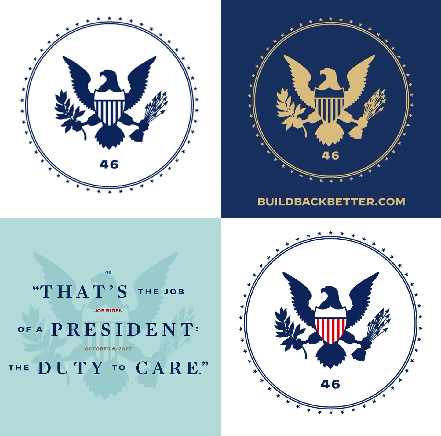
The Biden presidential transition logo is here
This is no ordinary rebrand, this is where design meets democracy in action

When Joe Biden went from being the Democratic presidential nominee to the American president-elect, his brand needs changed.
The election was over, and the loud, exciting visual branding Biden’s campaign used to encourage his supporters to donate, volunteer, and vote had served its purpose. Biden’s visual identity now had to become more subdued and refined, moving away from campaign mode to governing mode.
Interim visual identities have become standard operating procedure for winning candidates. They’re no longer speaking behind a lectern with their campaign logo, but they also can’t use the Seal of the President of the United States yet, so this transitional branding bridges the gap.
The Biden transition is using a seal with a “46” and eagle icon inspired by the official presidential seal. The 46 numerals are set in Decimal, the Biden campaign’s sans-serif typeface from Hoefler&Co. The typeface was inspired by vintage wristwatch type, which means it’s especially well suited to be used inside a small circular seal.

Past Presidents-elect George W. Bush and Barack Obama both used eagles in their transitional logos, while President-elect Donald Trump used a White House icon back in 2016.
Interestingly, Bush, Obama, and Trump all used bold sans-serif type in their campaign logos as candidates, but then switched to serif fonts for their more formal transition logos. That sets Biden apart typographically from his predecessors since he stuck with Decimal as his primary transition typeface.
The Biden team has unveiled the transition website buildbackbetter.com. The URL is a reference to Biden’s “Build Back Better” campaign slogan and follows the precedent of similarly titled transition sites, like Trump’s greatagain.gov and Obama’s change.gov.
The site lays out Biden’s future top priorities as president (1. Covid-19, 2. economic recovery, 3. racial equity, and 4. climate change) and includes news updates from the transition team. It’s a White House website-in-waiting.
The site is designed accessibly, with high-contrast color and large font-size options for readability. The site uses Decimal in bold, book, and semibold, and the serif Mercury, another Hoefler&Co. font used by the Biden campaign, in bold, book, and medium. The transition team did not respond to a request for comment about who designed the site or identity, but Hoefler&Co. said it was Wide Eye, the creative agency behind presidential logos for Vice President-elect Kamala Harris and Sen. Bernie Sanders founded by creative director Ben Ostrower.
This transition site is a lot more sober than the campaign site. You can spot the differences in the “About” sections of the two sites; candidate Biden’s site called him “Joe,” while his transition site calls him “Joe Biden, the President-Elect.”
The campaign site is more playful — There’s a train! And a childhood photo! — while the transition site is more in line with what you would expect for a guy who just announced a Covid-19 advisory board and who’s fielding phone calls from world leaders like Canadian Prime Minister Justin Trudeau. There’s a seriousness that’s conveyed visually.
Subscribe to Yello for the latest news on the culture, branding, and visual rhetoric of politics, delivered each week:
The peaceful transfer of power that’s been enjoyed in the United States is made possible because of Constitutional guidelines, but also because of ceremony. The president-elect receives congratulatory calls from allies and well wishes from past presidents, and we mark traditional rites and rituals of American democracy, like the losing candidate’s concession speech and the inauguration. The temporary brand refresh that a winning candidate gets before becoming the next POTUS has become an important visual ritual itself.
Biden’s transition is, of course, no ordinary transition. It’s being attacked by an incumbent who has not yet conceded the race despite losing and who tweets debunked conspiracy theories about widespread voter fraud. Still, Biden is moving forward with planning for his future administration, and his new logo and brand identity is a visual marker of that. This is no ordinary rebrand, this is where design meets democracy in action.
Update: This article has been updated with information about Wide Eye, the creative agency behind the Biden transition branding and website.


