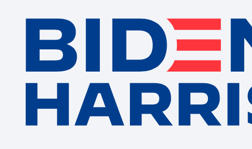
The Biden-Harris logo is here
The Biden rebrand is complete
Note: This story was first published in the August 11, 2020 issue of Yello’s newsletter. Subscribe for the latest in visual politics delivered each week:
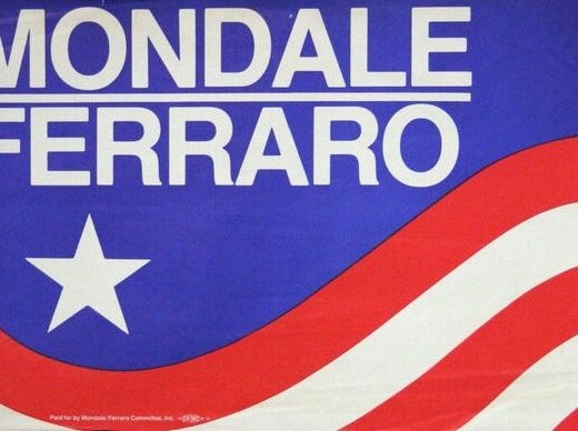
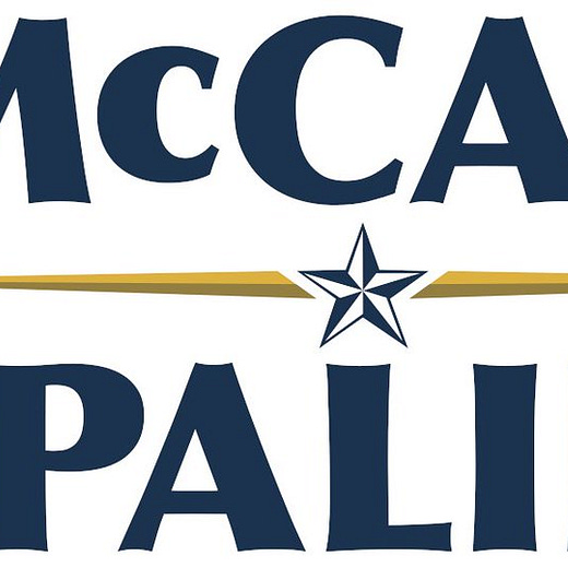
Former Vice President Joe Biden announced Sen. Kamala Harris (D-Calif.) as his running mate Tuesday afternoon and his campaign unveiled a new logo that includes Harris’ name. Harris is only the fourth woman to be included in a major party presidential nominee’s campaign logo:
The new Biden logo uses the sans-serif typeface Decimal, unlike the previous logo Biden used during the primaries which was set in the sharper-edged sans serif Brother 1816. Decimal was released in 2019 by Hoefler & Co., the type foundry behind former President Obama’s campaign typeface Gotham. Decimal was inspired by vintage watch lettering and makes the new logo appear sturdier. Biden senior creative adviser Robyn Kanner told Yello in July the campaign decided to introduce it into its visual identity because it was “true as time.”
Kanner said the new logo was designed to retain the style of the original 2020 logo with strengthening its presence.
“There's no malarkey in this logo — it's clear and represents an America that is strong, bold, and unified,” Kanner said in an email statement. “Joe Biden knows that governing partners must work in lock-step, as he did with President Obama, and the visual alignment of Biden and Harris in the logo helps convey the powerful impact of a strong partnership and unified America. The new logo uses the red stripes from the original logo to maintain the roots of our campaigns's visual identity but uses our new Decimal typeface and Senator Harris' name to ultimately strengthen its presence what our campaign offers Americans: a historical presidential ticket that is ready to unify the country and win the battle for the soul of the nation.”
The designer behind Harris’ 2020 primary logo, Ben Ostrower, told Yello the updated logo is “a logical and elegant evolution of the brand.”
“Decimal is a gorgeous typeface and a perfect fit for the Biden campaign,” he said.

Biden’s general election logo rollout went smoother than President Trump’s did in 2016. After Mike Pence was announced as Trump’s running mate, the campaign introduced a logo that depicted a T inside a P and was considered suggestive and promptly pulled. It was replaced with a new logo that spelled both candidates’ last names out.


