


The Biden-Harris 2024 reelection logo is here
How Biden's campaign rebranded for the reelect
Hello, in this issue we’ll look at the new design elements brought in for Biden’s 2024 campaign rebrand. Scroll to the end to see what the campaign is doing with its most experimental accounts. — Hunter
Welcome to this week’s free issue of 𝘠𝘌𝘓𝘓𝘖, a newsletter about politics, marketing, art, and design. 𝘠𝘌𝘓𝘓𝘖 is supported by readers like you. If you want to support my work and get access to exclusive stories, upgrade your subscription now to see more:
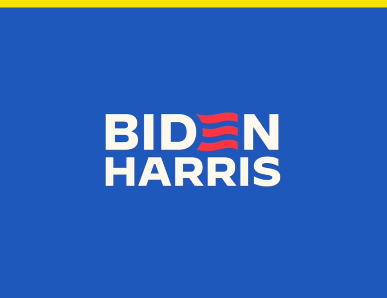
President Joe Biden is officially running for reelection with a new logo that shows the red stripe E in his last name now waving like a flag. Say hello to Biden ‘24.
Biden’s announcement video assumes former President Donald Trump or at least an heir to MAGAism is on track to challenge him next year, but how do you rebrand for a sequel voters aren’t particularly interested in? Polling has found voters are unenthusiastic about the prospect of Biden v. Trump II, but the Biden 2024 identity sticks to presidential rebrand fundamentals: keep what voters know but update it enough to stay current.
The Biden campaign didn’t immediately make creative director Robyn Kanner available for comment, but we can assume there were no mood boards used in the making of this rebrand. Kanner told the New York Times in a story published earlier this month that she designs for “worlds” instead of “mood boards.”
“A mood board is an idea,” Kanner said. “A world is a place that triggers all my senses.”

The Biden campaign’s 2020 world introduced gradients into political design, but across Biden’s 2024 launch day digital assets there was only one piece of creative I came across that used a gradient. The ad, running on Meta, used a classic orange-to-purple gradient and the copy was an apology. “You know I hate to ask, but a donation would mean a lot.”
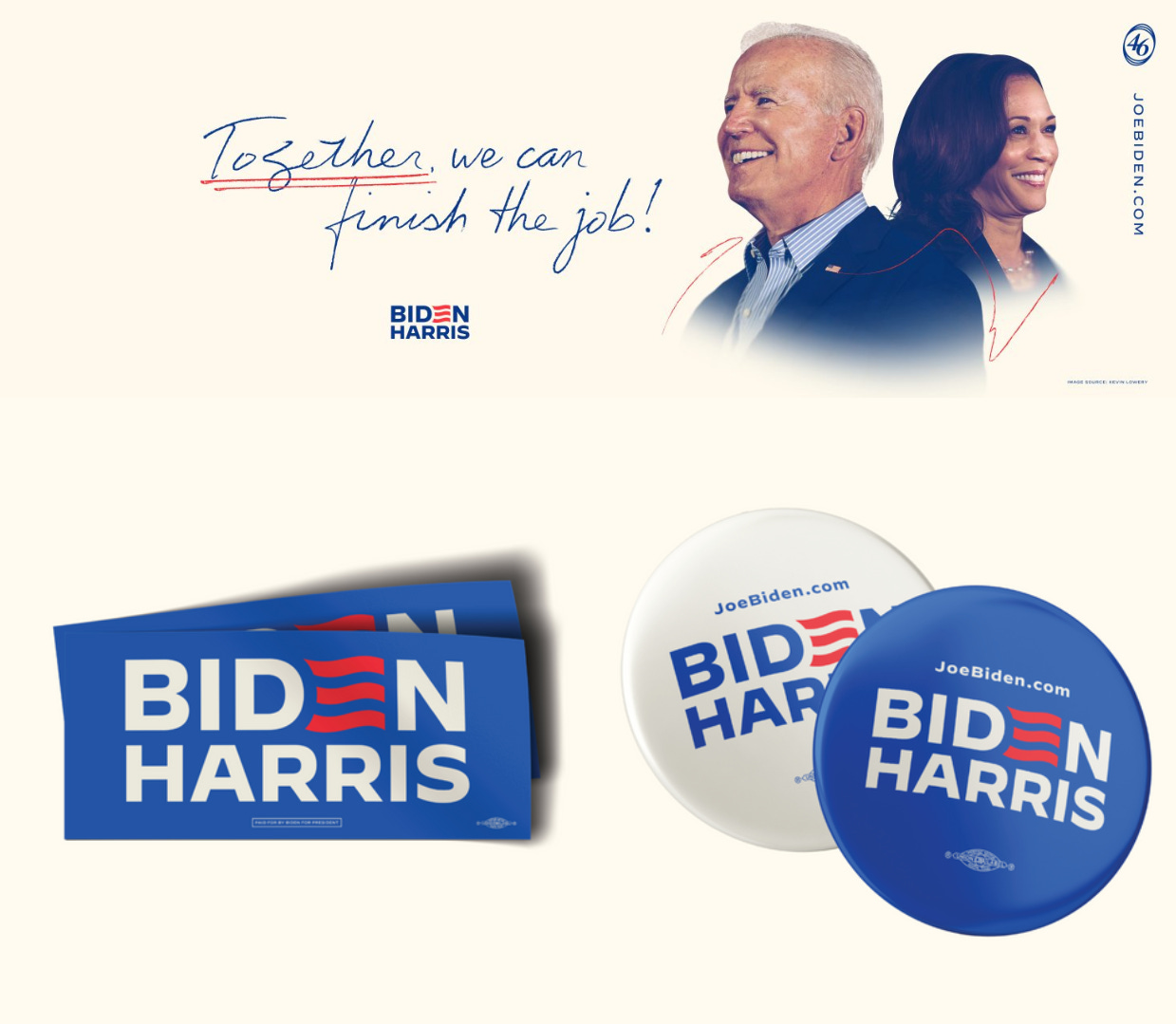
In lieu of gradients, Biden’s 2024 identity introduces an off-white creme to compliment the campaign’s red and blue. A similar color combination was previously used in the Philadelphia 76ers 2019-20 City Edition uniforms, and it provides a way to “world build” in traditional American colors distinct from the Trump campaign aesthetic.

Another new element in Biden’s campaign identity is handwritten scribbles and notes. The effect is used to jazz up graphics with underlines and circles for emphasis, and slogans are written in a controlled but relaxed cursive you’d expect from the husband of an English professor who signs bills into law for a living.
Biden’s first Instagram post of the campaign was the new logo with a call to action to join the campaign’s text list, and a caption positioning the campaign as a fight against “MAGA extremism.” In a launch email to supporters, Biden reiterated the message of his launch video: “When I ran in 2020, I said we were in a battle for the soul of America. We still are.”

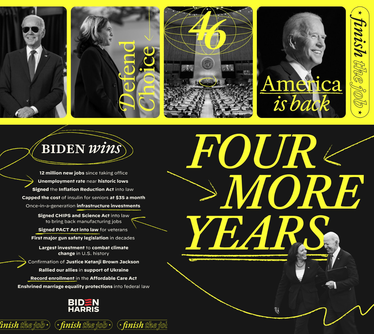
The campaign’s Team Joe and Vote Joe accounts posted the most experimental graphics in 2020, but in their first posts back, the formerly gradient-heavy accounts have new yellow, black, and white graphics. The color scheme is giving Clinton 2016 campaign opposition branding, but so far the accounts are promoting Biden’s first-term record and making the case why he deserves a second.
Make no mistake, this is the Biden-Harris reelection campaign. The campaign website’s favicon isn’t the new waving Biden E, but a BH monogram. Vice President Kamala Harris appears 12 times in the reelection announcement video and in 57% of the campaign’s digital ads with photos now running on Meta platforms. While some pundits cast Harris as a drag on the ticket, Biden’s campaign launch treats her as one of its greatest assets.
The campaign’s online storefront is selling items with the new logo, but the merch that received the most attention is the “Dark T-shirt” and “Dark Roast Mug” showing Biden’s “Dark Brandon” character with glowing red eyes. “Best worn while vanquishing Malarkey,” the shop page reads.

Biden’s 2020 campaign world was lit by gradients that felt like the future and looked like candy. So far, his 2024 campaign world isn’t as sugary. The updated color scheme feels classic and the creme carries the weight of parchment or official White House letterhead. The handwritten marks aren’t doodles you’d find on the back of a napkin, they’re notes from the president.

The challenge in any reelection campaign is to convince voters progress is being made but the job isn’t done, and Biden’s visual identity is built to communicate things like his White House accomplishments and record on infrastructure. While next year’s race could become a dreaded rerun of the last presidential campaign, Biden’s visual branding is preparing at least for a world that looks different.

Have you seen this?
🔒 Biden and Trump are taking two different approaches to social media. Welcome to a new era of social media where influencers deinfluence, verification is paid, and campaigns no longer rely on Facebook like they used to. [𝘠𝘌𝘓𝘓𝘖]
Droga5 takes us on a hyperlink trip in The New York Times campaign. Through a series of connected objects, the ads replicate a reader’s journey from one article to the next, and the next, and the next... [It’s Nice That]
💌 There are new U.S. Postal Service stamps in honor of Roy Lichtenstein’s 100th birthday. Lichtenstein’s widow Dorothy said in a statement, “I have always been a fan of the Post Office. I think it's an amazing organization. It gets mail to everywhere, not just in this country, but around the world. I think it's an honor and more people will find out about Roy. I think he would have really loved it.” [U.S. Postal Service]

Guess which swing states Biden and the Democrats have first reserved ad time in? Arizona, Michigan, Nevada, Pennsylvania, and Wisconsin, per AdImpact Politics.
Like what you see?
Subscribe for more: