
Presidential campaign logos: Where are they now?

Former presidential candidates are pivoting to the next thing. They’re launching PACs, starting nonprofits, and running for Senate, and they have new logos to match. While some former candidates stuck with variations of the logos they used in their presidential runs, others are going with visual identities that are entirely new.
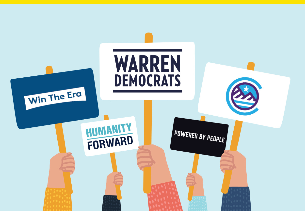
Here’s what 12 former candidates and their logos are up to now:
Elizabeth Warren

In an email to supporters last month, Sen. Elizabeth Warren (D-Mass.) announced “Warren Democrats” as her Senate reelection campaign. Warren isn’t up for reelection until 2024, but she plans to use her campaign to back other Democratic candidates this year and mobilize support for them. The new logo takes Warren’s presidential logo and expands it to include “Democrats.”
Pete Buttigieg
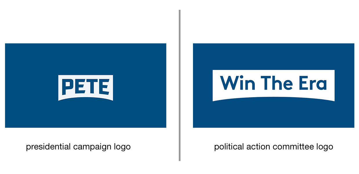
Former South Bend, Ind., Mayor Pete Buttigieg’s post-campaign plans include his new Win The Era PAC and an associated nonprofit group, per the New York Times. The PAC is expected to focus on backing candidates who represent “generational change” to create a deeper bench of future Democratic talent, as well as promote issues including climate change and cybersecurity. The PAC logo uses the Pete logo’s bridge mark to house “Win The Era,” but it doesn’t keep the customized Industry typeface that was used to spell out “Pete.”
Andrew Yang
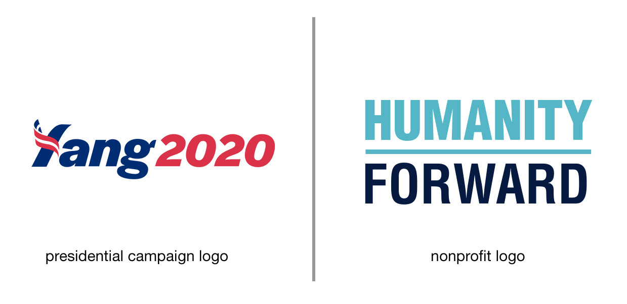
Andrew Yang’s new nonprofit Humanity Forward pushes for issues like universal basic income and data protection. Last month, the group announced a coronavirus relief fund that will give away at least $1 million to the “working poor,” Yang said. The Humanity Forward logo is a departure from Yang’s campaign logo in color, typeface, and style, but then again, that logo was never really the most defining visual identifier for the Yang campaign anyways. Leave that to his “MATH” hats, American flag scarf, and that little cartoon Yang avatar.
Beto O’Rourke

Former Rep. Beto O’Rourke (D-Texas) launched a Texas-focused PAC called Powered By People last year. The PAC’s goals include building a Democratic majority in the Texas House, flipping six U.S. House seats in the state, and beating Republican Sen. John Cornyn and President Trump. The PAC instituted some self-imposed restrictions, according to the Texas Tribune, like capping individual donations and not taking money from corporations, and it will focus on organizing for candidates rather than dolling out money. O’Rourke stuck with a black-and-white color palette for his Senate, presidential, and PAC logos. Rather than use the same Abolition typeface that was used in his past logos, though, Powered By People uses a typeface called Prohibition. It’s slightly wider but very similar, and both typefaces were made by the same design studio, Fort Foundry.
John Hickenlooper
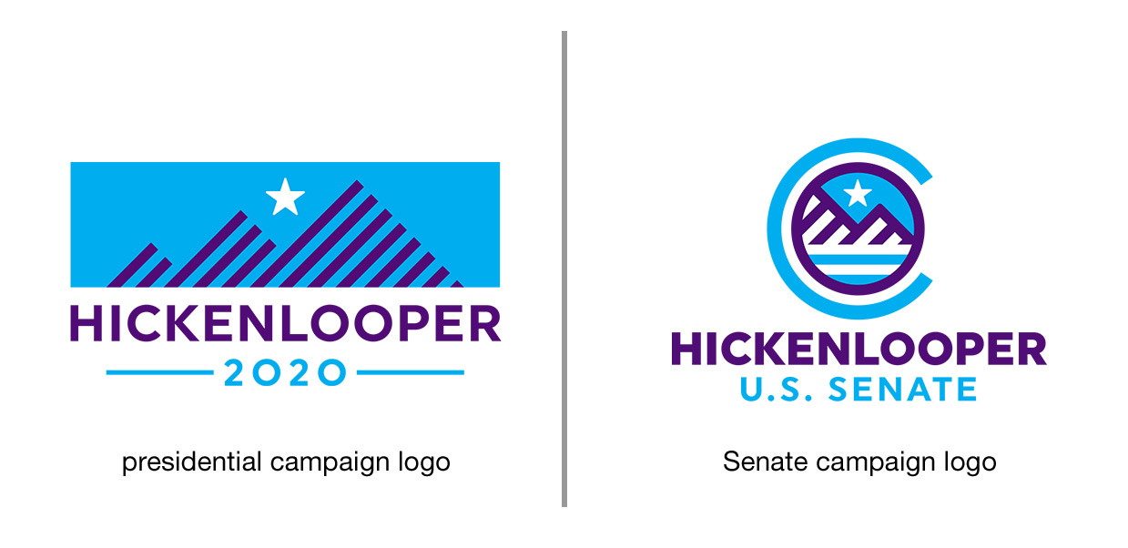
Former Colorado Gov. John Hickenlooper is now running for U.S. Senate in one of Democrats’ top targeted states of the year. Hickenlooper’s presidential campaign logo was as wide and hard to fit on the front of a baseball cap as his last name. His Senate campaign logo does a nice job editing it down into something more concise that can easily be used as a social media avatar. The new icon is encircled by a C, inspired by the Colorado flag.
Jay Inslee
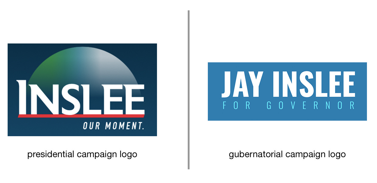
As governor of one of the earliest states to be hit by the coronavirus, Washington’s Jay Inslee has become more of a national figure in the past month than he ever did as a presidential candidate (according to Google Trends, there was more than double the interest in Inslee in March than at any point during his presidential run). His logo back then reflected his climate change platform with a blue and green color palette that happened to also double as an homage to Washington’s pro-sports teams. For his gubernatorial reelection campaign, Inslee has a new, simplified logo. Although green isn’t used in the logo or current merchandise, it does appear as an accent color on his campaign website.
Subscribe to Yello for the latest news on the culture, branding, and visual rhetoric of politics, delivered each week:
Cory Booker
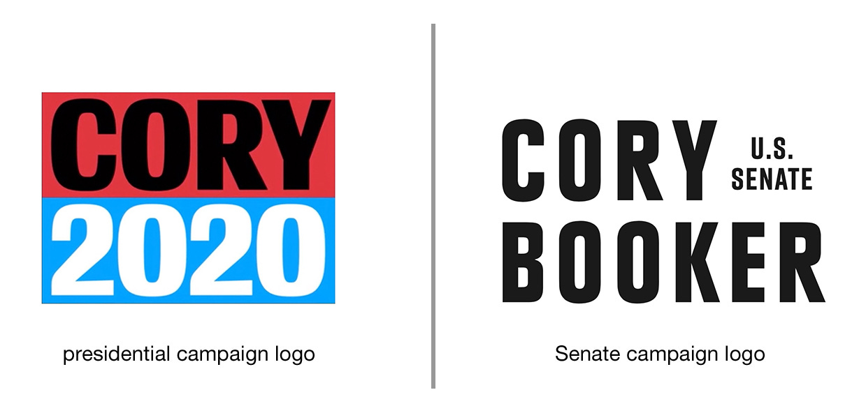
Sen. Cory Booker (D-N.J.) is running for reelection in the U.S. Senate, and his campaign got a simplified rebrand that uses his same red, white, black, and blue color palette. Conductor, the typeface used in his presidential run, has been swapped out for Plak Black Condensed, which was picked in part because of its vaguely sci-fi look and Booker’s love of “Star Trek.” You can read more about Booker’s Senate rebrand in the February 11 issue of the Yello newsletter.
Tom Steyer
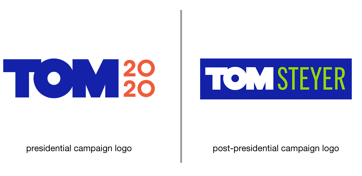
Tom Steyer hasn’t yet made any specific announcement about what his plans are next, but on his website, the billionaire activist wrote that he will “continue to work on the issues that I am passionate about — environmental, economic, and racial justice,” as well as defeating Donald Trump. His site still has his “Tom” presidential campaign wordmark, but the “2020” has been swapped out for his last name.
Steve Bullock
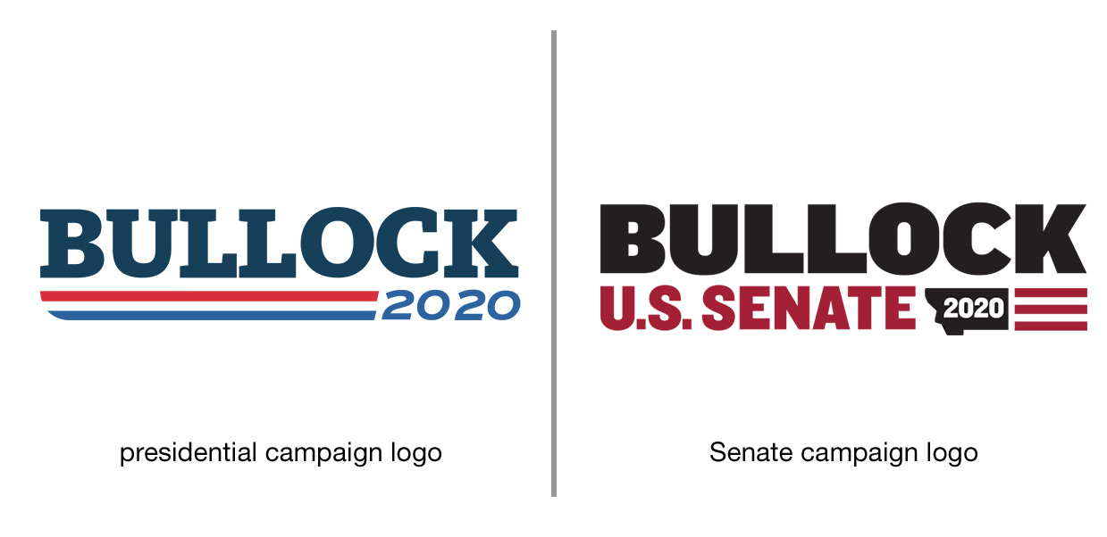
Montana Gov. Steve Bullock is term-limited, and he originally said he wasn’t interested in running for U.S. Senate. After a recruiting campaign that included meetings with former President Obama and Senate Minority Leader Schumer, though, he’s changed his mind. Bullock’s Senate campaign logo continues the visual idea of his presidential campaign, but with modifications. He’s now using a bold sans serif typeface, a dark red and black color palette, and a Montana state icon that houses “2020.”
Tim Ryan
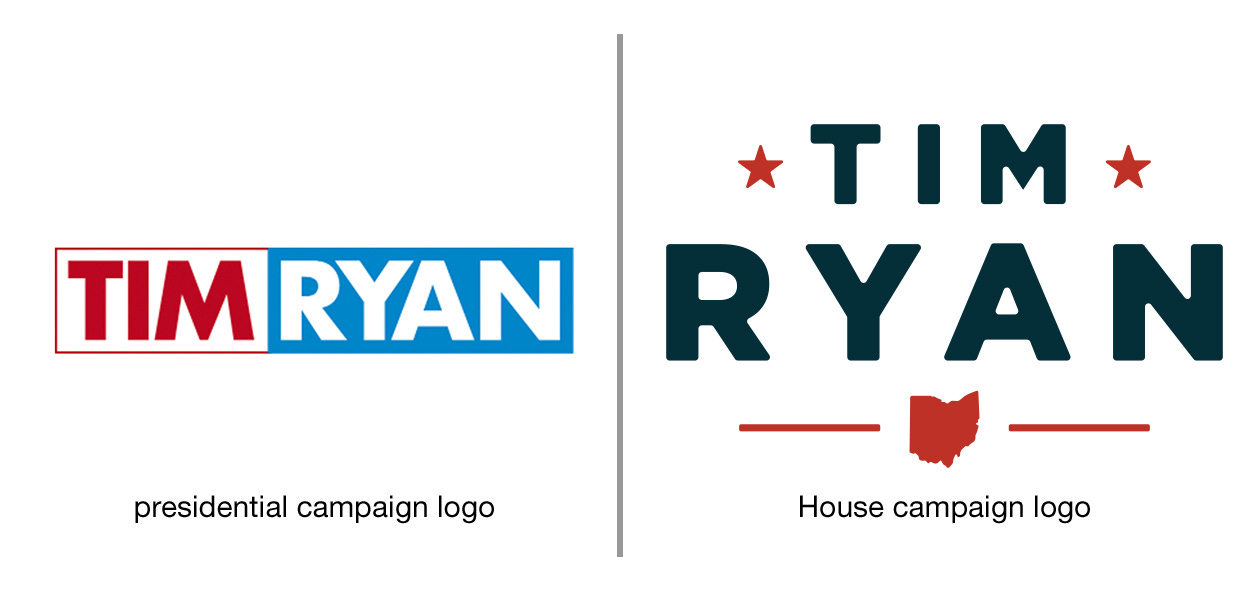
Rep. Tim Ryan is running for reelection in the Ohio 13th District and he’s gone back to the logo he previously used in his 2018 reelection race. Ryan’s presidential campaign logo was a generic political wordmark that didn’t really say much of anything. His House campaign logo actually does a better job communicating the industrial Midwestern working class Democrat that Ryan ran as.
Marianne Williamson
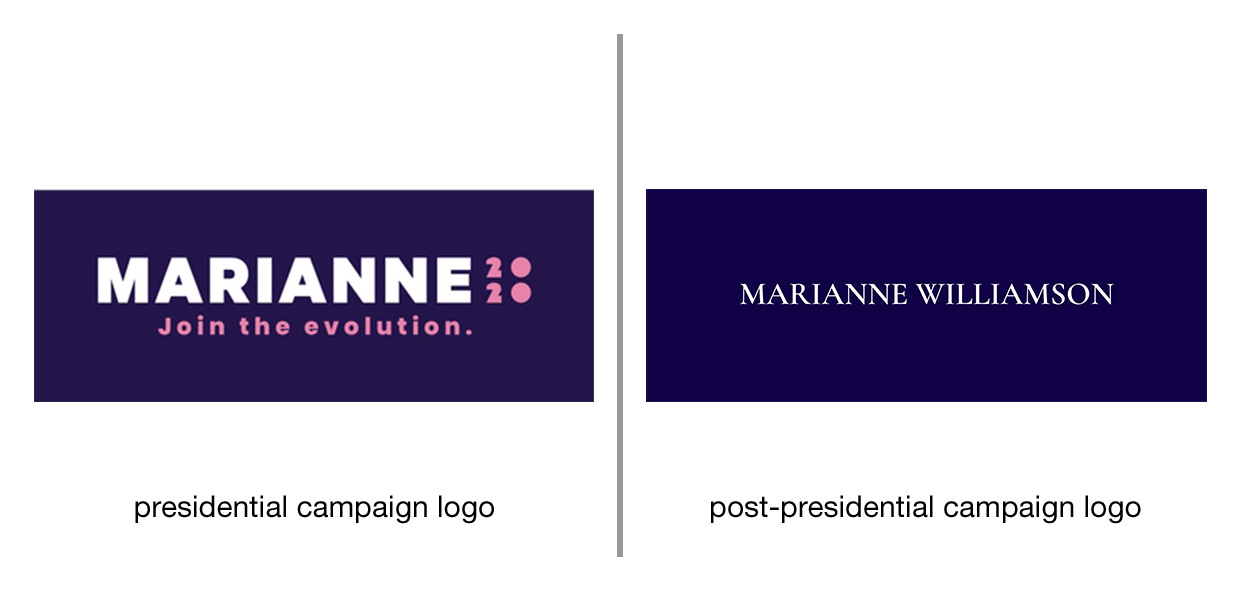
Since dropping out, author Marianne Williamson has returned to her work as a spiritual and self-help advisor. She launched the Williamson Institute, an “online platform dedicated to growth & transformation through motivation & conversation” with lectures, podcasts, and a membership that starts at $19.99 a month. Williamson doesn’t currently have one single visual identity that’s used consistently across platforms, but on social media, she does have a banner image that continues her use of the color purple. It uses a serif typeface that’s much more refined and quiet than the typefaces she used in her campaign, like Proxima Nova and Hitchcock.
Michael Bloomberg
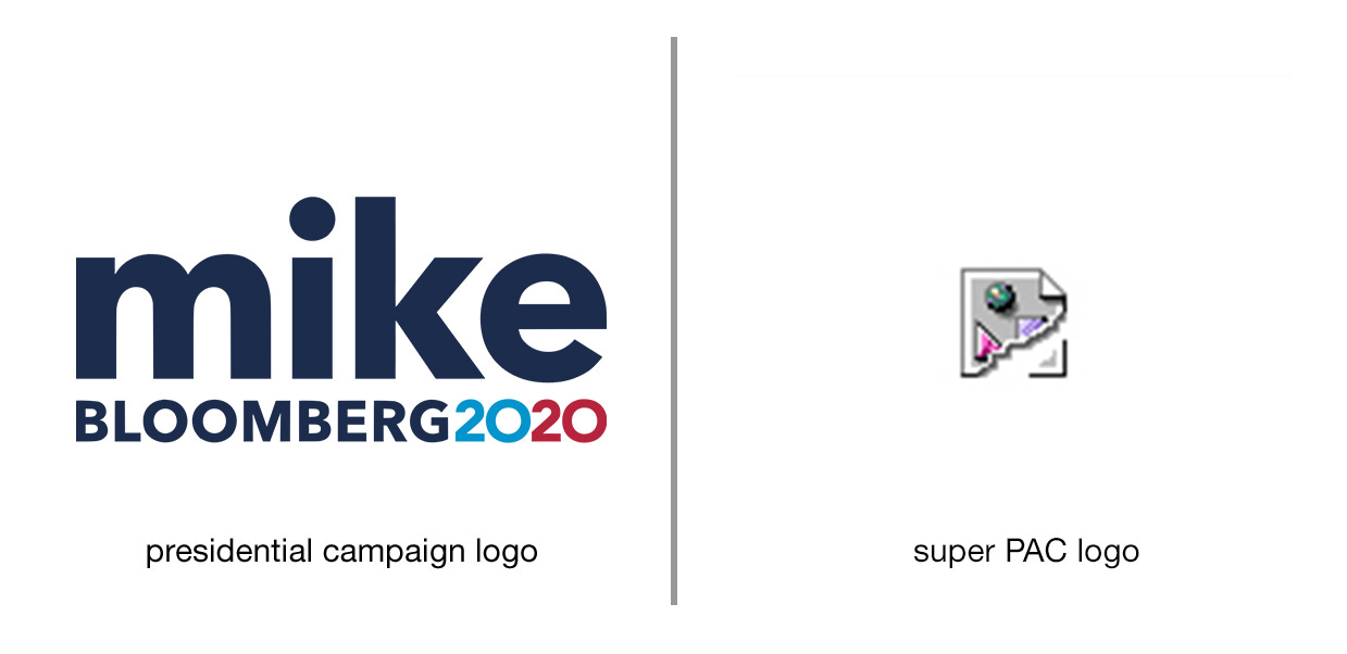
No, that broken image icon isn’t a glitch. Former New York City Mayor Michael Bloomberg doesn’t have a super PAC logo because he didn’t start a super PAC. After promising campaign staffers jobs through Election Day regardless of whether he was the nominee, Bloomberg reneged. His staff ballooned to more than 2,000 people during the campaign, and the original plan was to put them to work in support of the eventual Democratic nominee if Bloomberg dropped out. Instead, much of his staff was laid off and Bloomberg said he would give $18 million to the Democratic National Committee. Former field organizers filed two proposed class-action lawsuits against the campaign, arguing they were hired on under false pretenses.