
How the text on the Obama library was typeset
Plus: Here’s how much the X algorithm pushes people to the right

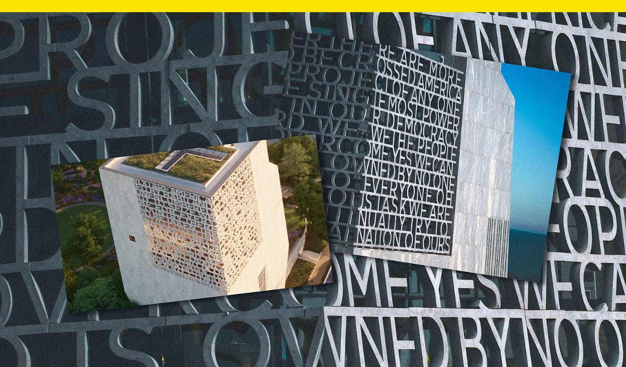
As the Barack Obama Presidential Center takes shape ahead of its June 2026 opening, some observers have pointed feedback about an element of the building’s design.
The Chicago tower features all-caps lettering that wraps around two sides of the building. But for many people, the text—an excerpt from the former president’s speech in 2015, on the 50th anniversary of the marches from Selma to Montgomery, Alabama—is nearly impossible to read.
Its designers say legibility isn’t the only—or even the primary—function of the lettering.
“One of the key questions I asked at the beginning was, are people supposed to read this?” says designer Micheal Bierut, who typeset the lettering with a team at Pentagram, led by designer Britt Cobb. “Is legibility the primary goal here? Do we want people to be able to stand on the ground, look up at this tower, and read those words? And that was discussed on the client end, and the answer came back, ‘No, it should have the promise of meaning, it should be decipherable, everything should be spelled right and it should make sense.’”

Letters as texture
Early concepts of the Obama Presidential Center designed by Tod Williams Billie Tsien Architects (TWBTA) showed a perforated upper section depicted in drawings as an abstract, irregular pattern. At one point, architects considered filling the space with a bunch of words, like a word cloud, though that idea didn’t feel quite dignified enough for a presidential library. Instead, they decided to use an excerpt from one of Obama’s speeches.
“Just as a million people go to the Lincoln Memorial, some of them will stand and read every word of the second inaugural; some people will just admire the statue in the building and kind of take it in, and a couple of words will jump out, but not the whole thing,” Bierut tells me. “It’s in that tradition that I think we were operating.”
The function of the feature is to serve as a space on the building that would be illuminated to the outside at night; from the inside, it’s a viewing area. Bierut says it was “never intended to look or feel or communicate as an applied sign stuck on the building.” It’s part of the architecture, not separate from it.
Not everyone is a fan, though.
Chicago Sun-Times architecture critic Lee Bey wrote on X that the text was “tough to read to me, giving off the lorem ipsum vibes,” referring to the Latin dummy text designers use as a placeholder when typesetting, while other X users joked the full quote can only be fully read by a drone as a dual dig against the design and against the Obama administration’s drone warfare program.
Typesetting an architectural feature
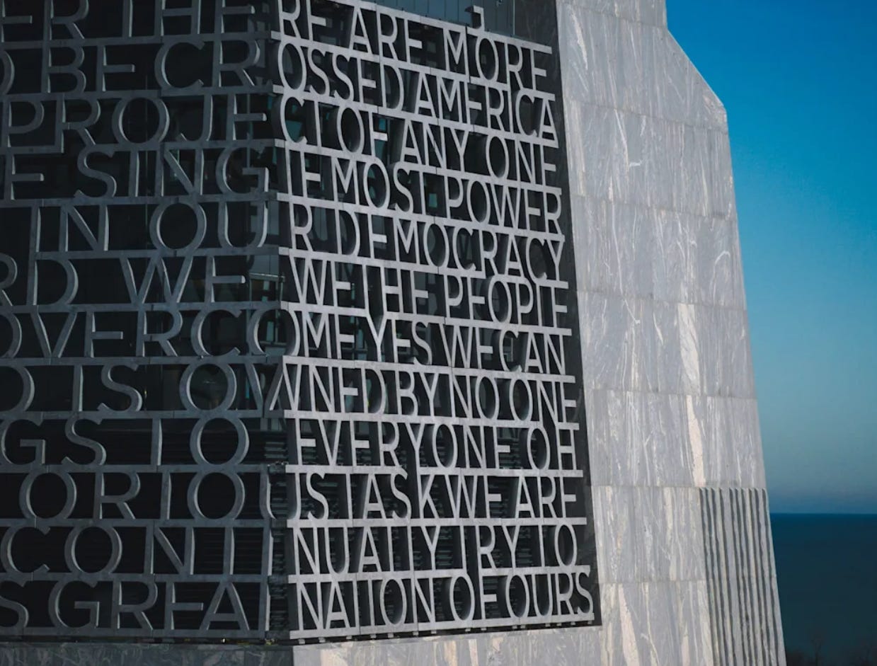
The words are load-bearing, which added an element of complexity to the design process.
“We’re moving around typography, adjusting letter sizes and letter spacing, and suddenly you’re typesetting 5-foot letters that are bearing tons of weight,” Cobb says. “It gets to a point where it becomes [more] about structural design. . . . I might say how I wish that letter could be three inches closer, but no, sorry, it’s bearing all this weight. It’s got to be here instead of there.”
The letters are set in an adapted version of Gotham, Obama’s presidential campaign font, and the excerpt comes from one of Obama’s most famous speeches as president. Given at the Edmund Pettus Bridge, the National Historic Landmark where police attacked civil rights marchers on Bloody Sunday 1965, Obama tied Selma to the broader American story in his speech.
The excerpt reads: “You are America. Unconstrained by habit and convention. Unencumbered by what is, ready to seize what ought to be. For everywhere in this country, there are first steps to be taken, there is new ground to cover, there are more bridges to be crossed. America is not the project of any one person. The single most powerful word in our democracy is the word ‘We.’ ‘We the People.’ ‘We Shall Overcome.’ ‘Yes We Can.’ That word is owned by no one. It belongs to everyone. Oh, what a glorious task we are given to continually try to improve this great nation of ours.”
The text as it appears on the building wasn’t designed to be a billboard or read as a speech. It’s a pep talk to America. You are America. We the people. Yes we can. Even if glanced only in snippets, these words still hold power.
This story first appeared in Fast Company.
Here’s how much the X algorithm pushes people to the right
A new study found that using an algorithmic feed over a chronological feed changed how users felt about a range of issues.
The algorithm on X is pushing users to the right, and that change looks hard to break.
That’s the finding of a new study published this month in Nature that tracked thousands of participants in July and September 2023, nearly one year after Elon Musk bought the social network then called Twitter. In the seven-week study, users who switched from viewing a chronological feed to an algorithmic one became more conservative across a variety of topics, and those attitudes didn’t change after a reverse switch back to a chronological feed.
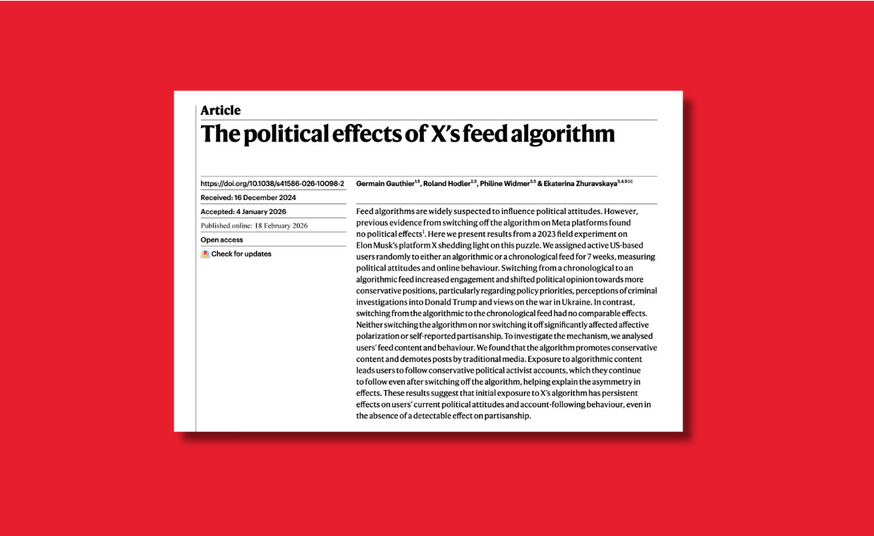
U.S. adults increasingly get their news from social networks, and the design of their apps and bias of their algorithms have long shaped our political discourse. Ahead of this year’s midterms, the new study, called “The political effects of X’s feed algorithm,” puts the extent of that influence in stark relief.
Algorithmic feeds are more engaging, racking up more likes, comments, and reposts, and keeping users more glued to the app than chronological feeds. Algorithmic feeds promoted more entertainment content and less traditional news media content, according to the findings by researchers from the Paris School of Economics, Bocconi University, and University of St. Gallin. Algorithmic feeds also showed users more political content.
The study found U.S. X users who used the algorithmic feed became more likely to prioritize issues considered aligned with Republicans, like immigration and crime, and their views also became more sympathetic to Trump and the Kremlin: algorithmic users become 5.5 percentage points more likely to disapprove of investigations into Trump at the time, while 7.4 percentage points less likely to approve of Ukrainian President Volodymyr Zelensky.
Today’s social media landscape
The right’s dominance on X isn’t new. When Twitter introduced an algorithmic feed in 2016 under previous ownership, it prioritized right-wing content, the study notes. Nor is it evenly applied. The study found self-identified Republicans and independents drove the results while Democrats were “largely unaffected.”
That dynamic could say something about the recent crop of Democratic “war room” accounts, like the recently rebranded Headquarters account or California Gov. Gavin Newsom’s press office account. As the left looks to fight back online, it’s doing so in a landscape that’s long been more friendly to the right. It’s asymmetric.
Democrats’ need for a “new Gen-Z led progressive content hub” seems like a joke until you realize the past decade has been driven in large part by a Boomer-led MAGA content hub called realdonaldtrump, along with the universe of content creators who have organized around him, and the odds are stacked in their favor.
Washington’s newest Trump banner is its worst one yet
The Department of Justice is now decked out in a Trump banner.
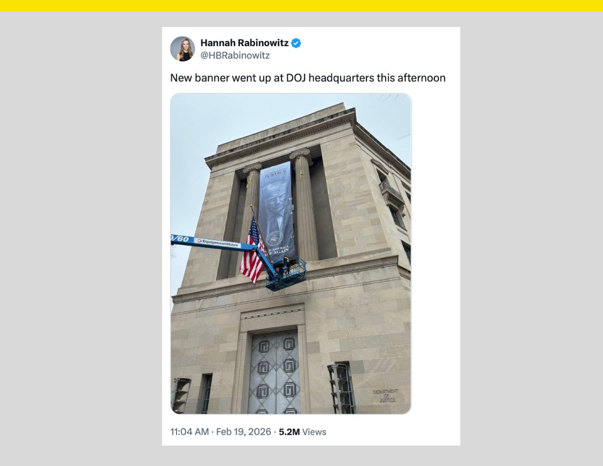
Trump’s official portrait is now hanging on the outside of the Department of Justice building in Washington, D.C., on a banner. It is, as Project Lincoln senior adviser Jeff Simmer noted, the first time a convicted felon’s face has appeared on the DOJ. The banner says “Make America Safe Again.”
Trump’s administration hung banners of his face at the Department of Agriculture and Department of Labor last year, and these physical displays of fealty have inspired growing comparisons to propaganda for authoritarian leaders in places like North Korea, China, and the Soviet Union.
The banner at the DOJ has especially inspired blowback over the agency’s tradition of independence from the White House and Trump’s persistent efforts to direct its work.
“Trump is plastering his face on the building that’s supposed to investigate him,” Rep. Jimmy Gomez (D-Calif.) said. “There was once a time when a president couldn’t boss the attorney general around like his own personal lapdog.”
As of last fall, the Trump administration has spent at least $56,000 on banners of his face, according to a report from Sen. Adam Schiff (D-Calif.). The report also found the administration awarded contracts for 11-feet-by-88-feet “Make America Healthy Again” banners for the Department of Health and Human Services.
Have you seen this?
FLOTUS’s “redaction dress” was just added to the Smithsonian’s collection. First lady Melania Trump and designer Hervé Pierre were on hand Friday at the Smithsonian National Museum of American History where the black-and-white dress he designed for last year’s Inauguration was added to the museum’s popular First Ladies Collection. [Whig by Hunter Schwarz]
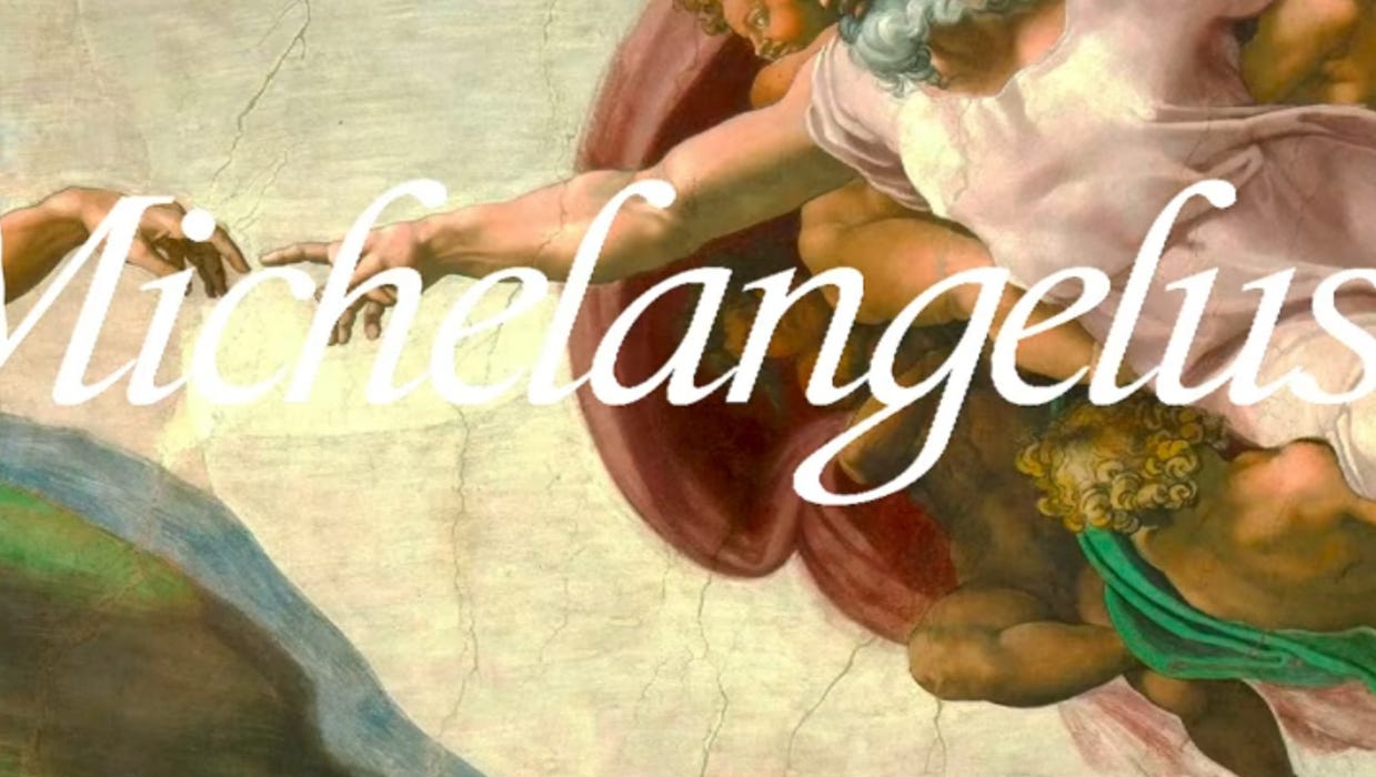
Vatican, Microsoft launch digital font inspired by Michelangelo’s handwriting. The new “Michelangelus” typeface, created for St. Peter’s Basilica’s anniversary, will appear in the latest versions of Microsoft Office. [EWTN News]
The government’s free speech doctrine allows Trump to name things after himself. In some cases, though, the administration may be bound by statute or formal contracts, as with the legal battle over the Kennedy Center, which was named by an act of Congress. [Fast Company]
Georgia says Elon Musk’s America PAC violated election law. The political action committee sent out partially pre-filled absentee ballot applications. [The Verge]
