How magazine covers are illustrating the pandemic

A week ago we were sharing hand washing memes, and today, several Bay Area counties are under orders to shelter in place and some cities are limiting restaurants to take-out service only. Things are going from 0 to 100 real quick. In this week’s issue we’ll look at how magazine covers are illustrating the pandemic, plus:
Two gifs that should convince you to stay home
Gaga is coming out with book on kindness
These posters of one-star National Park reviews are perfect
Yours,
P.S. With all that’s going on in the world, one unexpected story that really threw me for a loop this past week is RuPaulmay be frackingon his Wyoming ranch.
Two gifs that should convince you to stay home

The Washington Post published a story on Saturday by graphics reporter Harry Stevens headlined “Why outbreaks like coronavirus spread exponentially, and how to ‘flatten the curve’” that included some pretty incredible simulation graphics. The above gif shows how a virus spreads among a population of 200 people represented as dots if people go about their normal lives.
The below gif uses stationary dots to represent social distancing and show how staying at home slows the virus’ spread.

According to the Post’s Paul Farhi, the story is now the most-read in the history of the Washington Post’s website. If you need help convincing a loved one to stay at home, you might want to try this article. The Post removed the paywall for it and also made it available in Spanish.
How magazine covers are illustrating the pandemic

New York magazine went with a “D̶o̶n̶’t̶ Panic” cover and the New Yorker featured an illustration by Cristoph Niemann showing a man in the middle of a globe of dominos that resembles a virus. Niemann said of his illustration, titled “Critical Mass,” “that sense of fragility felt apt.”
Time Out New York did a temporary rebrand as Time In New York, with a cover by Pablo Delcan.

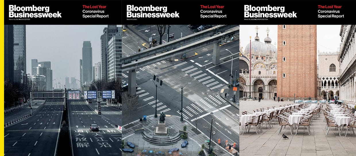
Bloomberg Businessweek released three covers with different scenes of empty cities for its U.S., Asia, and Europe editions with the coverline “The Lost Year.”

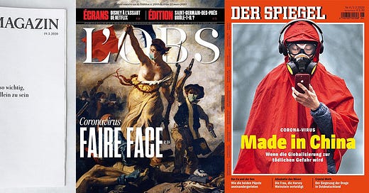
And here are a few covers from Europe. Zeitmagazin, in Germany, had a minimal all-text cover that reads “Nie war es so wichtig, gemeinsam allein zu sein,” or “It’s more important than ever to be alone together.” L’obs, in France, put facemasks on people in the 1830 painting “Liberty Leading the People,” and Der Spiegel, in Germany, went with “Made in China.”
This is the artist who made the Women’s March logo

Credit: Trent Nelson/Salt Lake Tribune
Illustrator Nicole LaRue made the Women’s March logo after a friend reached out and suggested she submit artwork.
“When I gave it to her, I was like, ‘Surely it’s not going to be anything,’” LaRue told the Salt Lake Tribune, and she was surprised when her image was selected as the logo for the march. The logo was made in one day.
LaRue, who studied graphic design at Brigham Young University, said she used to think, “I’m never going to really make an impact with what I do. I just make things look pretty,” but feels differently now. She wrote two books out this month on youth activism she described as guided journals, “Girl Almighty” and “Small and Mighty.”
Gaga is coming out with a book on kindness

Not only does Lady Gaga have a new album on the way, but she helped pen an anthology called “Channel Kindness: Stories of Kindness and Community” that will be out September 22. The book features 51 essays from young activists who work with Gaga’s Born This Way Foundation, including a “menstrual hygiene access activist” and a young man who advocates for queer visibility. Gaga wrote messages to go with the essays.
“If these stories inspire one act of kindness, then we’ve accomplished our mission,” Gaga said, according to Oprah magazine. “We can’t do it alone, and here is a book that shows we aren’t.”
Shepard Fairey teamed up for a new mural about women’s right to vote

Credit: @obeygiant/Instagram
Shepard Fairey joined artist Sandra Chevrier for a mural on the facade of the LINE Hotel in Austin celebrating the 100th anniversary of women’s suffrage. Titled “The Beauty of Liberty and Equality,” the mural features an image of Wonder Woman breaking chains.
“To me, one of the most important things about this project is that it was created by a man and a woman,” Chevrier wrote on Instagram. “Men can be our allies, they can support us, hold our hands high and fight by our side. Let’s be a team, let’s work together to make a change.”
The mural is the largest in Austin.
These posters of one-star National Park reviews are perfect

From left to right: Olympic, Arches, and Yosemite National Parks. Credit: @subparparks/Instagram
Illustrator Amber Share set out late last year on an ambitious project to illustrate one-star reviews for all of America’s National Parks. They are incredible, like “No wow factor” for Olympic National Park and “A hole. A very large hole,” for the Grand Canyon. Share has currently posted 20 parks, with 42 to go.
Democrats' likely nominee will have a red, white, and blue logo. What that means for campaign design.

Credit: Ezra Deutsch-Feldman
ICYMI, I wrote a look back on the expressive and experimental visual identities of the Democratic primary now that we’re down to two candidates who stuck with the traditional red, white, and blue color palettes. Fun fact: liberty green wasn’t originally meant to be the Warren campaign’s signature color. You can read my story here.
Forwarded this email by a friend? Subscribe to Yello for the latest news on the culture, branding, and visual rhetoric of politics, delivered each week:


