
Here's the font Trump's using on his new Oval Office sign
Plus: The government just canceled its super-popular free tax filing pilot

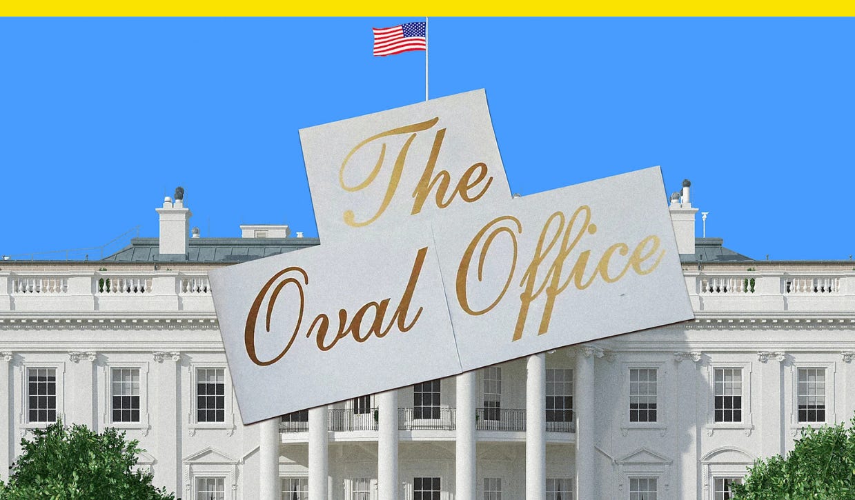
In President Donald Trump’s ongoing second-term White House remodel, even the typography is getting the Mar-a-Lago treatment.
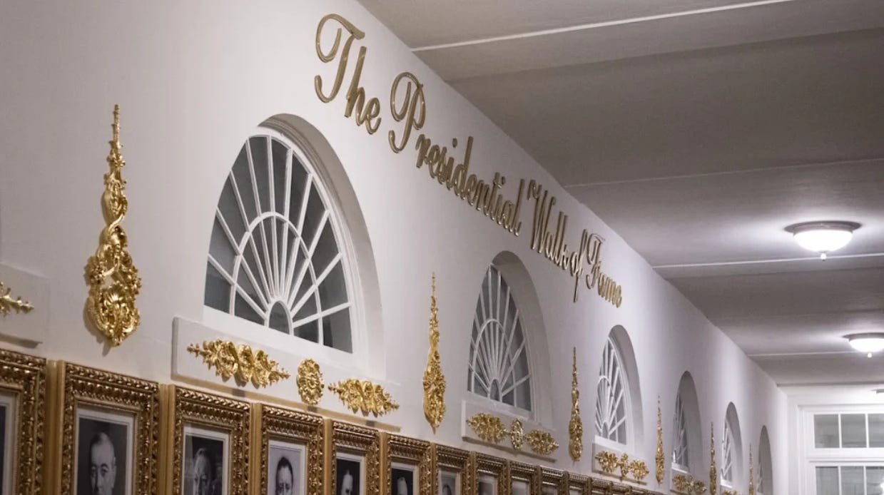
New signage has begun rolling out at the White House this fall. First, the words “The Presidential Walk of Fame” appeared in September in the gold Shelley Script on the West Colonnade. The signage appears above the presidential portraits Trump installed to troll former President Joe Biden.
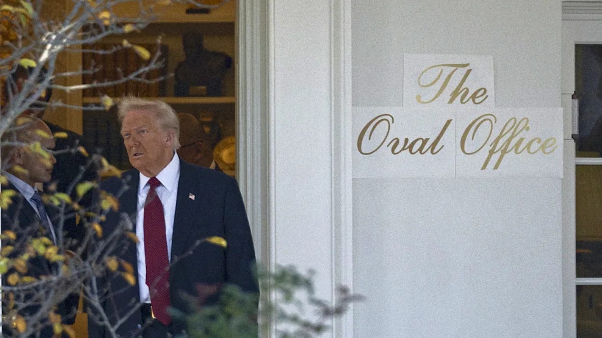
Now new images show lettering that reads “The Oval Office” written in the same font, and which appears to be going up on its exterior wall.
The White House press office did not immediately respond to a request for comment about whether more signage will be going up. An auto-reply to a media inquiry included text that blamed Democrats for staff shortages due to the ongoing government shutdown.
Trump’s new, gold White House signs are aesthetically aligned with other recent redecoration efforts, including his planned ballroom. To critics who find it tacky, though, it’s not necessarily the type choice that’s off.
“Shelley is one of a handful of long-standing, go-to formal script fonts,” Charles Nix, senior executive creative director at Monotype, tells me in an email. “It’s testimony to the quality of the design (and the skill of the designer) that it perseveres as visual shorthand for formal or ‘fancy.’”
Famed type designer Matthew Carter designed Shelley Script for Linotype in 1972. It’s been used for everything from winery websites to book covers, according to Fonts in Use, and it’s a go-to choice for wedding invitations.
“The typeface is perfectly fine, and it does seem in keeping with the dignity of the White House,” type historian Paul Shaw says. “The problem is not the fit, but the idea of even slathering the phrase ‘The Oval Office’ on the exterior. It looks like part of a theme park.”
Further, Shaw says, “The ‘Walk of Fame’—is this Hollywood or Las Vegas?—cements that tacky association. Fortunately, this is one of the least egregious things that this short-fingered vulgarian has done in the past 10 months.”
Script fonts also seem less the domain of the West Wing than the East (RIP), before Trump had it torn down to make room for a 90,000-square-foot ballroom.
The fonts of the West Wing are the fonts of the state, like Courier New, which is used in executive orders. While the West Wing is for government functions of the executive branch, the East Wing, where the offices of the First Lady were once located, was for soft power. Before it was destroyed, the East Wing housed the White House Calligraphy Office, which produces the White House’s most famous script lettering on social documents like invitations and state dinner menus.
Trump has already added gilded embellishments to the Oval Office and turned the Rose Garden into a concrete patio that resembles the one at his Florida home and club. Now it seems he’s cribbed its typography as well, with each detail making the people’s house appear much more like Mar-a-Lago North.
This story first appeared in Fast Company.
Gannett rebrands to USA Today Co. for a world where trust in media is local
The company behind more than 200 local newspapers is changing its name after its most famous paper.
Gannett, the New York-based newspaper company with a portfolio of titles including The Arizona Republic, The Des Moines Register, The Detroit Free Press, and El Paso Times, has renamed itself for its most famous brand, USA Today, because of its brand equity.
“USA Today Co. is no longer your hotel newspaper,” Brand Officer Lark-Marie Antón told USA Today. “We are a digital platform. Over 181 million unique visitors come to our sites across the course of a month. We need to tell that story better. And tying our name to USA Today really is how we move this company forward.”
The logo for the new company name uses a blue dot for the period at the end of Co., a visual effect adopted from the flagship paper’s logo. A national print newspaper designed for a graphic, television age, USA Today was founded in 1982 for a general-interest audience and was known for its full-color photos, graphics, and weather maps.
“Editors elsewhere dismissed such things as mere glitz — until, that is, they quietly adopted them for their own papers,” Erik Brady, a founding member of USA Today wrote in a column for the paper’s 40th anniversary in 2022. “And then, as other newspapers became more like us, we, in turn, became more like them, at least in terms of serious watchdog reporting.”
Trust in the media in the U.S. is at an all-time low — just 28% trust mass media to report the news fully, accurately, and fairly a great deal or fair amount, according to an October 2025 Gallup poll — but Americans still trust local media. A Pew Research Center survey last month found U.S. adults across all age groups trust local news more than national news or social media.
By renaming the parent company for more than 200 local newspapers after its well-known national title instead of after its founder, Frank Gannett, an Upstate New York publisher who died in 1957, USA Today Co. is betting on the power of local news with a national name brand.
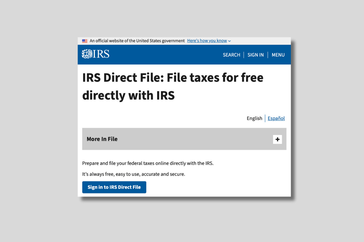
The government just canceled its super-popular free tax filing pilot
Tax preparation software companies like Turbotax and H&R Block are thrilled, I’m sure.

The Internal Revenue Service, or IRS, is pulling the plug on a popular pilot program to file federal taxes for free.
Direct File allowed some taxpayers to file taxes free online in as little as 30 minutes, and it launched last year in 12 states before expanding this year to 25 states. The program was well-liked, with 90% of respondents rating their experience using it as excellent or above average, and 86% said using it increased their trust in the IRS.
The IRS said more than 140,000 taxpayers filed their returns using Direct File last year, and that more states expressed interest in participating. The agency estimated it would cost the government between $10 to $20 per return to be implemented nationwide, according to Federal News Network, an independent, nonpartisan trade outlet about the federal government.
Despite Direct File’s popularity and growth, the IRS told states this week that Direct File “will not be available in Filing Season 2026.”
Direct File, which was funded through the Inflation Reduction Act then-President Joe Biden signed into law in 2022, was previously available only to some taxpayers, including those with W-2s or Social Security income, but not for those with income through gig work, rental properties, or businesses, or those who itemize deductions. As it’s in the public domain, most of the code for Direct File is available on GitHub.
Trump’s One Big Beautiful Bill Act earmarks $15 million to research a replacement for Direct File. Treasury Secretary Scott Bessent said “we think that the private sector can do a better job.”
The program was piloted first in Arizona, California, Florida, Massachusetts, Nevada, New Hampshire, New York, South Dakota, Tennessee, Texas, Washington, and Wyoming. This year, the IRS added Alaska, Connecticut, Idaho, Illinois, Kansas, Maine, Maryland, New Jersey, New Mexico, North Carolina, Oregon, Pennsylvania, and Wisconsin.
Have you seen this?
Zohran Mamdani won because he knew when to be online — and when not to. He was credited for being popular on TikTok, but New York’s new mayor spent his time on the city’s streets. [The Verge]
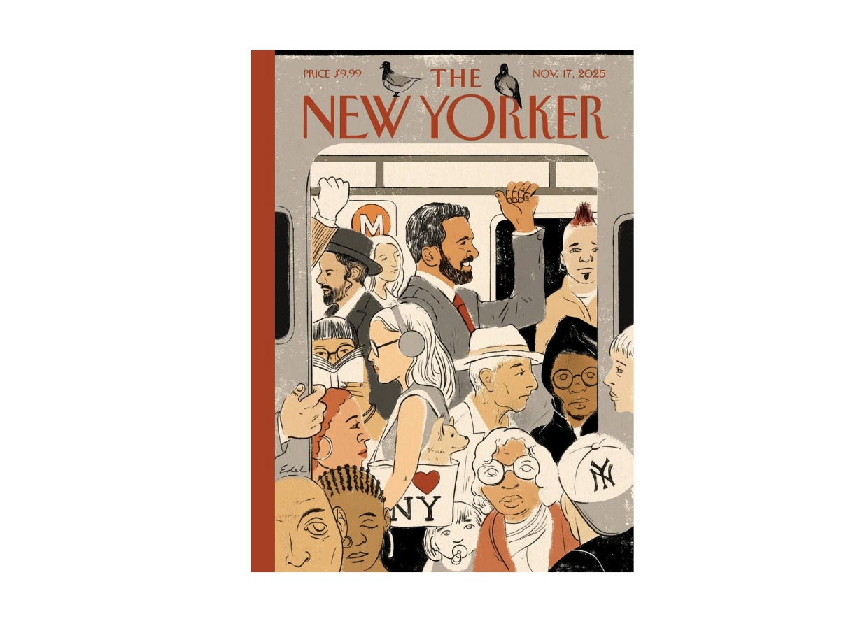
He’s drawn Donald Trump hundreds of times. Now he’s drawing Zohran Mamdani. Illustrator Edel Rodriguez is famous for his acerbic drawings of Trump. Now a cover for The New Yorker featuring Mamdani shows his style in a new light. [Fast Company]
Michelle Obama’s longtime stylist, Meredith Koop, reflects on the first lady’s style from the White House to now. “When you’re the first lady in the United States, at least in her case, there are just things you need to consider and think about as being sort of almost like a representative, a diplomat of that position. So I think that from then to now, certainly things are more open. Certainly things can be a bit more edgy, a little bit more bold. That’s very clear.” [Vanity Fair]
