
Here’s how the CDC branded their COVID-19 response


Yup, even viruses get their own branding system. I took a look at how the Centers for Disease Control and Prevention has created a visual identity for the coronavirus and their public health response. Also in this week’s issue:
The worm logo is back, long live the worm logo
Michelle Obama’s Becoming tour numbers are diva status
Kanye West was a high school artist
Yours,
P.S. Since delaying the release of her albumChromatica, Lady Gaga has been hard at work. On Monday, Gaga announced she curated the lineup forOne World: Together at Home, a live-streamed benefit concert that will be put on by the World Health Organization and Global Citizen on April 18. She also helped raise $35 million. “We want to raise the money before we go on air,” Gaga said during a virtual press conference. “When we do go on air, put your wallets away, your credit cards away, and enjoy the show.”

Here’s how the CDC branded their COVID-19 response
The CDC’s response to the pandemic includes illustrations, graphics, and a branding system that gives the agency’s communication about the coronavirus a coherent look.
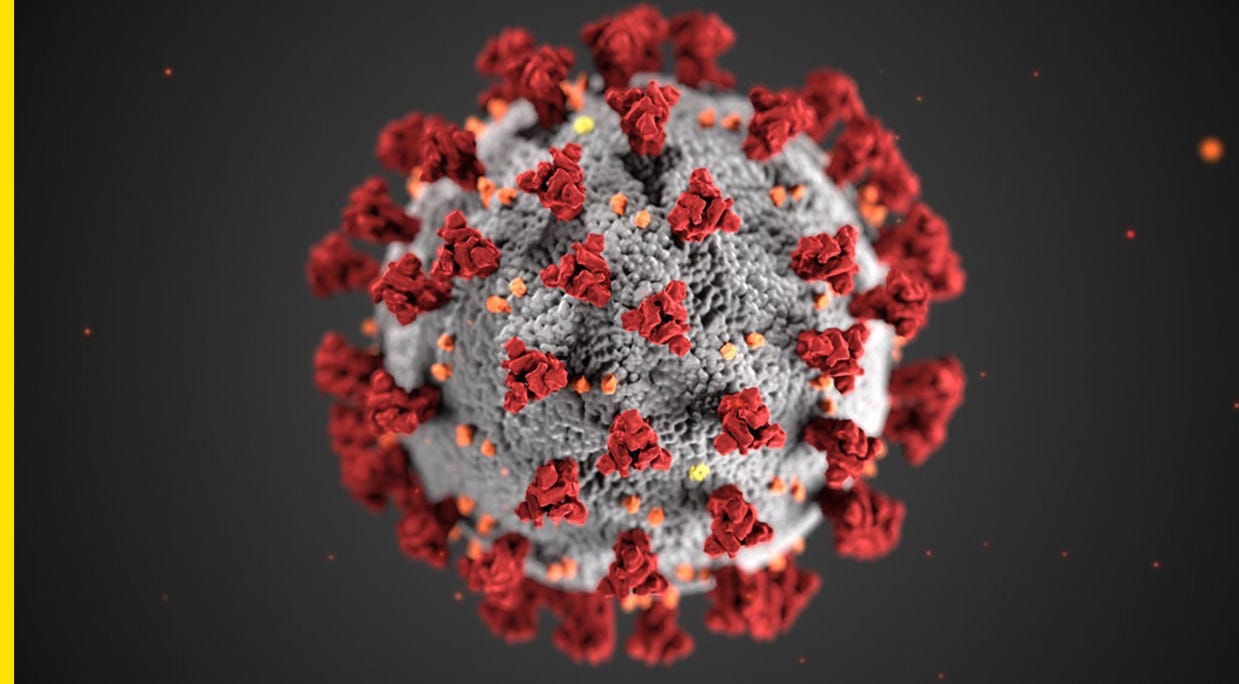
At the heart of this effort is the now-ubiquitous image of a floating coronavirus. It’s the work of CDC medical illustrators Alissa Eckert and Dan Higgins. Eckert’s resume includes things like illustrations of a mumps virus particle, a drug-resistant bacteria that causes gonorrhea, a ferret (they’re helpful for the study of influenza virus pathogenicity and transmissibility), and a prosthetic arm for anthrax testing trainings that she created using theater makeup to add on scabs and pustules. It’s truly gross — but important! — stuff.
The coronavirus illustration was created after referencing microscope images of the virus and 3D model files. We don’t actually know what color the virus is, but they created the grey, red, and orange scheme to stand out and complement the CDC’s graphic design strategy.

Transmission electron microscopic image of an isolate from the first U.S. case of COVID-19. Credit: CDC
“We tested different colors to see what was going to work in a combination for us, for our communication goals,” Eckert told the Chicago Tribune. “I didn’t want it to be too playful. For instance, I tried, like, the greens and blues, and it just didn’t speak to me at all, it just kind of fell flat. The red and orange combination was just very striking. It calls your attention and makes you look at it.”
Credit: CDC via Chicago Tribune
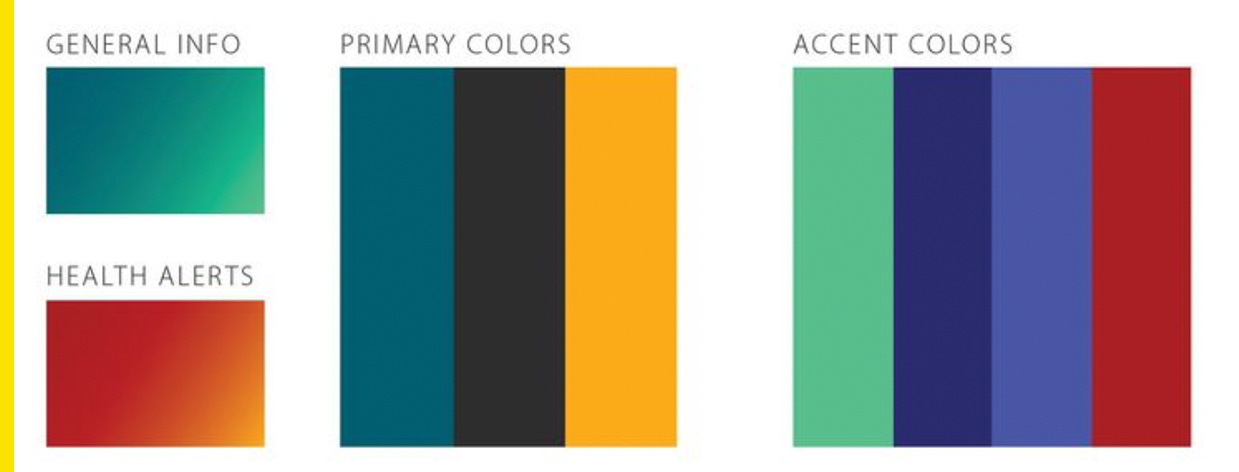
The CDC has a color palette that includes turquoise for general information and orange-red for health alerts. It’s used across agency communications, like posters about symptoms and what healthcare personnel should know about caring for patients infected by the virus:
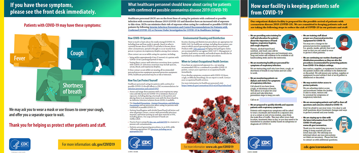
Credit: CDC
The colors also show up on social media. The CDC’s Instagram account has social graphics on topics like when to call a doctor, how to socially connect while physically distancing, and how to create your own masks.
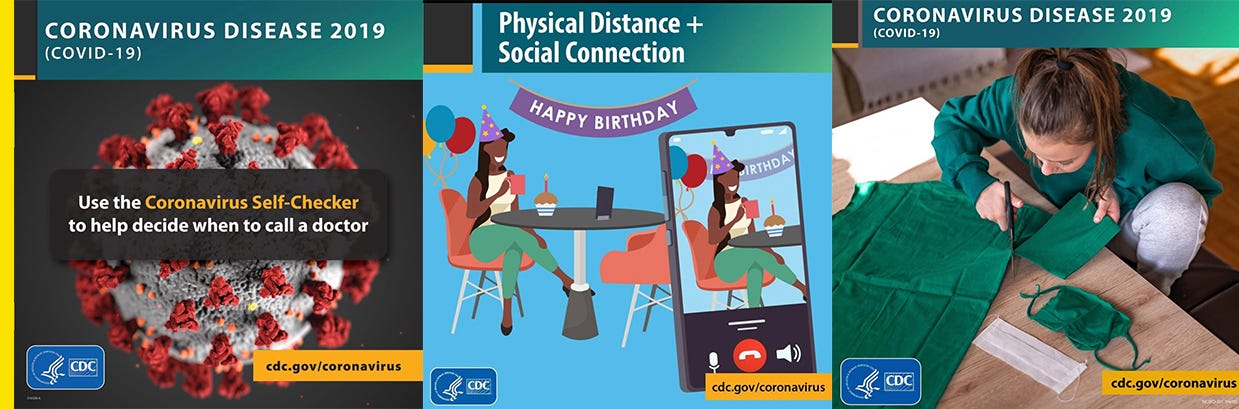
Credit: @cdcgov/Instagram
Google reverses coronavirus ad ban after Democratic backlash
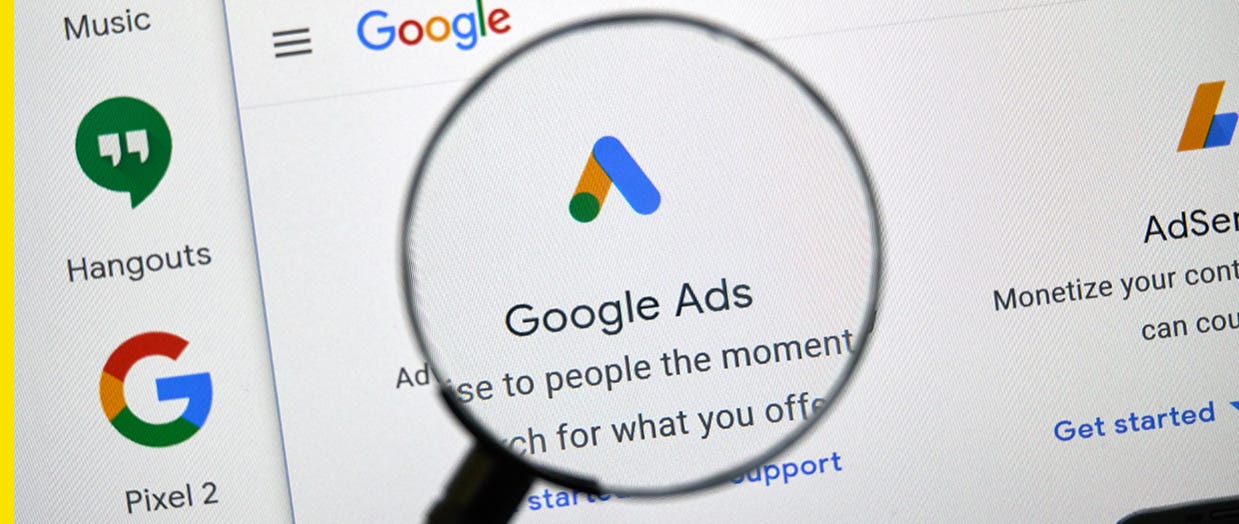
Since February, Google has banned nongovernmental agencies from running ads related to the coronavirus. In a blog post, CEO Sundar Pichai wrote that the company was blocking “all ads capitalizing on the coronavirus.” While that made sense in context of stopping things like fraud and misinformation, Democrats said it hurt their efforts to criticize the Trump administration’s delayed response to the outbreak.
“We're in the middle of the defining event of this election and potentially a generation,” Mark Jablonowski, CTO at the progressive ad firm DSPolitical told Protocol. “To not allow political candidates to mention or discuss COVID-19 is something that has the potential to dramatically bolster Trump's and Republicans' chances of reelection.”
Google changed course last Thursday, writing in a memo to advertisers that it will allow some ads from government entities, hospitals, and medical providers, with guidance on political advertisers to come, per Protocol.
The worm logo is back, long live the worm logo

Credit: SpaceX
NASA is bringing back the “worm” logo. The agency announced its previously retired bright red wordmark will appear on the side of the Falcon 9 rocket that will carry astronauts to the International Space Station for a mission scheduled for mid- to late-May.
A little background for the uninitiated: the worm logo was designed by the agency Danne & Blackburn and introduced in 1975. It replaced what’s known as the meatball logo. At the time, NASA administrator and former University of Utah president James Fletcher said he wasn’t comfortable with the letters in the logo because he felt like something was missing, and “I just don’t feel we are getting our money’s worth,” which has got to be one of the best client responses of all times.
The worm was divisive among NASA staff and ultimately retired in 1992, but it still shows up in merchandise all the time. NASA said although the meatball will remain their primary symbol, “there’s a good chance you’ll see the [worm] logo featured in other official ways on this mission and in the future.”

I think both logos are iconic, but personally, I’m #teamworm all the way. I won’t tell you what to think, though. You can vote for your fav here.
Subscribe to Yello for the latest news on the culture, branding, and visual rhetoric of politics, delivered each week:
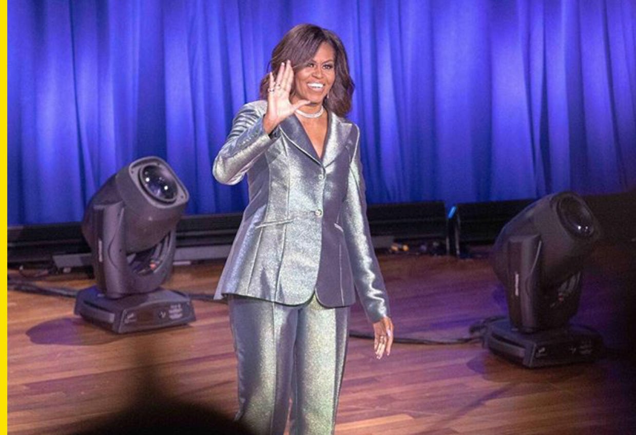
Michelle Obama’s Becoming tour numbers are diva status
Credit: @michelleobama/Instagram
Former first lady Michelle Obama wrapped her Becoming book tour in May 2019 after 34 stops, and according to estimates, she brought in enough money to rank among tours by big-name pop stars.
According to Billboard, final figures for the tour have not been reported in full, but based on select submissions, she averaged 13,176 tickets and $1.595 million per stop. Billboard estimated Obama brought in a total of somewhere between $55 million and $60 million. That would put her in the same range as 2019 tours by Jennifer Lopez and Celine Dion, who brought in $54.7 million and $58.7 million, respectively, per data from Poll Star.
“Very few speaking acts or book tours can fill large clubs or theaters, much less the arenas that” Obama filled, Billboard noted. “Without the proof of concept and tour history of an A-list band or singer, filling an arena remains an especially elusive achievement for speakers, rarely accomplished at the scale of … Obama.”
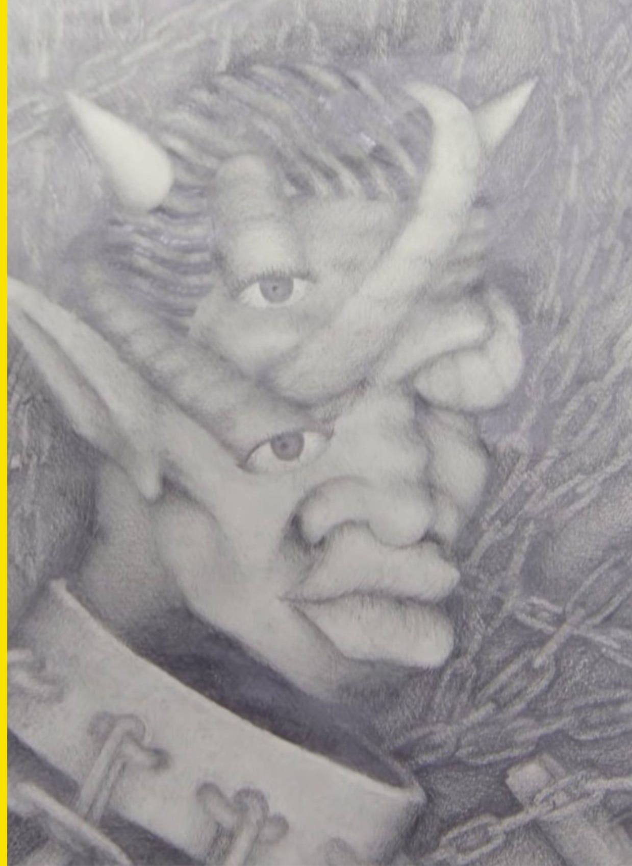
Kanye West was a high school artist
Credit: via PBS
Artwork by Kanye West when he was a 17-year-old high school sophomore was appraised on a recent episode of PBS’ “Antiques Roadshow.” The work, created around 1995 when he attended the Polaris School in Oak Lawn, Ill., was obtained by a man who said he married West’s cousin and acquired it after the death of West’s mother Donda.
Appraiser Laura Woolley, who’s managed sales of entertainment memorabilia and items from celebrities including Marilyn Monroe and Cher, said West’s work demonstrated “an extraordinary facility as an artist” and was “exceptionally well done.” She appraised the above work, done in graphite, at $6,000 to $8,000. You can see the segment and more of West’s work here.
Presidential campaign logos: Where are they now?
ICYMI, I wrote about what 12 former presidential candidates and their logos are up to now. You can read my story here.