Democrats' likely nominee will have a red, white, and blue logo. What that means for campaign design.

That the most diverse primary in history ended up as a contest led by a pair of white men in their 70s happens to be reflected in the top two candidates’ more traditional logos.
The Democratic primary began as an unprecedented rainbow of campaign color palettes — there were oranges and yellows and pinks and greens — but it’s ultimately come down to former Vice President Biden and Sen. Bernie Sanders (I-Vt.), whose campaign visual identities both stuck to the tried and true red, white, and blue.
Political design trends have historically been influenced strongly by winning campaigns, but designers who worked with some of the Democratic primary’s more out-of-the-box visual identities believe a new era of expressive and experimental campaign design is here to stay.
“It would be a mistake to assume because either Biden or Bernie are going to be a nominee everyone’s going to chase that” aesthetic, said Ben Ostrower, founder and creative director of the Washington, D.C., creative agency Wide Eye, in an interview with Yello. “As candidates change and what candidates look like changes, I think that’s going to change how they’re represented visually.”
Ostrower, who’s worked on identities for candidates including Sanders and Sen. Kamala Harris (D-Calif.), said the untraditional branding was born out of necessity and identity.
“We had an unprecedented field of candidates in terms of how crowded it was and so I think there was more need for folks to distinguish themselves in any way they possibly could from the pack,” he said. “I think the other was we had a more diverse crowd of candidates in terms of gender and background and age. I think that allows for different expressions for what it means to be an American leader.”
He also said he thinks there was probably a desire among designers and campaign staff to show that this was a moment in American political history “unlike any other.”
Candidates who used red, white, and blue in this primary largely fit the traditional demographic of U.S. presidents; as this graphic from Axios shows, of the eight candidates who used all three colors exclusively, nine when you add in former New York City Michael Bloomberg, all were male and all but two were white.

Credit: Andrew Witherspoon/Axios
For Ostrower, designing for a campaign is less about following established trends than creating a visual identity that speaks to the candidate themselves.
“This needs to be something they’re inspired by and feel good about,” he said. “The same way an outfit you buy at the store you feel good about.”
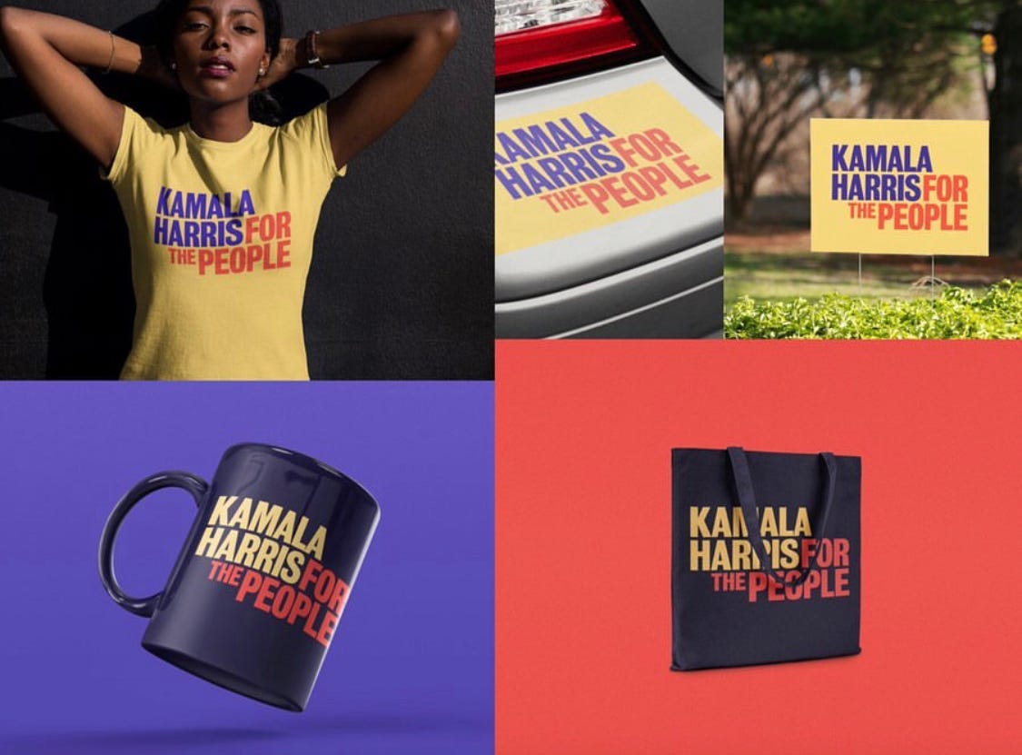
When Harris saw the first batch of campaign shirts, for example, “she had an emotional reaction because it was making real a vision she had for herself and her career.”
“It’s exactly how she wanted to be represented,” he said. “She said, ‘That’s me.’”

Credit: Kamala Harris for the People/Wide Eye
“I think as more diverse candidates come forward in future years, especially from younger generations … I think there’s going to be a desire to represent themselves in a more intricate and interesting way,” Ostrower said.
Raquel Breternitz, design director for Sen. Elizabeth Warren’s (D-Mass.) campaign, believes the growing diversity of candidates who run for office could ensure political design will continue to break traditional tropes.
“Even if we don’t see it in 2020, I think we’ll see it going forward,” she said. “I don’t think that women and people of color and queer people are going to stop running for president.”
Design as a form of activism
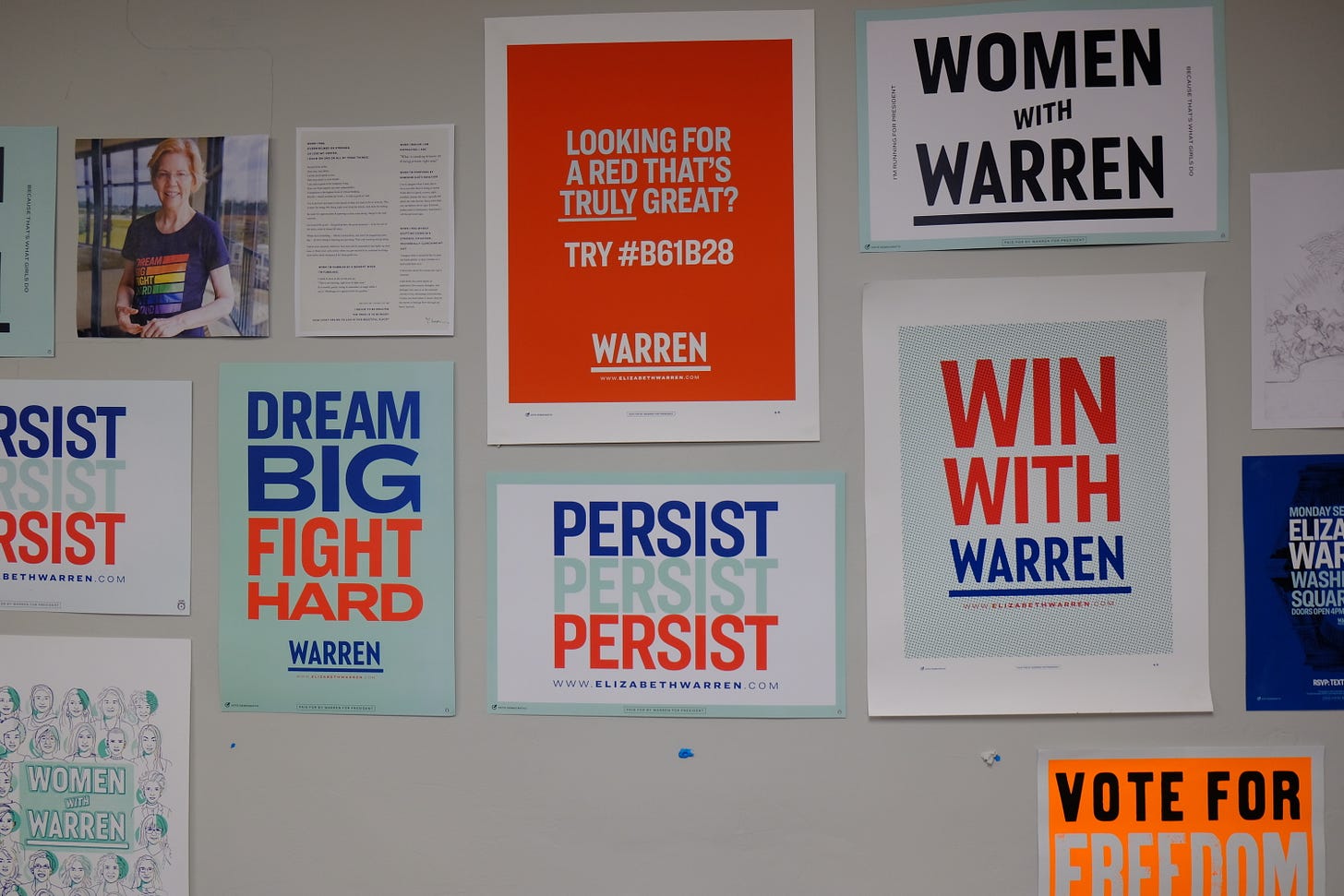
“Liberty green” wasn’t originally supposed to be Warren’s signature color, but it eventually became the defining color of her campaign.
“The idea was you take the red, white, and blue, you punch up the red, you make the blue bluer, you drop the white and you drop in the wildcard, and that was the liberty green,” Breternitz said, but “this brand really flipped on its head to where the blue very much became a base color, the red became an accent.”
After Warren designer Eric Ziminsky used liberty green for the background of his Twitter avatar, gradually “it became a thing,” Breternitz said. The avatar style “basically became the design team’s way of saying welcome to Team Warren.”

Posters on the wall of the Warren design team’s workspace. Credit: Ezra Deutsch-Feldman
The color was especially beloved by artist and designers who backed Warren and created their own images in support of the campaign. An Artists With Warren group even used their own unauthorized brand style guide to ensure their assets used the same shade of green as the campaign — hex code #B7E4CF.
“One thing is true always in politics: grassroots supporters will make their own things, they’ll make their own signs,” Breternitz said. “This happens for all fans everywhere.”
Subscribe to Yello for the latest news on the culture, branding, and visual rhetoric of politics, delivered each week:
Former South Bend, Ind., Mayor Pete Buttigieg’s campaign launched with his brand assets publicly available right out of the gate. His visual identity was designed by the Brooklyn creative agency Hyperakt, and they were inspired to release a Buttigieg brand toolkit because of a 2012 project they did for WNYC about teachers which had assets that educators around the country went on to download.
There’s always been a need to communicate ideas visually, Hyperakt creative director Deroy Peraza said, and “usually people take that into their own hands.”

Buttigieg campaign logos available for download on his toolkit site. Credit: Pete for America/Hyperakt
For several days, the campaign considered whether it was a good idea to release the brand toolkit or not because of the possibility it could be used by critics as well as supporters.
“For us, the thinking behind it was if people use it in a negative way, they would probably do it anyways,” Peraza said. “The stuff that was in there, there was nothing that needed to be hidden from the public.”
In the first day the toolkit went up, there were about 17,000 downloads. By the end of the campaign it had almost 115,000 downloads and 500,000 page views.
Read more: [How 2020 Democrats could rewrite the rules of political typography]
As for whether he believes future campaigns will follow the online toolkit model, Peraza said it will depend on the candidate.
“I think it’s a touchy subject,” he said. “I think it makes sense for some but it won’t make sense for others.”
For Buttigieg, who didn’t yet have a national profile, giving supporters a visual way to get to know and support him was helpful.
“It makes sense for a candidate who’s fresh,” he said. “Maybe a candidate who has more immediate weaknesses that are going to get called out would think twice about doing it.”
Design inspiration for the future
Campaigns sometimes draw design inspiration from the past and from political idols, as Harris did using yellow as an homage to Shirley Chisholm, and as Sen. Amy Klobuchar (D-Minn.) did using green as an homage to Paul Wellstone.
Building a branding system that pays tribute to a political hero tells a story and elevates a color palette to being part of a larger political heritage. So perhaps future candidates will one day turn to 2020’s diverse field for design inspiration, whether it’s a queer candidate paying tribute to Buttigieg, an Asian candidate paying tribute to Andrew Yang, or a Latino candidate paying tribute to former Housing and Urban Development Secretary Julián Castro.
“The stuff we’re doing now, people are going to look back at this,” Cruz Ortiz, an artist who created work for Castro’s campaign, told me in January.

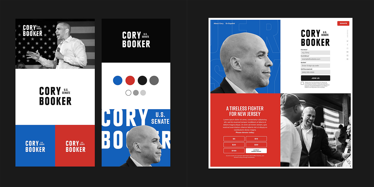
Credit: Wide Eye
Former 2020 candidates are also using their presidential branding as inspiration for their own future campaigns, as Sen. Cory Booker (D-N.J.) did with his Senate reelection visual identity.
“He’s completely married to the red, blue, and black,” said Ostrower, the Harris designer who also worked on Booker’s Senate campaign branding. “It was unthinkable that he would change that in a significant way.”
Sanders reused his 2016 logo in 2020, and should other candidates run for president again, their colors, typefaces, and other design assets could get reused or at least dusted off and refreshed.
“A lot of these candidates never need to change their branding ever again,” Ostrower said. “If you do it right, it’s theirs for life.”
While we don’t yet know the design legacy of this year’s primary, one thing is certain: campaigns, candidates, and supporters are savvier about the role design can play in establishing a political identity and visually communicating.
“Four years ago, people weren’t really looking at this very closely,” he said.
Top image credit: M. Scott Mahaskey/Politico via AP Images

