Biden's new campaign typefaces are a pivot to the general election
The Biden campaign is getting a design upgrade.
Biden campaign senior creative adviser Robyn Kanner tweeted on Saturday that the campaign was using two new typefaces: Decimal and Mercury. Their first prominent use was a Fourth of July video posted by former Vice President Biden, though they had previously been used in some smaller digital assets.
Decimal, a sans-serif typeface released in September 2019, was inspired by the type on vintage watches, while Mercury, a serif typeface released in 1999, was designed for newsprint and to be adapted for different printing presses.
In a statement to Yello, Kanner said these typefaces were chosen because of the message they send about truth.
“This campaign is about the battle for the soul of the nation,” she said. “That battle needs to be fought and won with the truth — the American people deserve that much. To that end, Decimal and Mercury were chosen based on their roots in the truth.”
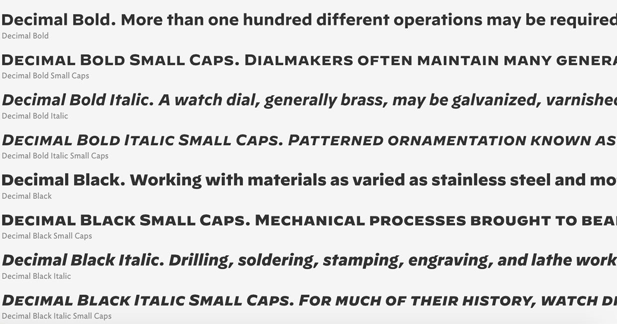
Kanner called Decimal “true as time” for its wristwatch origins…
Sample text using various weights of Decimal. Credit: Hoefler & Co.
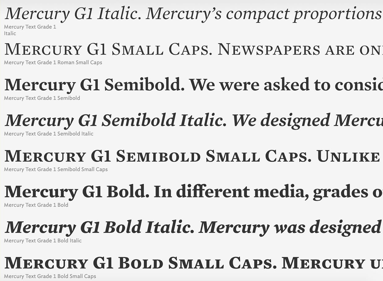
…and she said Mercury “holds the truth of a written word” because of its use in magazines and newspapers.
Sample text using various weights of Mercury. Credit: Hoefler & Co.
Decimal and Mercury were both designed by Hoefler & Co., the type foundry behind Gotham, the typeface used by former president Obama’s campaign, and Ringside, used by Sen. Elizabeth Warren’s (D-Mass.) campaign. Kanner said the Biden campaign partnered with Hoefler & Co. for their typography.
“As creatives, we are often relatively scrappy and are familiar with DIY projects,” she said. “Our partnership has been collaborative and conversational where we are able to research and develop typefaces that encapsulate core themes of Joe Biden’s campaign.”
The new type will join Brother 1816, the sharp-edged geometric san-serif typeface used in the Biden logo.
The general election design refresh
Campaigns update their visual identities when they transition from the primaries to the general election campaign to send a visual message and to adapt to the changing tempo of the race.
In 2016, Hillary Clinton’s campaign used the typeface Sharp Unity during the primary, then added Sharp Slab, a companion typeface with added serifs that was made custom for the general.
The Clinton campaign’s “Love trumps hate” graphic from the primary written in Sharp Unity, and “Stronger Together” from the general campaign written in Sharp Slab.
Ida Woldemichael, who worked on Clinton’s 2016 campaign and is now the associate creative director at Wide Eye Creative, said when making the move to the general campaign’s “Stronger Together” messaging of unity, this different typeface “let the public know that there’s something new.”
“The message has changed, the typeface has changed,” she said.
The shift to general election mode coincides with preparations for the national convention, when a candidate’s visual identity is on full display and adapted for new uses like placards and a decked-out arena. Campaign design teams also grow. For Clinton, her design staff went from six to 16.
The Biden campaign’s new typefaces are just the first of more updated visual elements to come. “Stay tuned,” said Kanner, the Biden creative adviser.
Decimal: inspired by vintage watch lettering
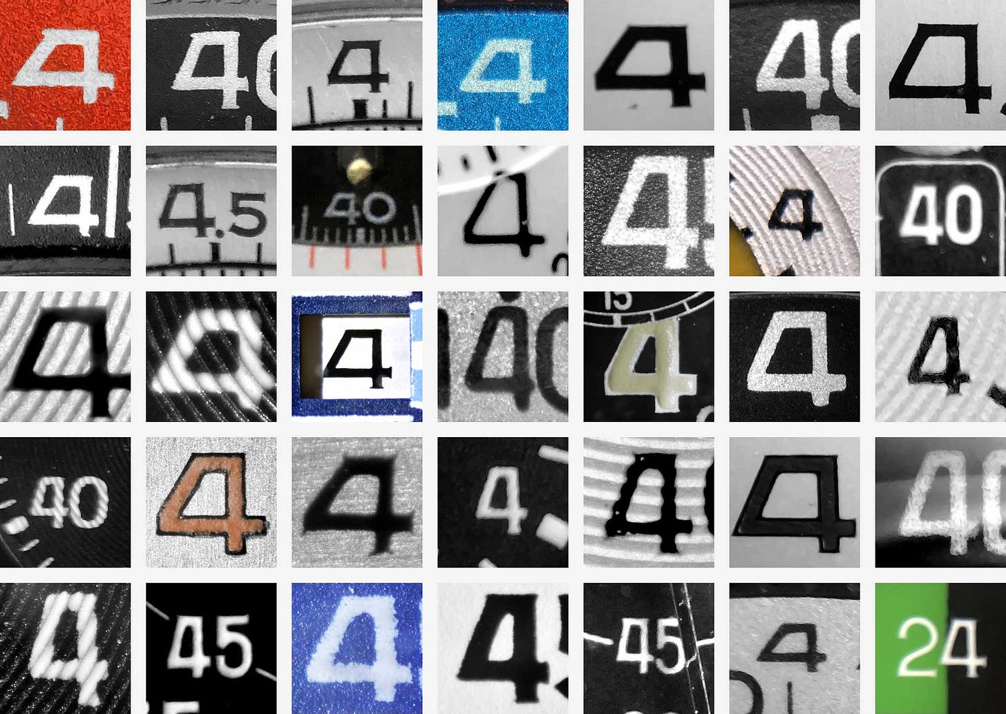
Vintage watch lettering tends to have a consistent look regardless of the watch manufacturer and it’s a style that developed independently from mainstream design trends to meet the needs of watchmaking, according to Hoefler & Co.
One of the most distinctive aspects of Decimal is the flat-top characters, like the letter A and number 4. This style was developed because the apex of these characters, or the spot where two strokes meet, had to be wide enough to prevent liquid ink from pooling.
Credit: via Hoefler & Co.
Woldemichael said Decimal feels like an evolution of Gotham, the Obama typeface, and it offers a visual connection between Biden and the former president.
“Continuing something that feels positive and optimistic is, I think, really smart,” she said.
The pilot watch-style type also has an aviation feel, which matches the aviator-wearing persona Biden has established.
Here’s a look at the alphabet in Decimal:
Mercury: developed to solve a problem for the New York Times
Mercury was created for the New York Times because the paper needed a typeface that could be used across its weekly regional editions which were printed at printing presses in multiple cities with different atmospheric conditions, according to Hoefler & Co.
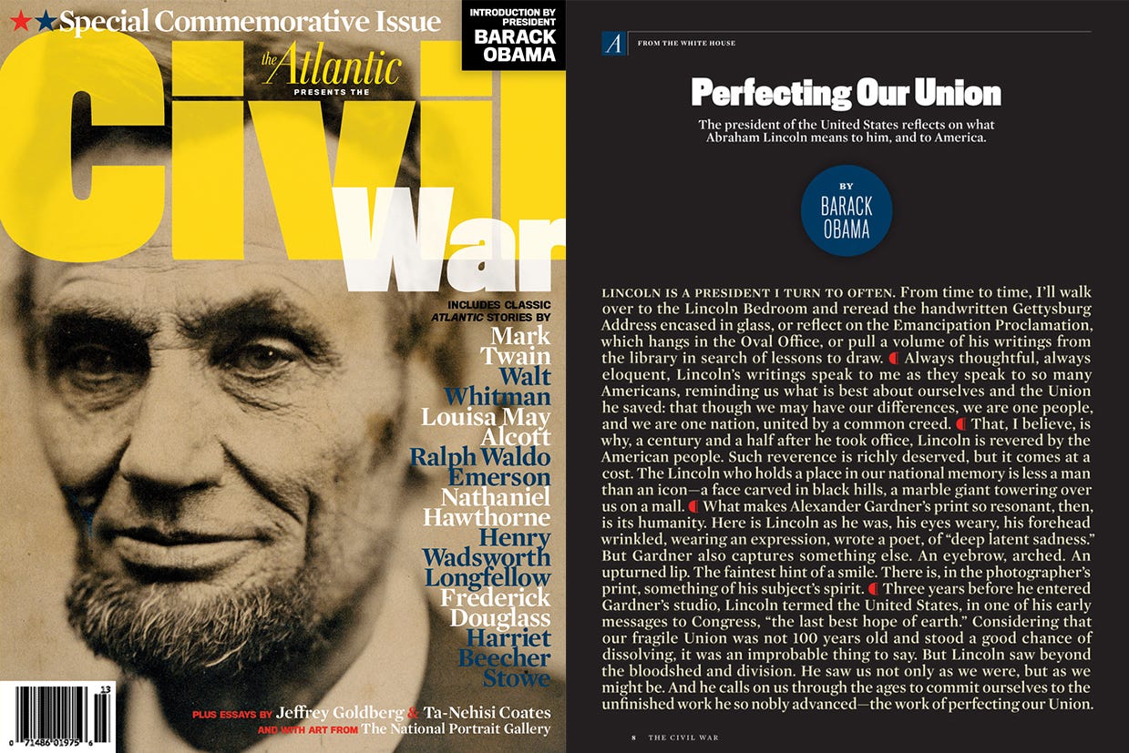
Mercury Text was designed with multiple grades. That allowed printing presses the ability to make type decisions based on local needs so the paper looked the same no matter where you picked it up. The typeface has also been used in other publications, including The Atlantic.
Credit: The Atlantic via Fonts In Use
Here’s a look at the alphabet in Mercury:
Biden’s expanded typography
The Biden campaign’s main typeface, Brother 1816, was easily identifiable because of its sharp As, Ms, Ns, and Ws. The typeface can be used playfully, but when displayed in all caps for political messages like “Ban Assault Weapons” and “Impeach Donald Trump,” it was loud, pointed, and uncompromising.
Brother 1816 was used across the Biden campaign website, digital ads, social graphics, and other assets for the vast majority of the campaign. This helped establish it as the campaign’s visual look, but because it’s such a strong typeface, it sometimes felt like it had just two volumes: shouting when it was in all caps, and using an outdoor voice inside when it wasn’t. It’s loud!
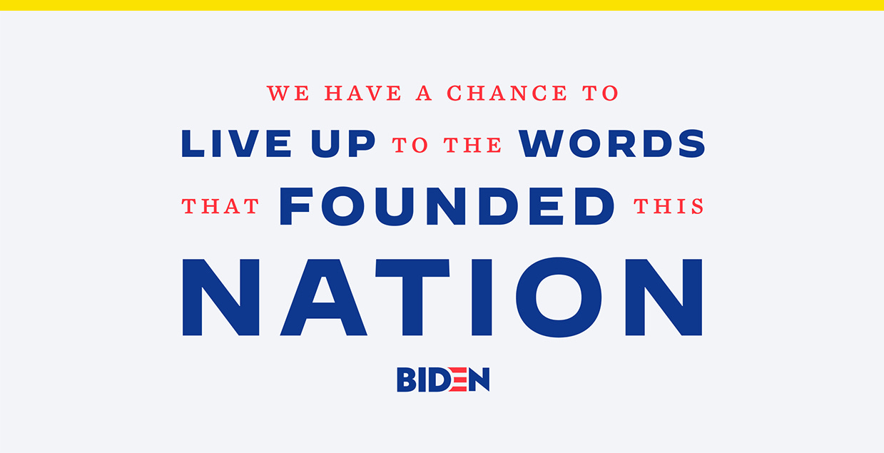
You can see the difference in typographic voice in this social graphic shared to the @teamjoebiden account Saturday written in Brother 1816, compared to the same message shared to the @joebiden account Tuesday that used Decimal and Mercury.
Credit: @teamjoebiden/@joebiden/Instagram
These two new typefaces allow the campaign to have more flexibility in its visual personality. The boldness of Decimal when used alongside Mercury allows for a hierarchy that emphasizes certain words in the message and they have a warmth, humanity, and nice pacing, Woldemichael said. They also pair well together.
“I thought the interesting thing about those typefaces together is they bring about something classic,” she said.


